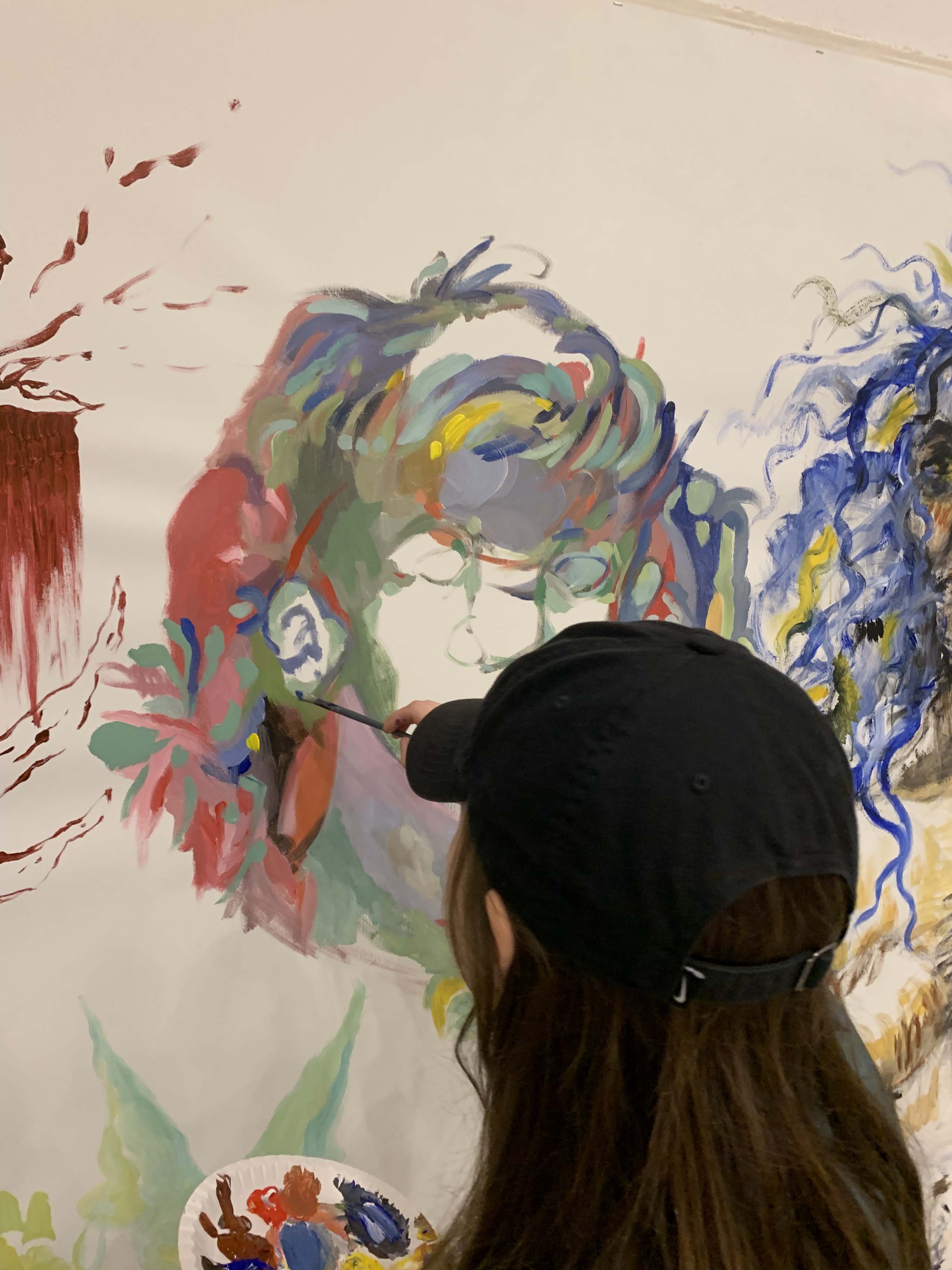

I’m a graphic designer moved by the alteration of the ordinary; fascinated by signs that gain new meaning through various ways such as superimposition, change or erasure. The vernacular is a driving force in my practice, I often let myself be guided by the places in which I evolve. When I'm on the street, I like to make the discovery of a voluntary modification, if not a temporal disintegration, on an object that will stand out from its everyday version. I experiment with collage, lettering, concrete poetry, color and style. I start from the commonplace, from what forms culture, exploring notions of standard and stereotype, and trying to bring nuance with a new image.
Fonts : 'Spanning', 'DINdong' by Clara Sambot, available on Bye Bye Binary's typothèque , and 'Tournure'.
Web development : Émilie De L'Arbre
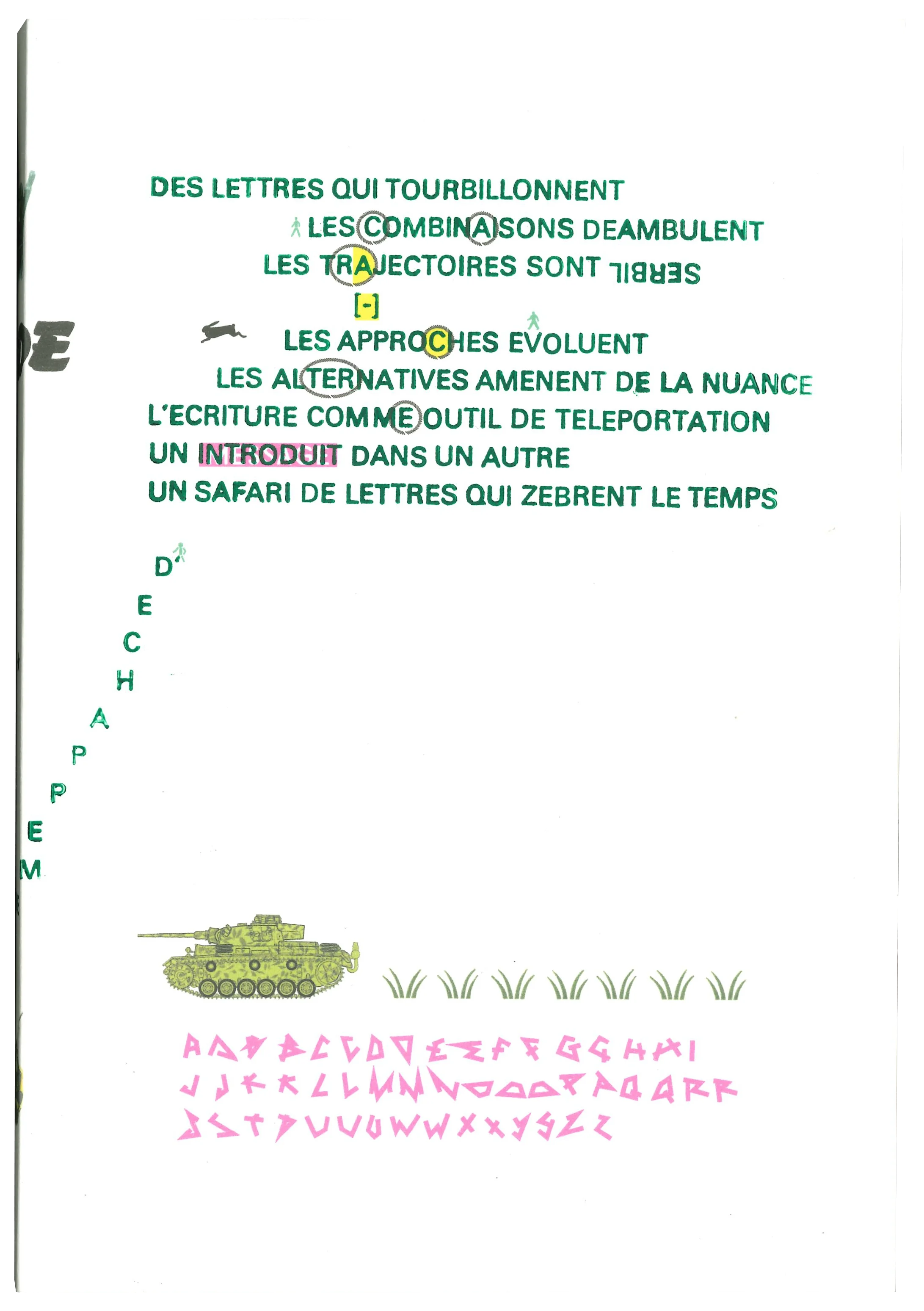
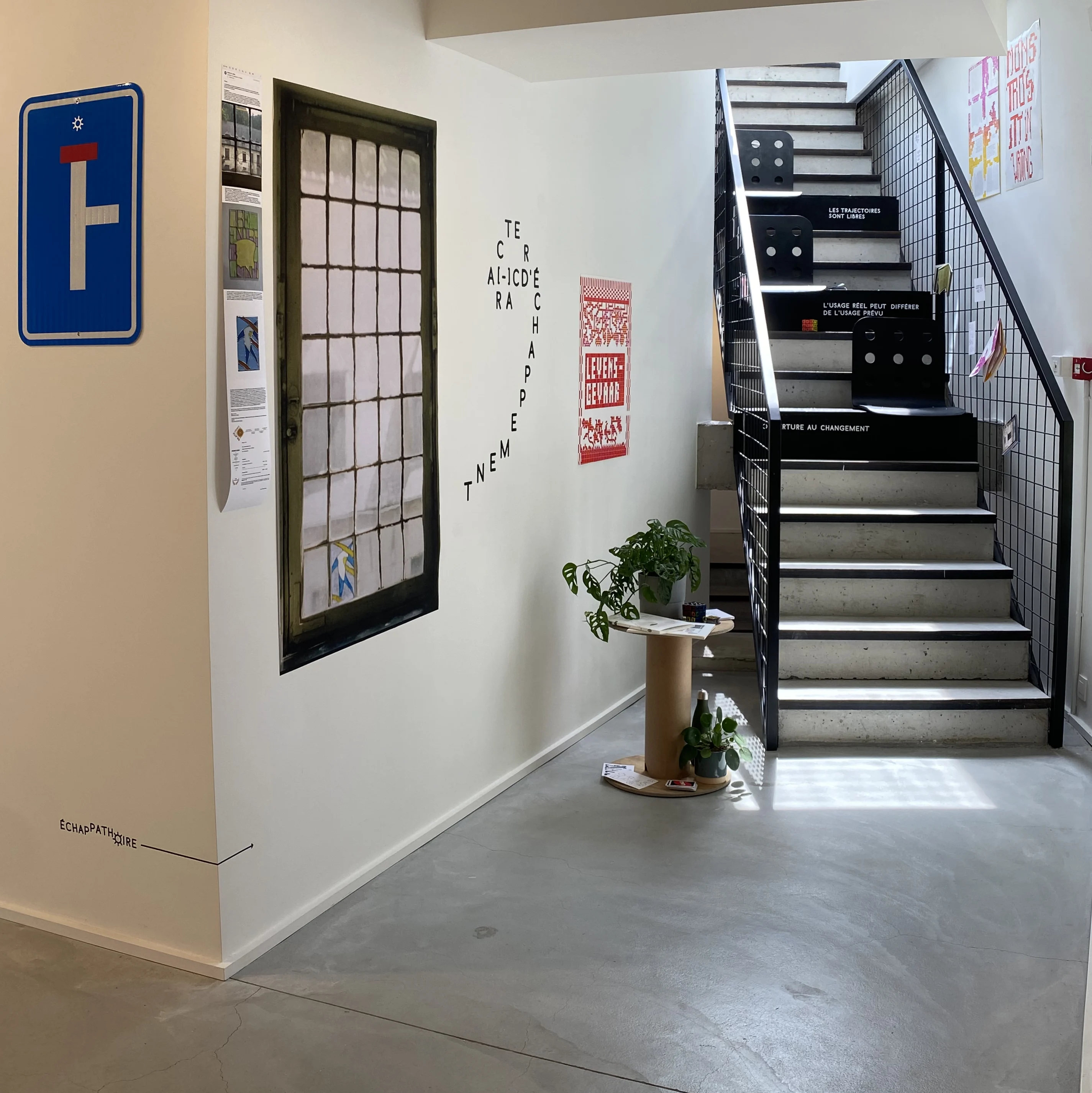
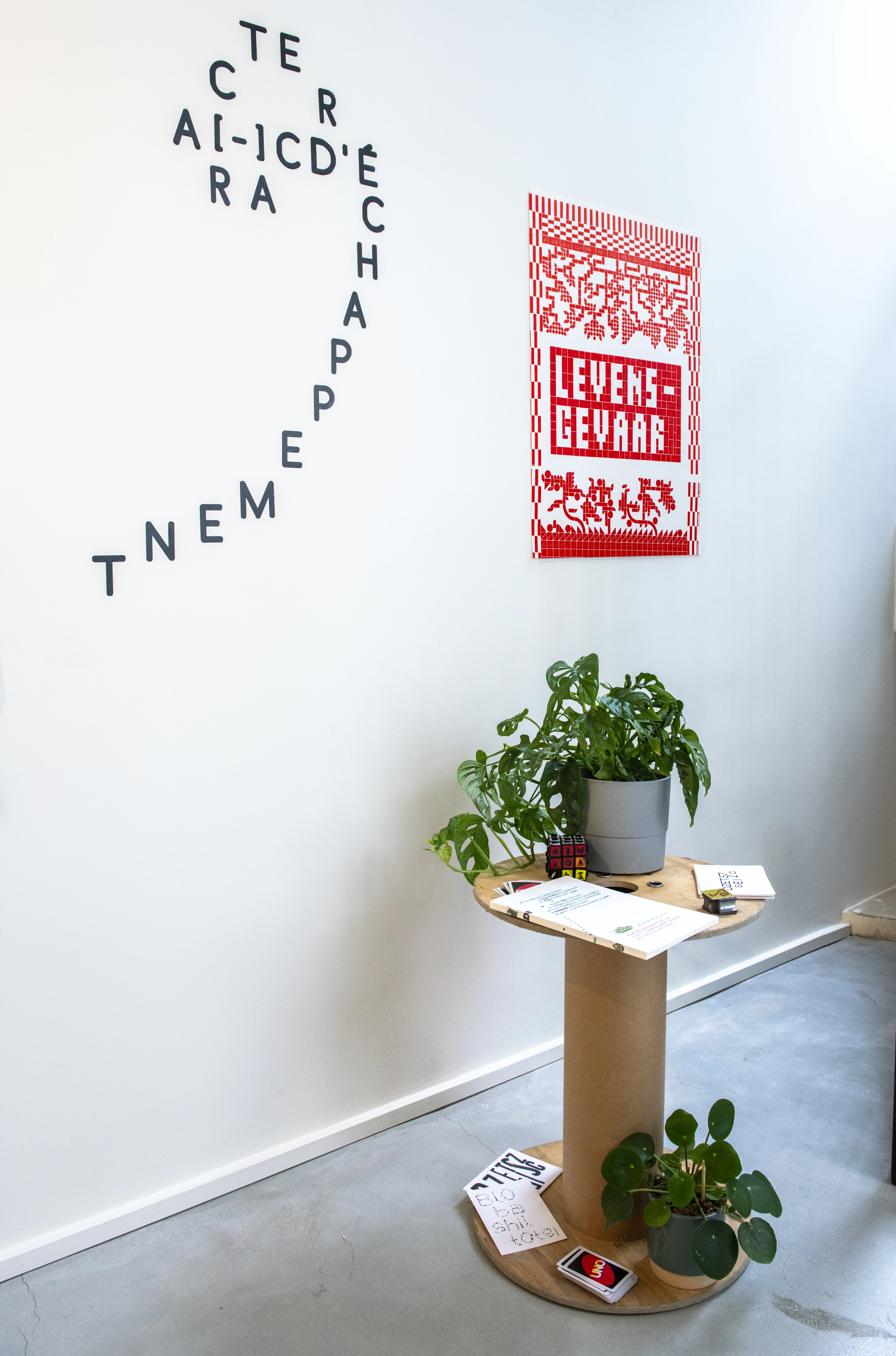
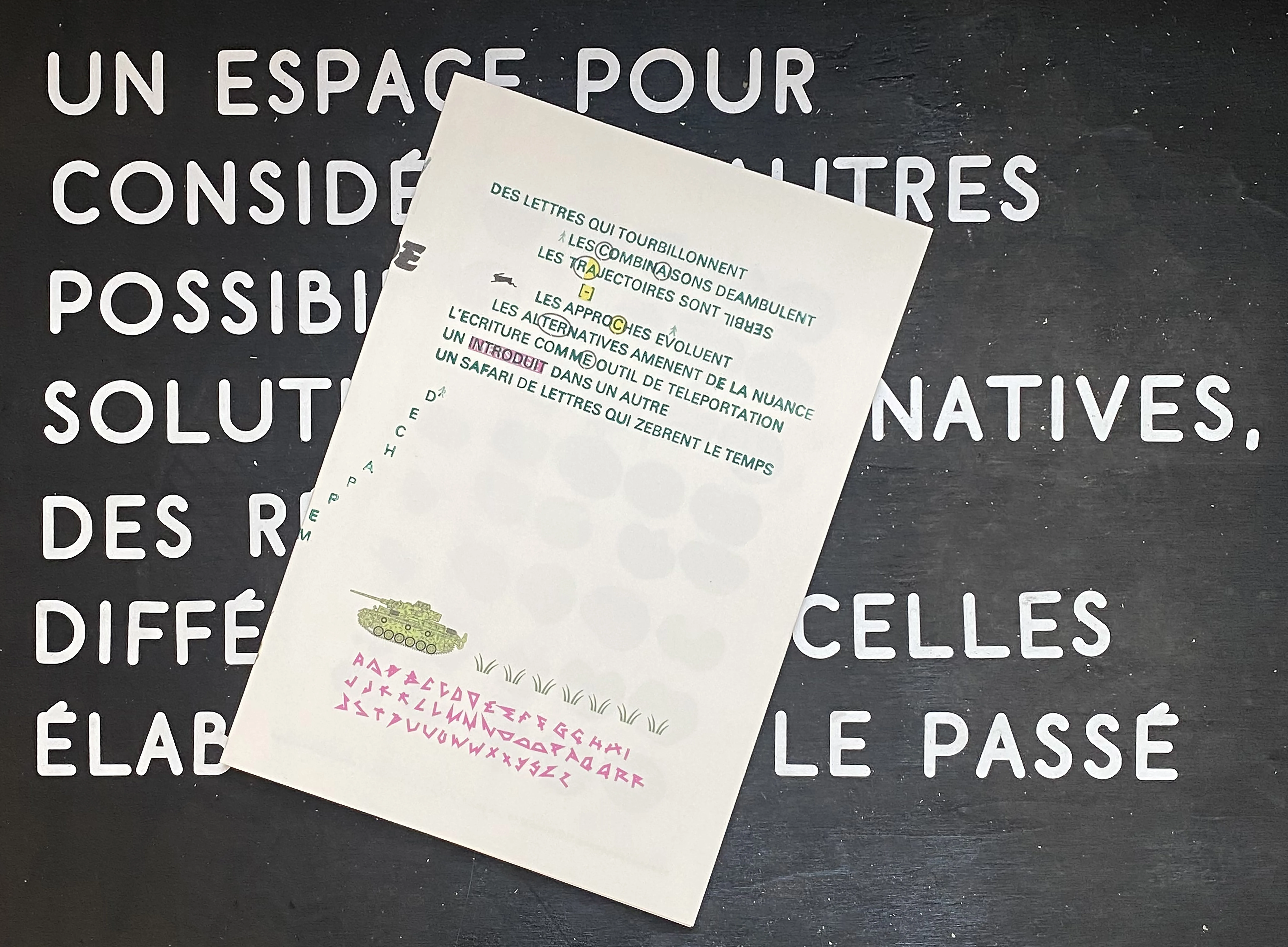
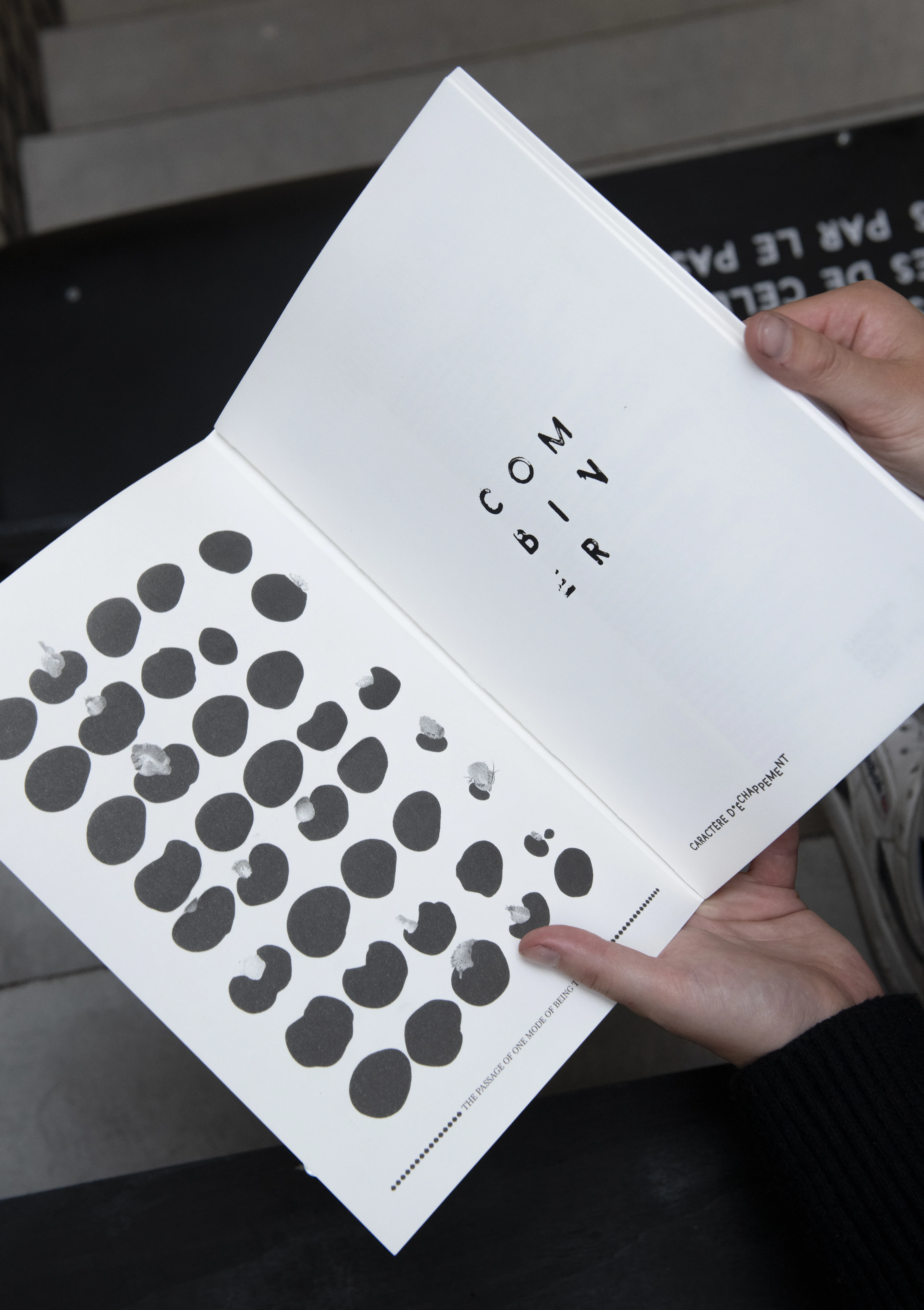
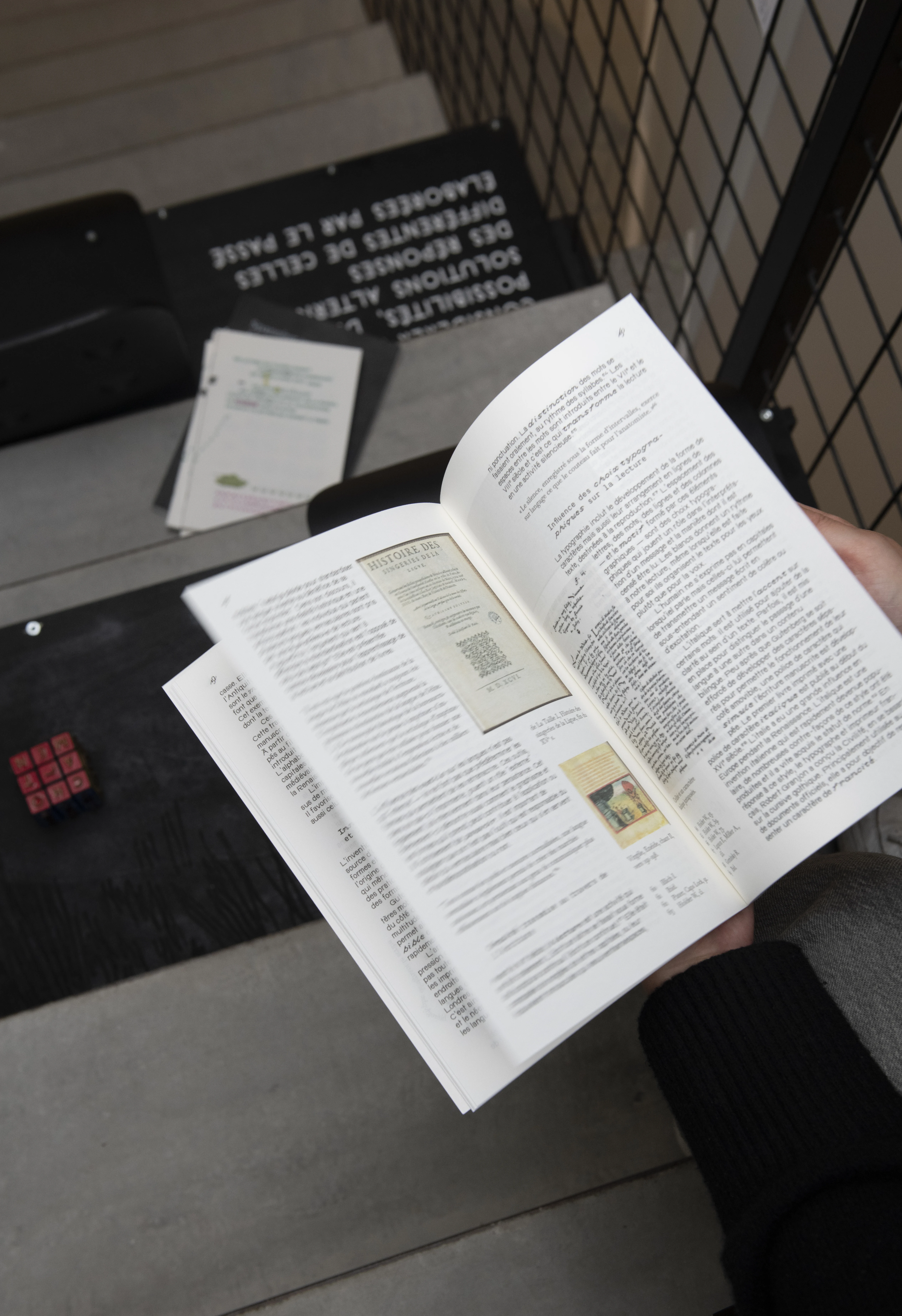
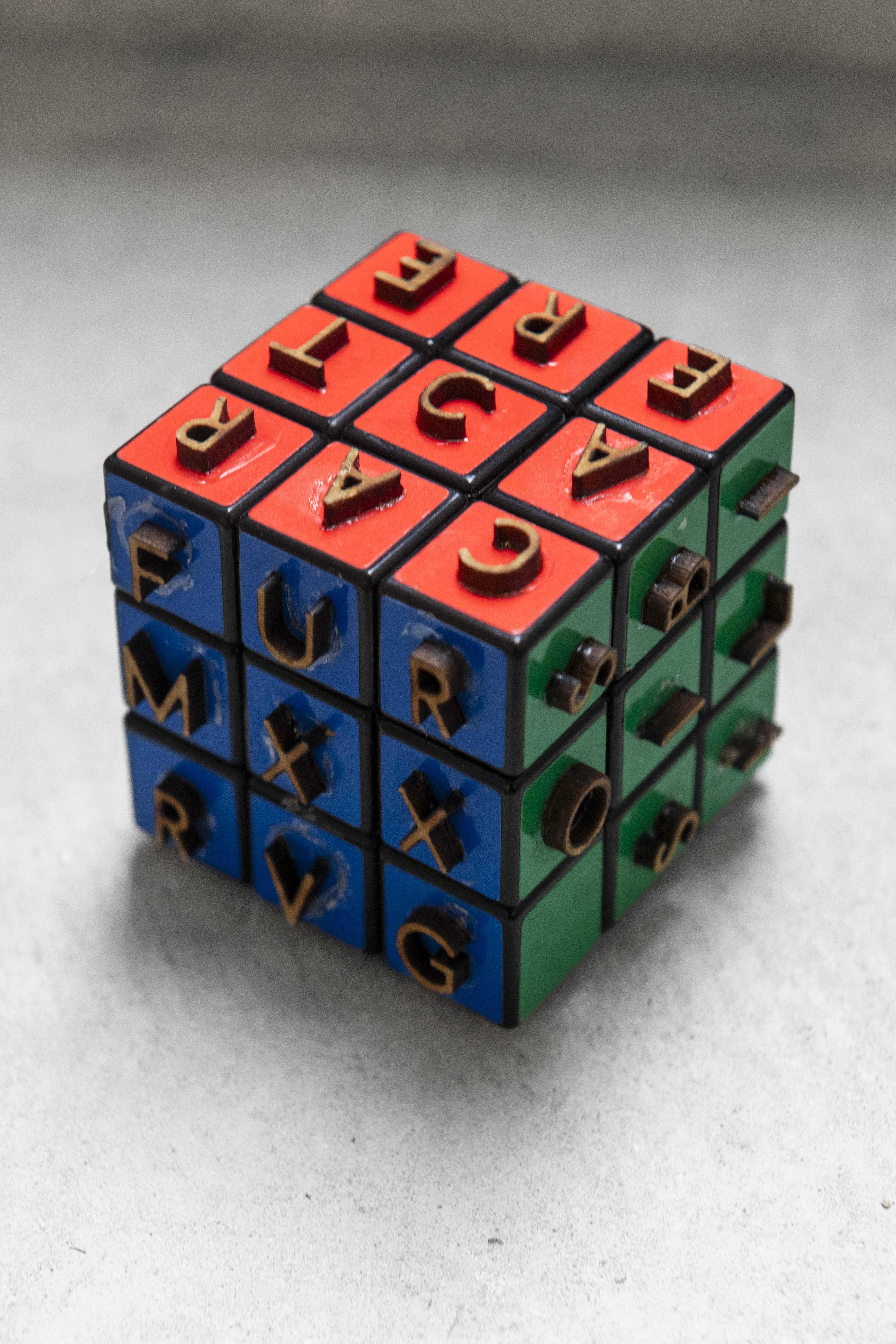
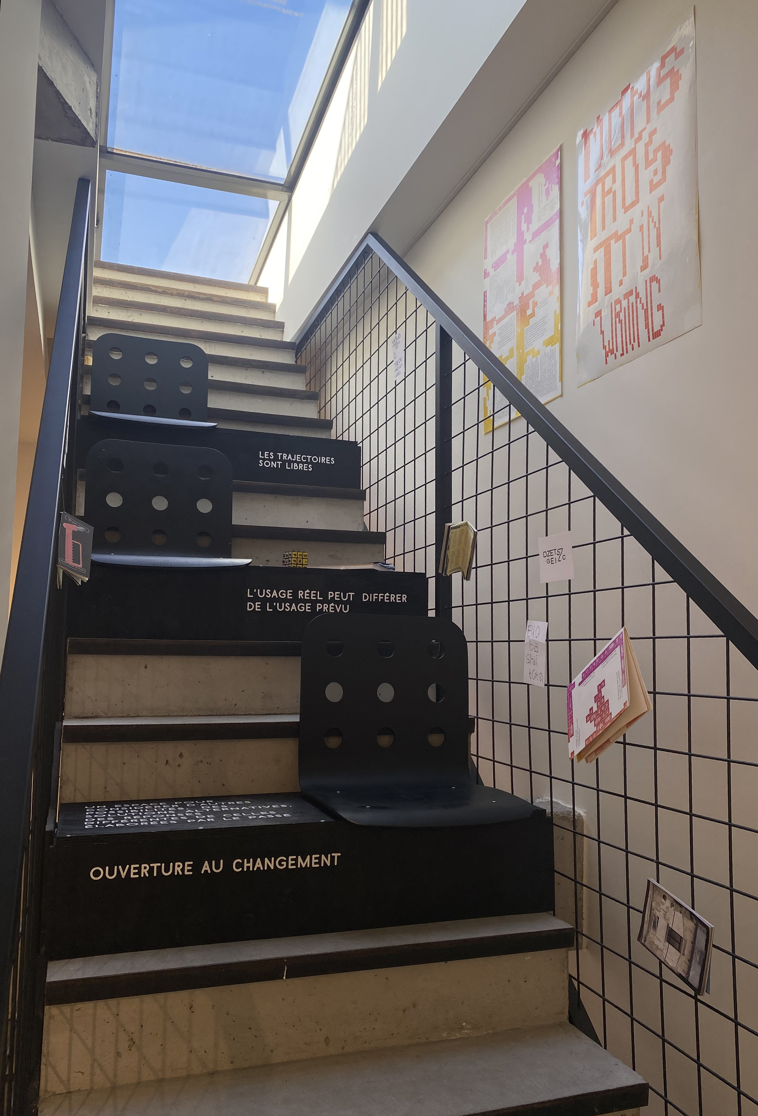
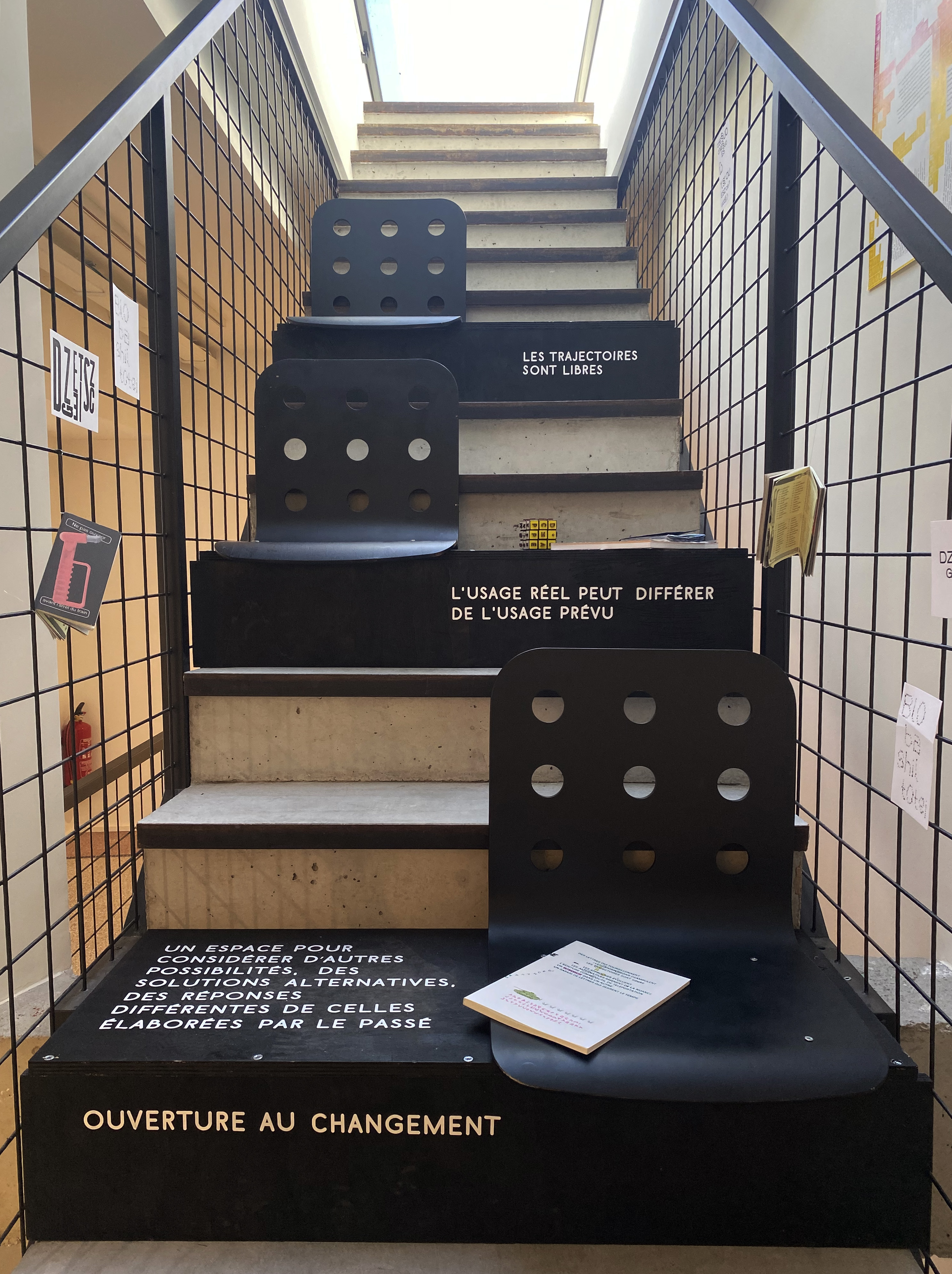
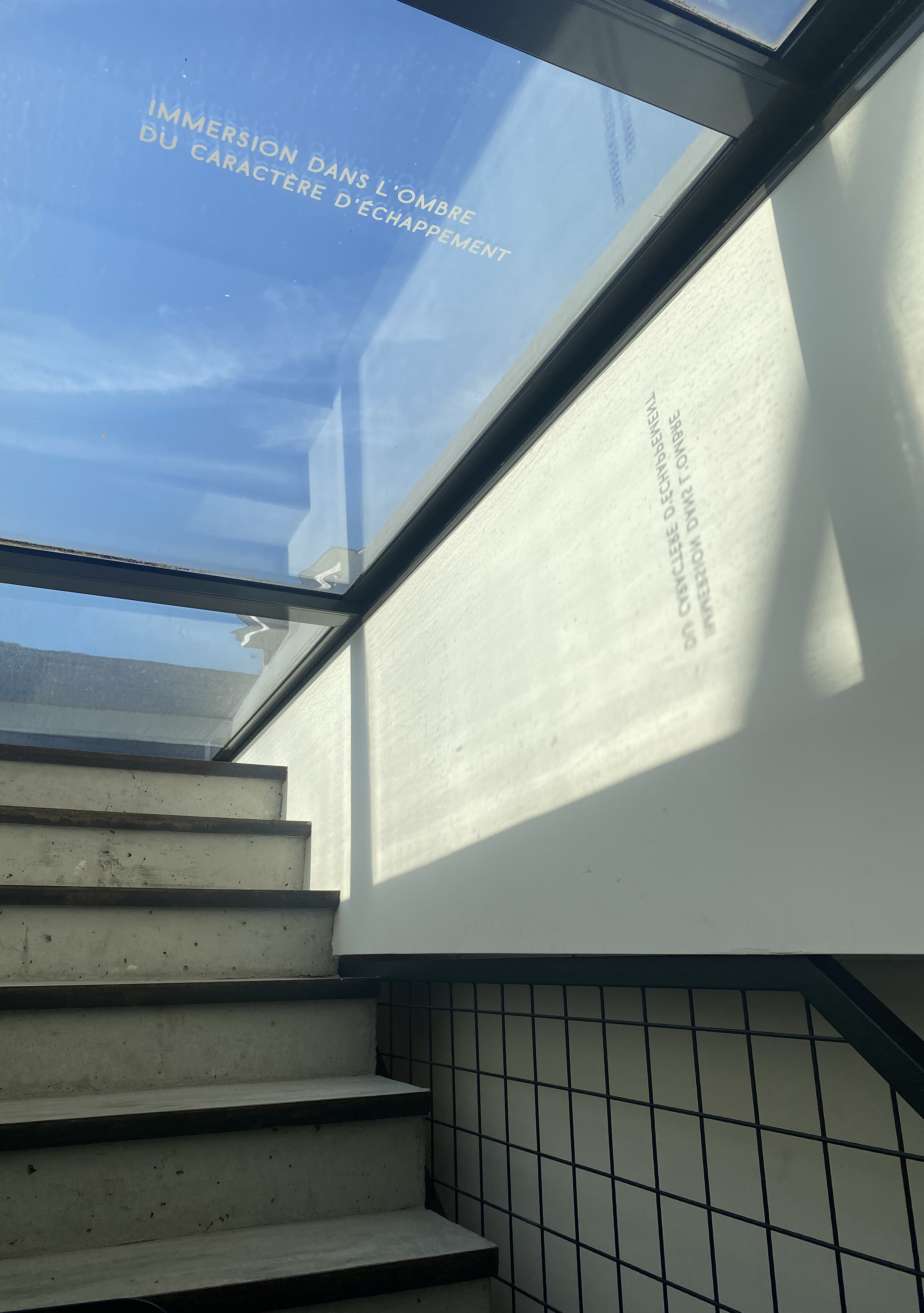
'Caractère d'échappement' is the thesis I wrote during my final year of my master's degree.
To activate this research, I chose to display some of its reflections in an installation
composed of diverted objects, projects carried out over the last two years and contextual
or referential inscriptions. For instance, I intervened on the form and function
of a staircase and that of a Rubik's cube. The escape character
has allowed me to tackle subjects such as re-appropriation or détournement, changing modes,
language evolution, the vernacular and post-binary writing. The projects that have been associated with this research,
and sometimes even enabled me to develop it, can also be seen on this site.—To learn more about this research you
can jump to the research's section, focusing on "".
You'll find a video I made to explain my process.
Cover printed with letterpress (in Univers) and Com'Color
Book block printed in Com'Color—on the 5th picure, you can see that the Rubik's cube has been used to print on the first page
17,5x25,5 cm, 104 p., coptic binding
language, neutrality, standardisation, alternatives, vernacular
Pictures n°3, 5, 6, 7 © La Cambre, Kamand Ravazi, 2024.
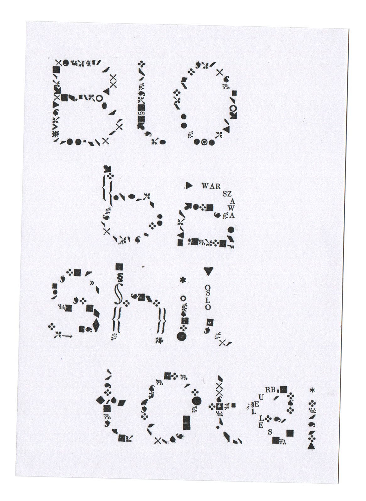
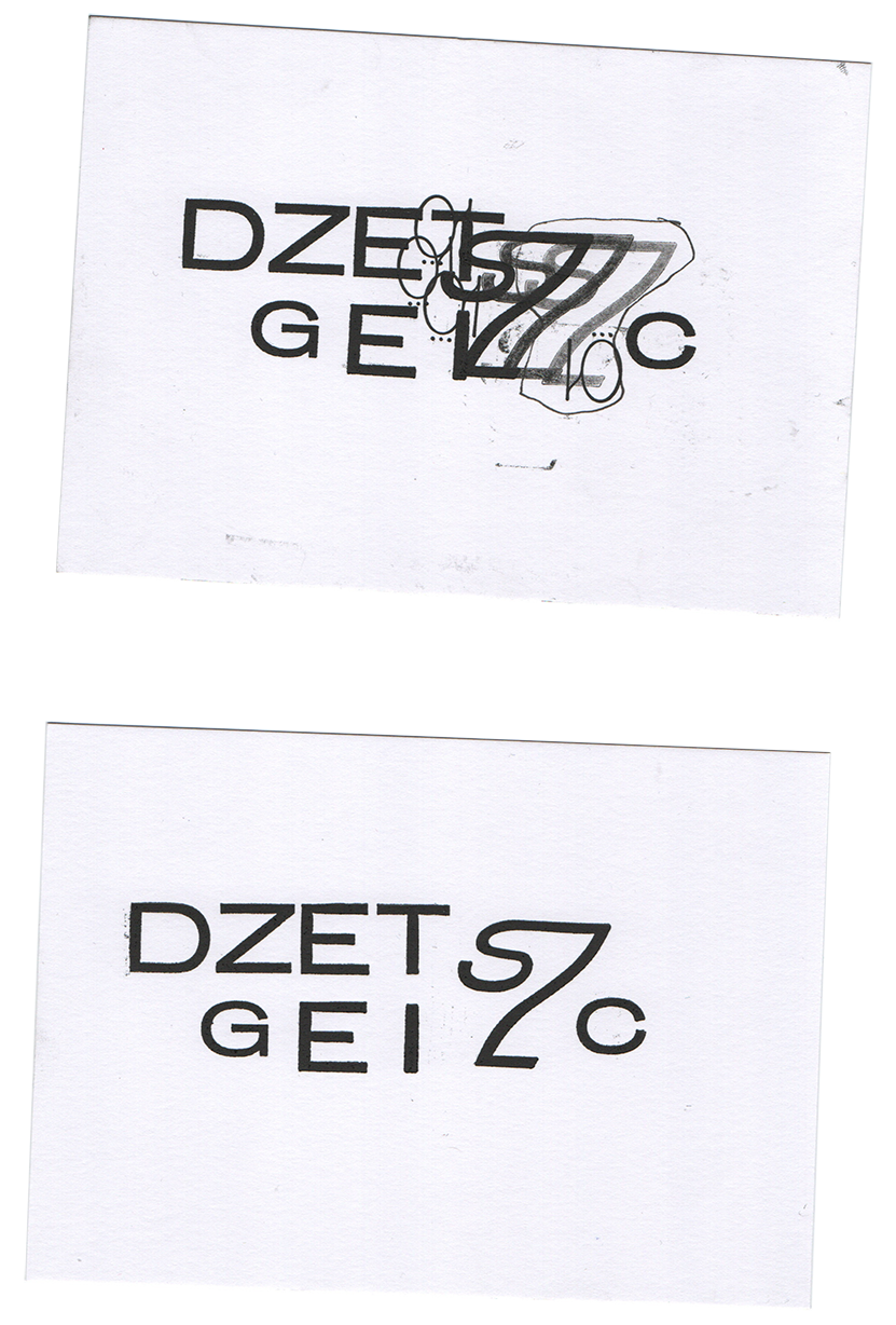
Workshop organised with students from Warsaw,
words were composed and represented solely on the basis of their
audio recording. A group of students from Oslo also took part in the project.
The process was as follows: a student
was given a word, at random, in a language that is foreign to them
- Polish / Norwegian / French. An edition bringing together all the designs
produced between 13 and 15 March is currently being prepared.
Postcards, POL / NO / FR
10,5 x 14,8 cm, composed with 'Baccarat półgruby' / 6pt ornaments
The 'sz' ligature on the last composition is printed using
a self-designed polymer
languages, experimentation
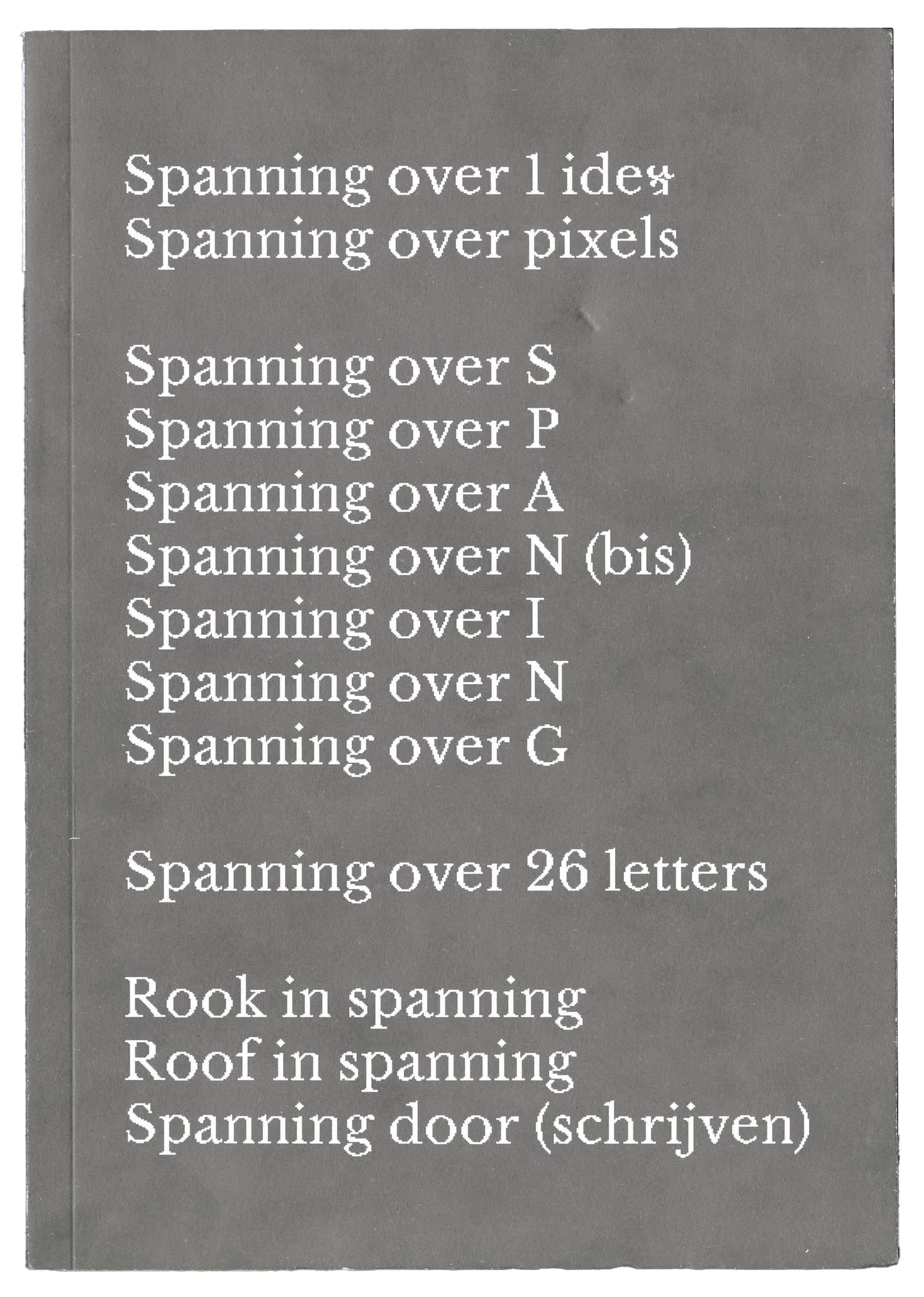
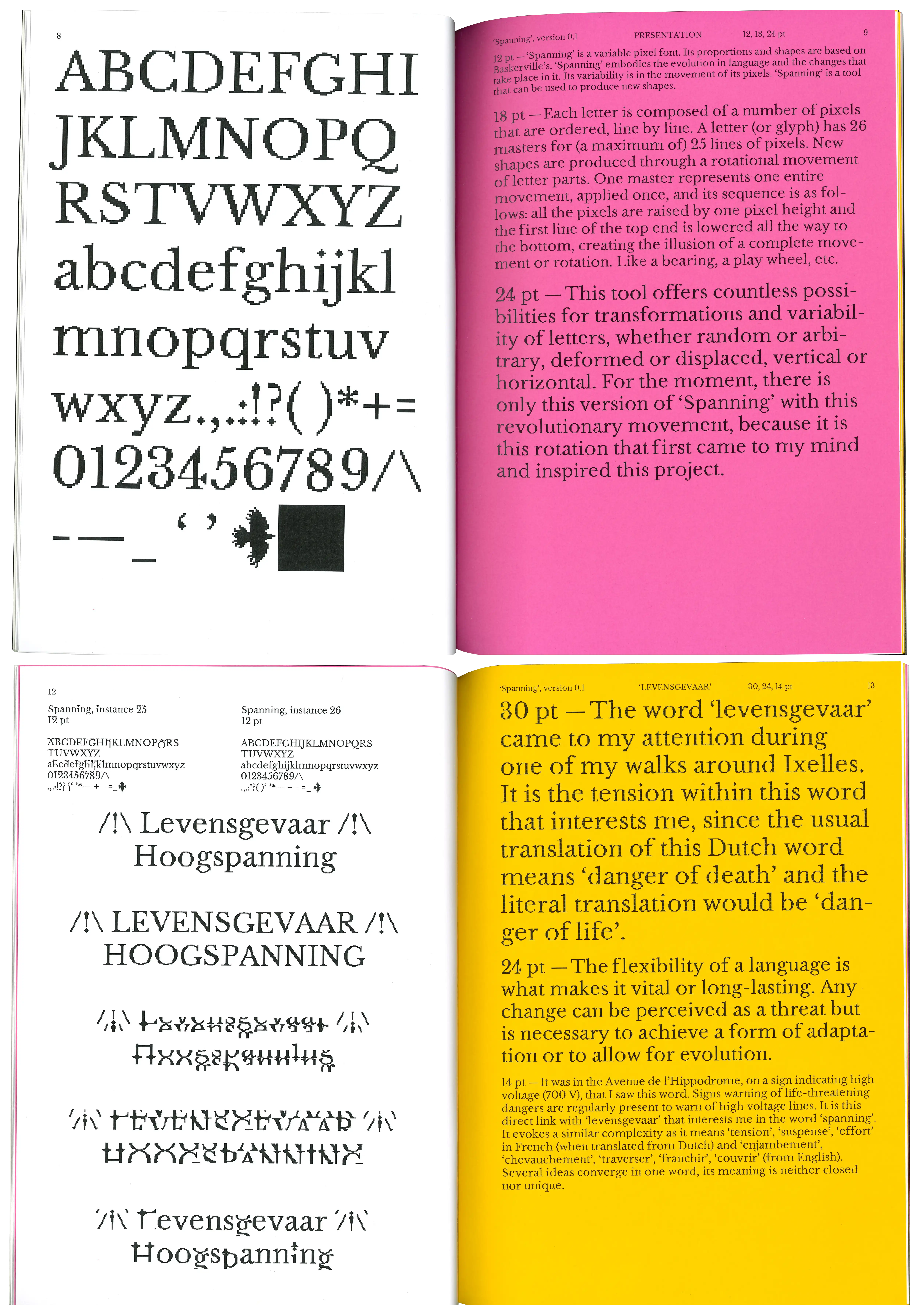
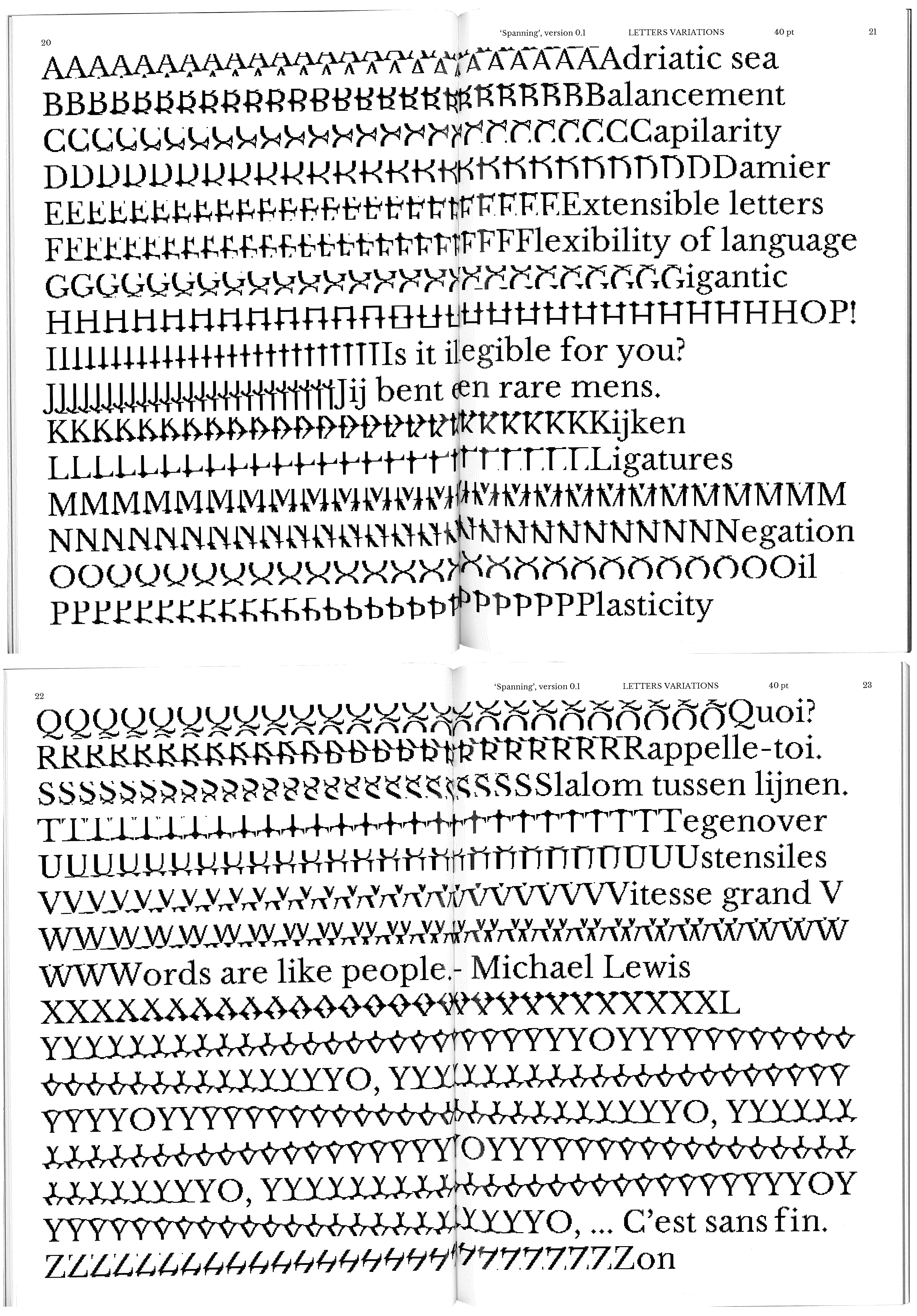
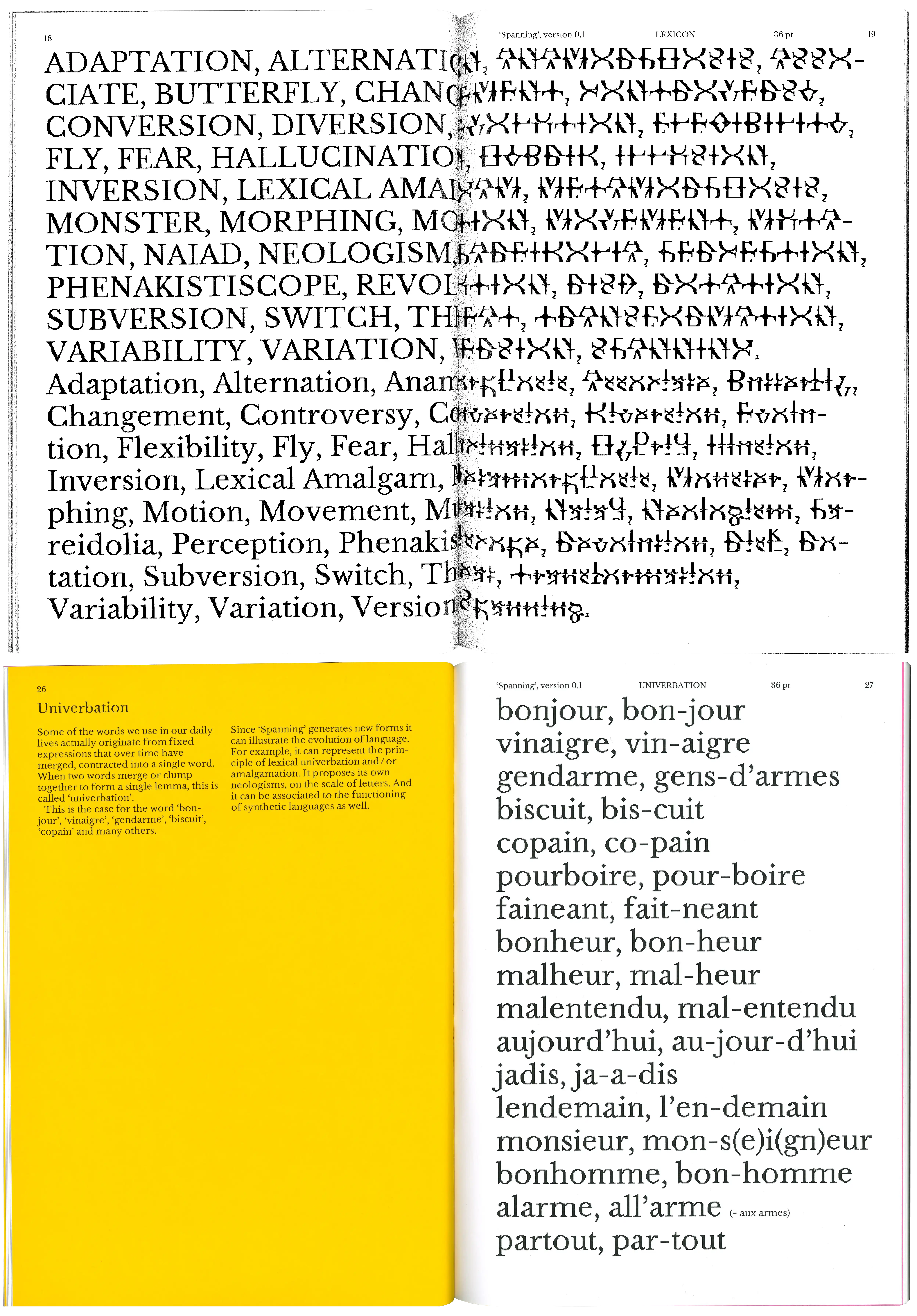
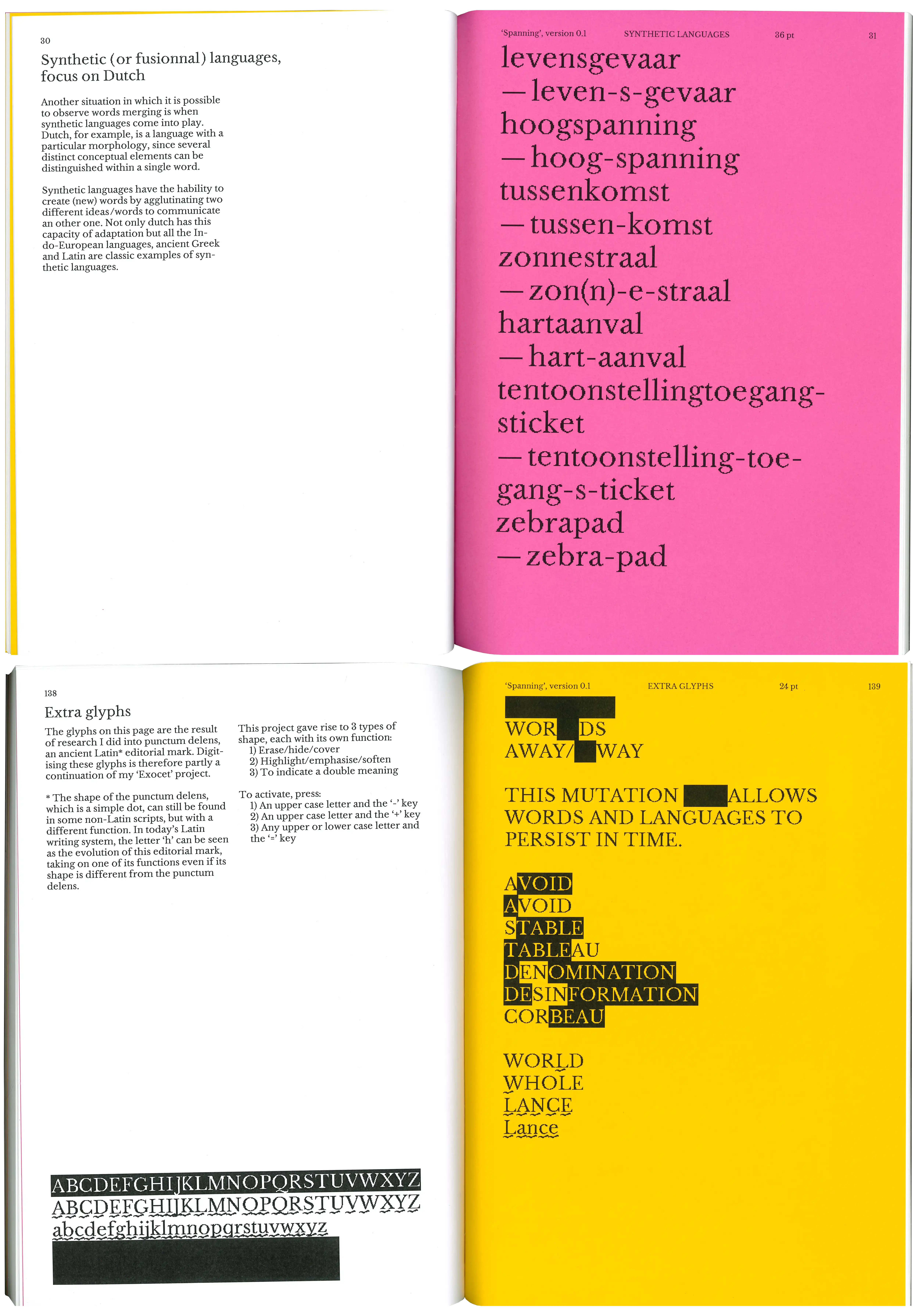
Spanning is a variable-pixel font whose first tests took shape during
a workshop presented by Eugénie Bidault. The proportions and character
designs are based on those of Baskerville. This typeface is a way of
representing the evolution of language — by following a certain protocol,
it deforms the letters and randomly composes new shapes. These new shapes
can then be used in different contexts, whether to create inclusive or
bilingual glyphs. Spanning also offers a number of extra glyphs that
can be used to add nuance to writing, for example by highlighting
certain letters or words.
Specimen, ENG (+ some french and dutch)
A4, 142 p.
language evolution, shape-shifting
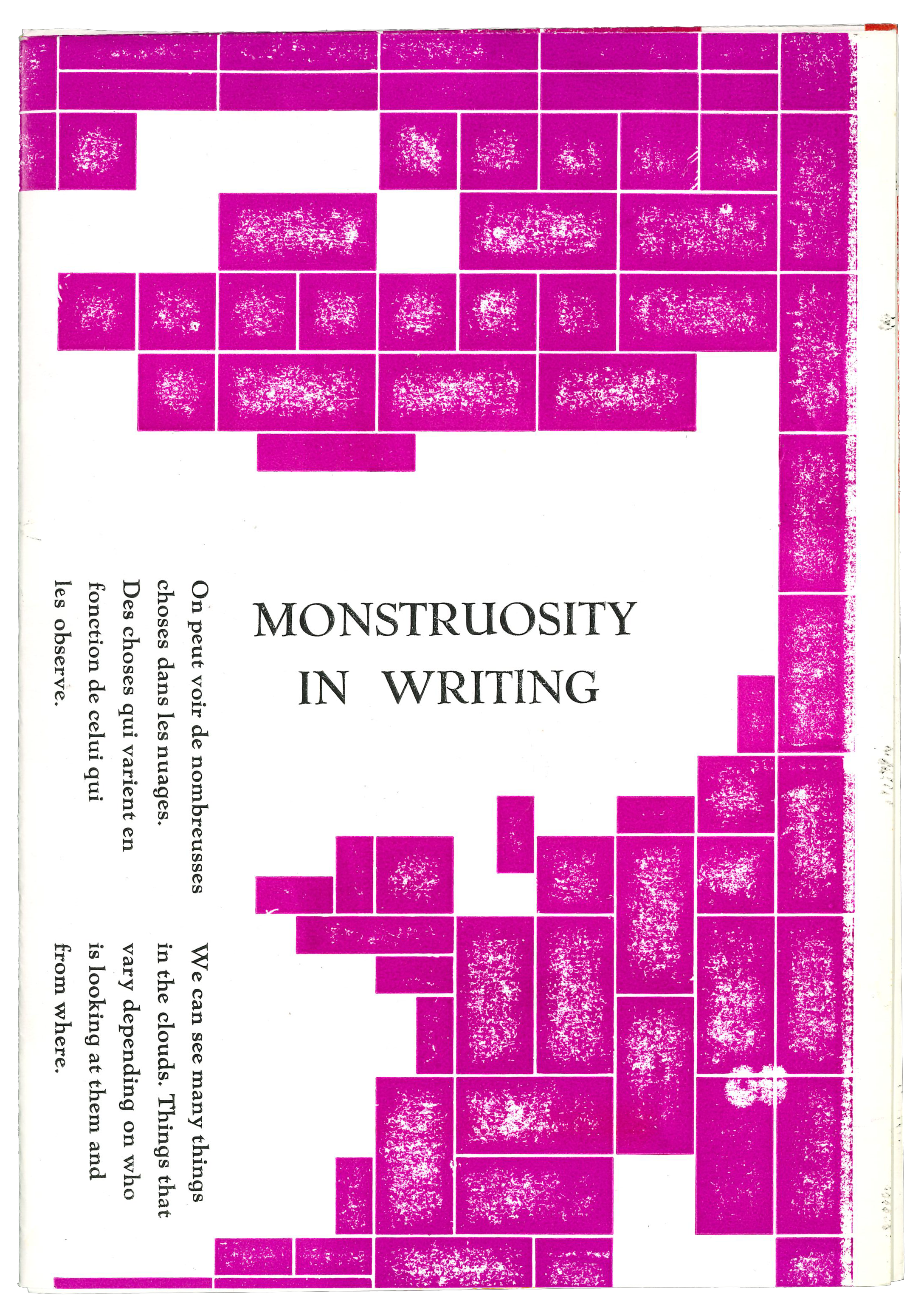
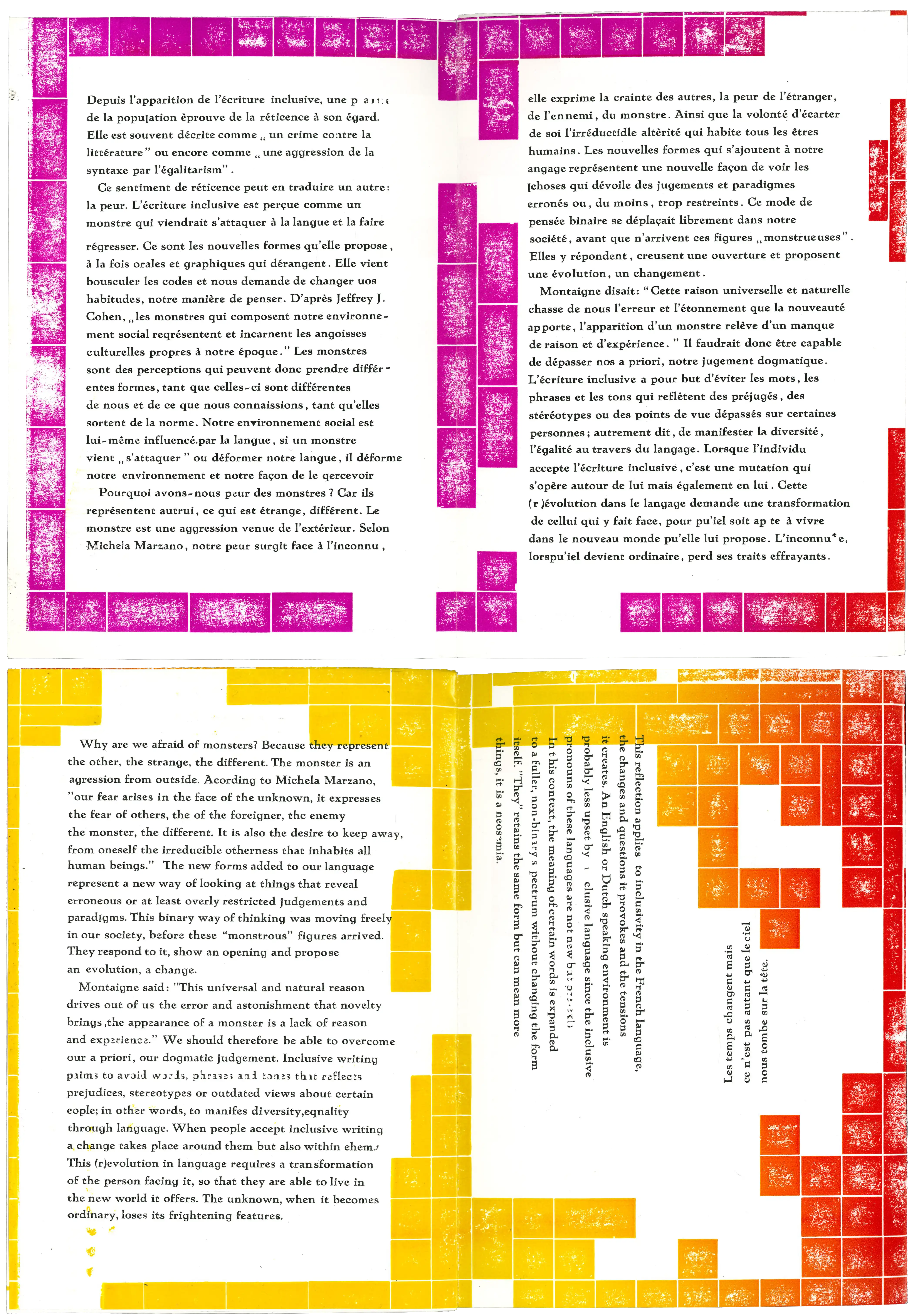
Clouds are perceptions
that compose and decompose. Perceptions are like clouds that compose
and decompose.
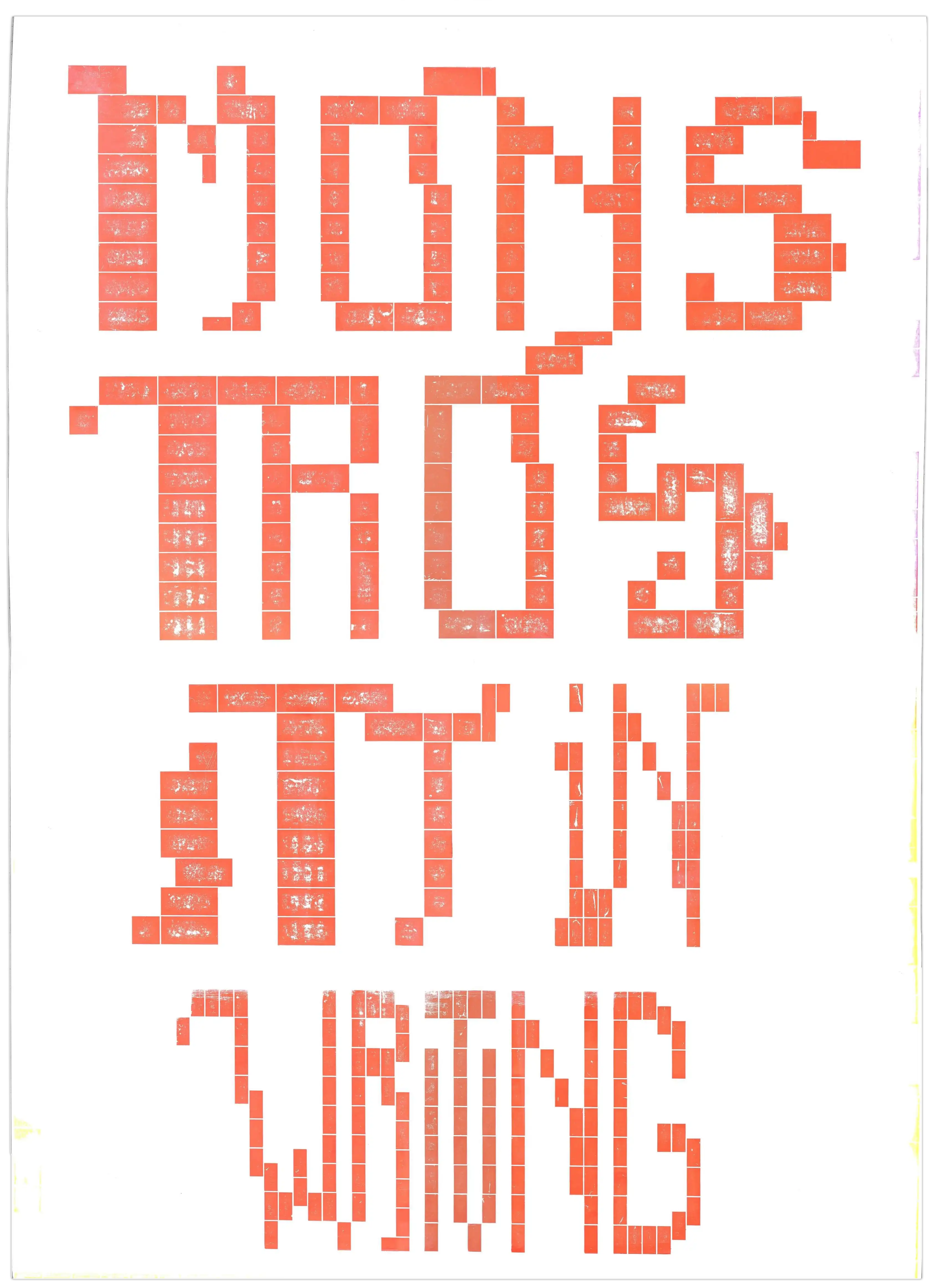
Booklet - Poster (recto/verso), ENG / FR
17,5 x 25 cm, composed with 'Grotius' + 'LEGO'
inclusive writing, xenophobia, changement
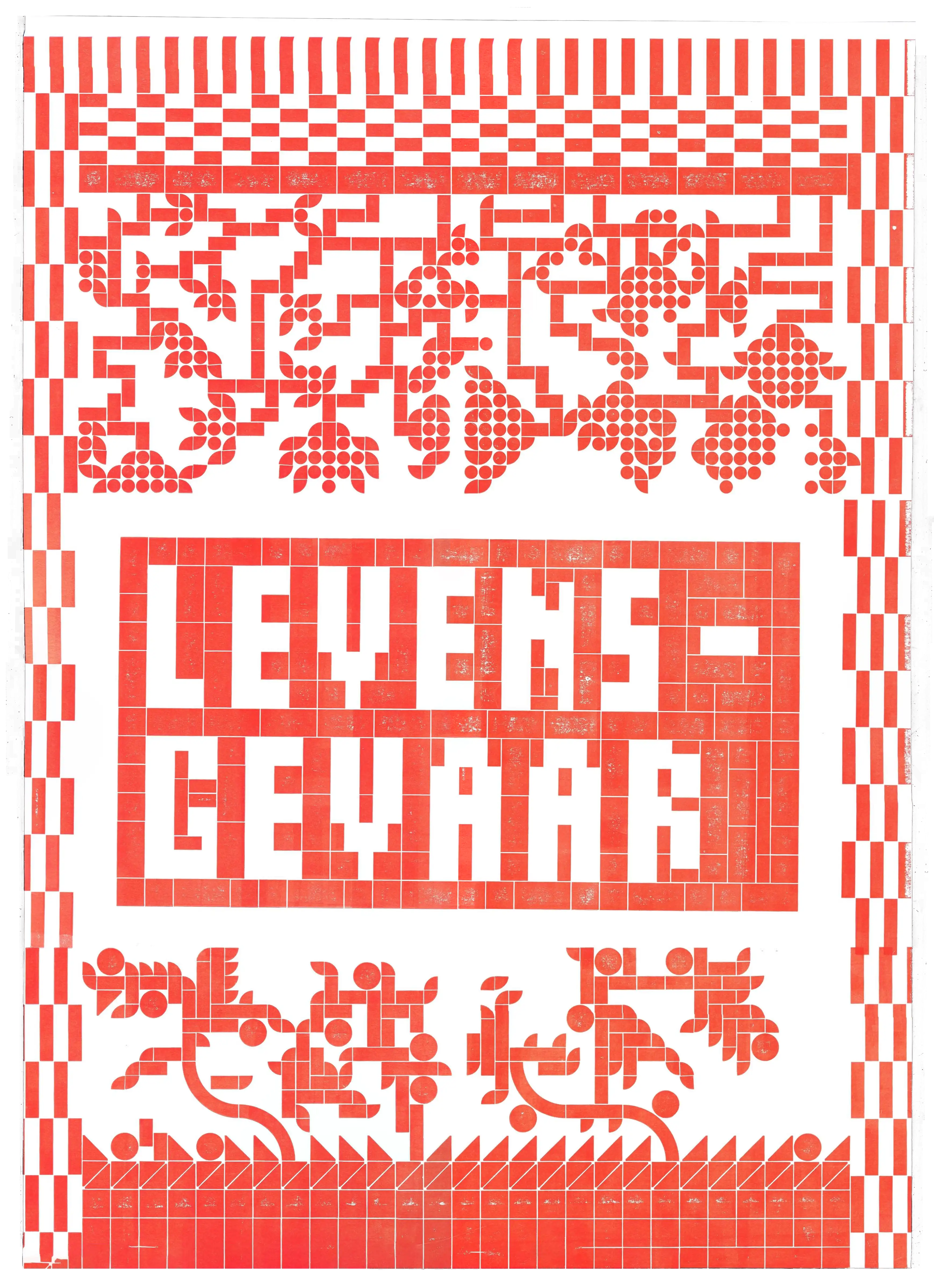
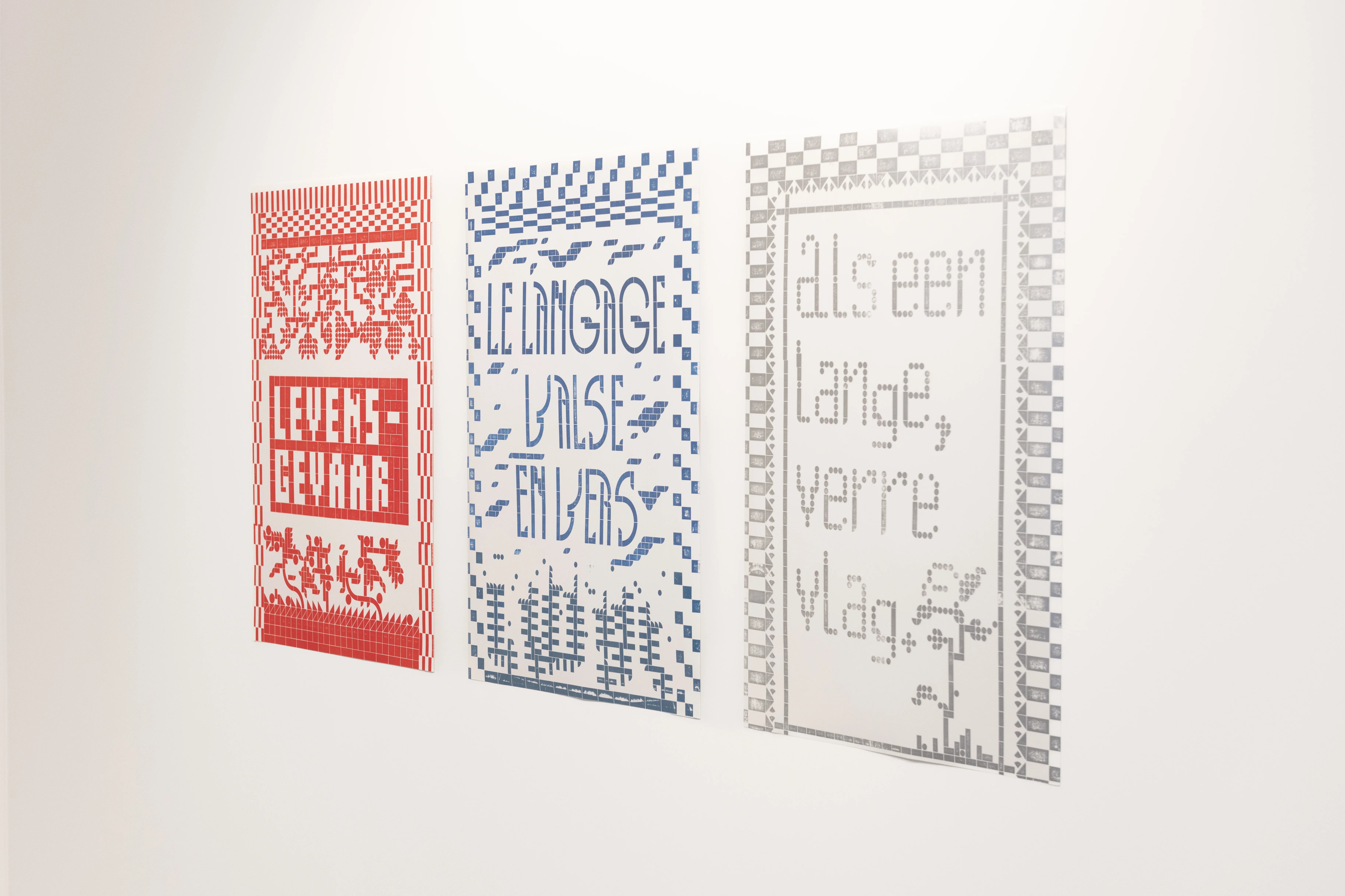
LA LANGUE VALSE EN VERS
EEN LANGE VERRE VLAG
Posters, NL
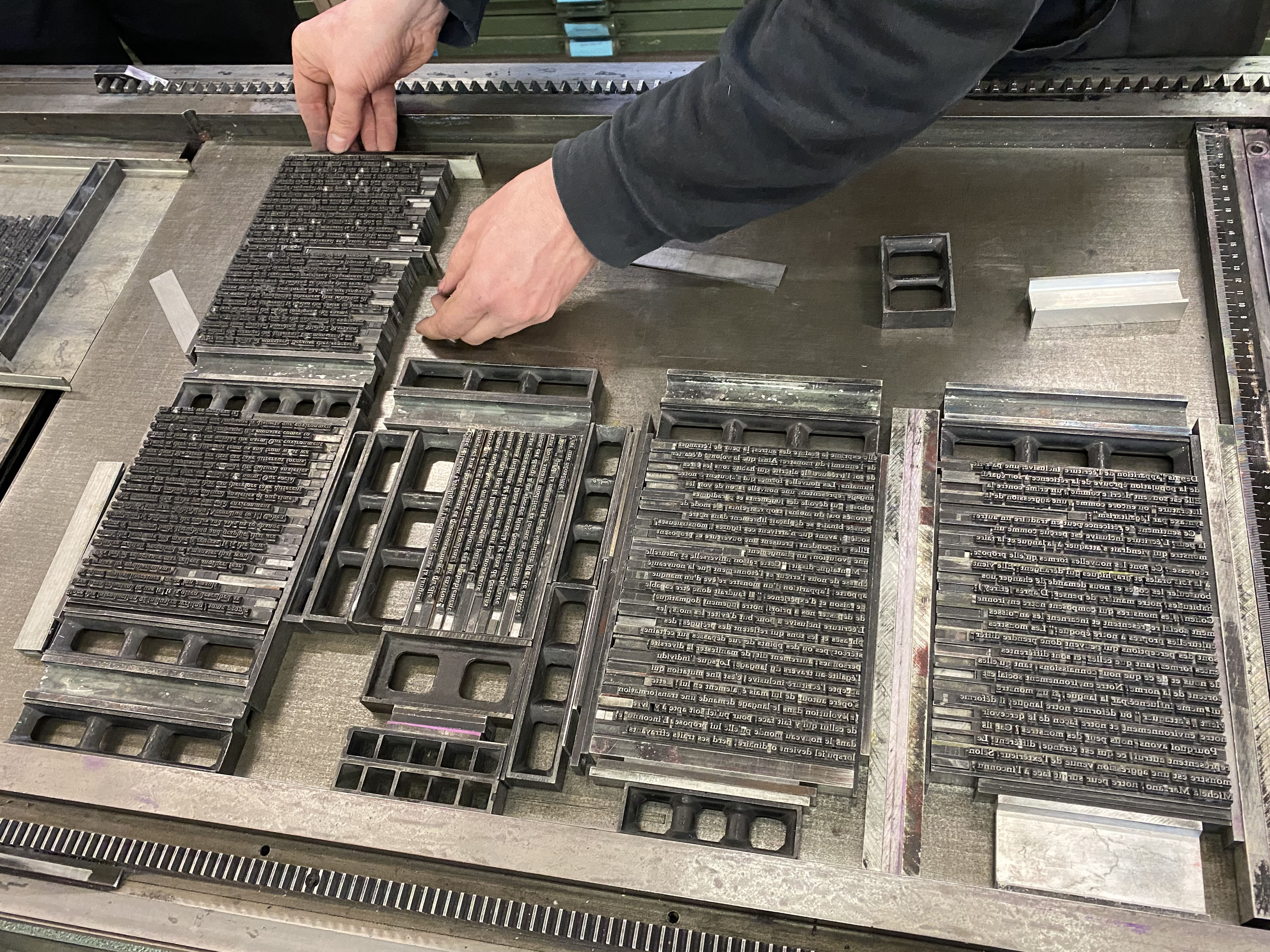
50 x 70 cm, letterpress printing + 'LEGO' bricks
anagrams, modularity
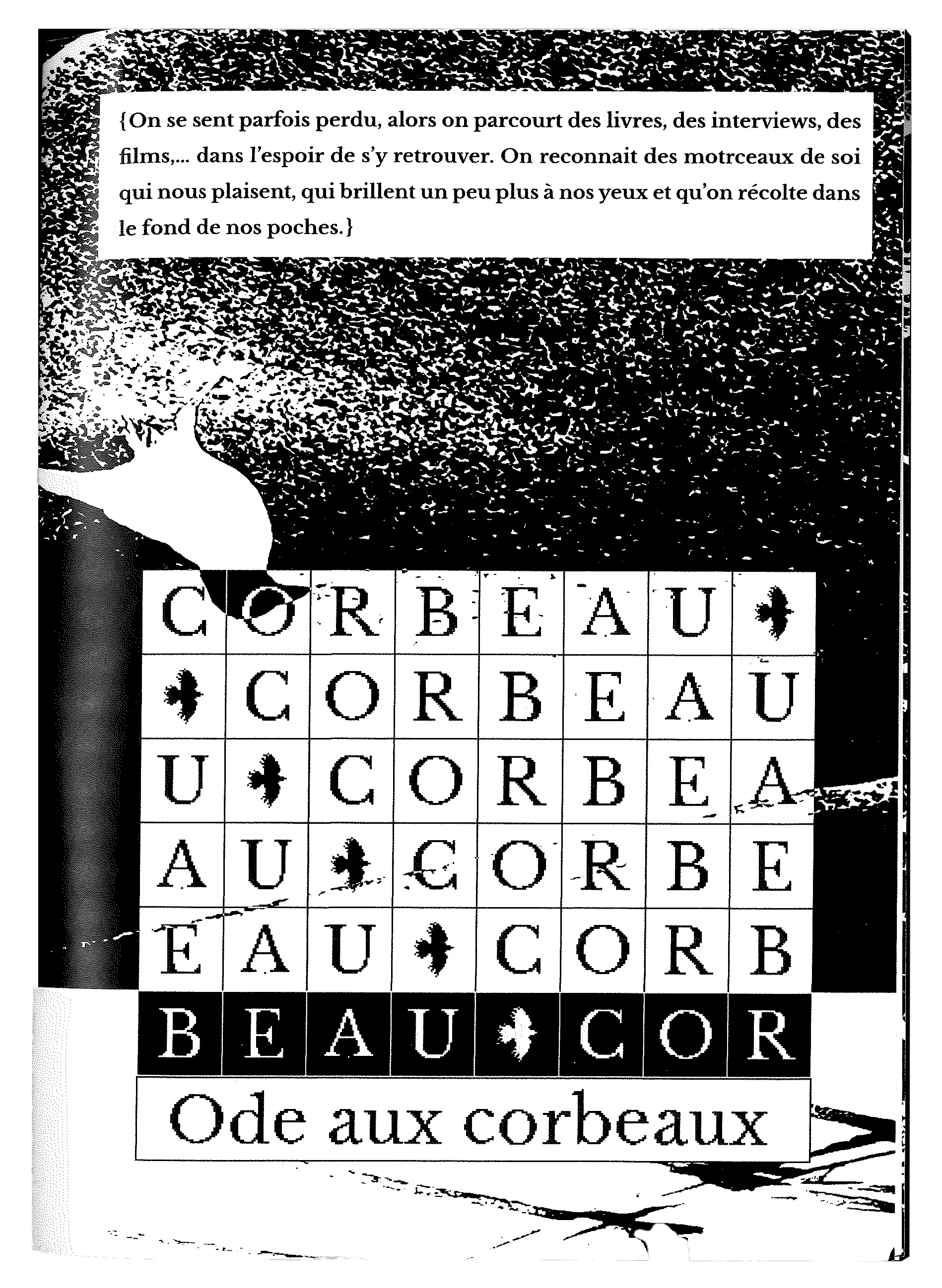
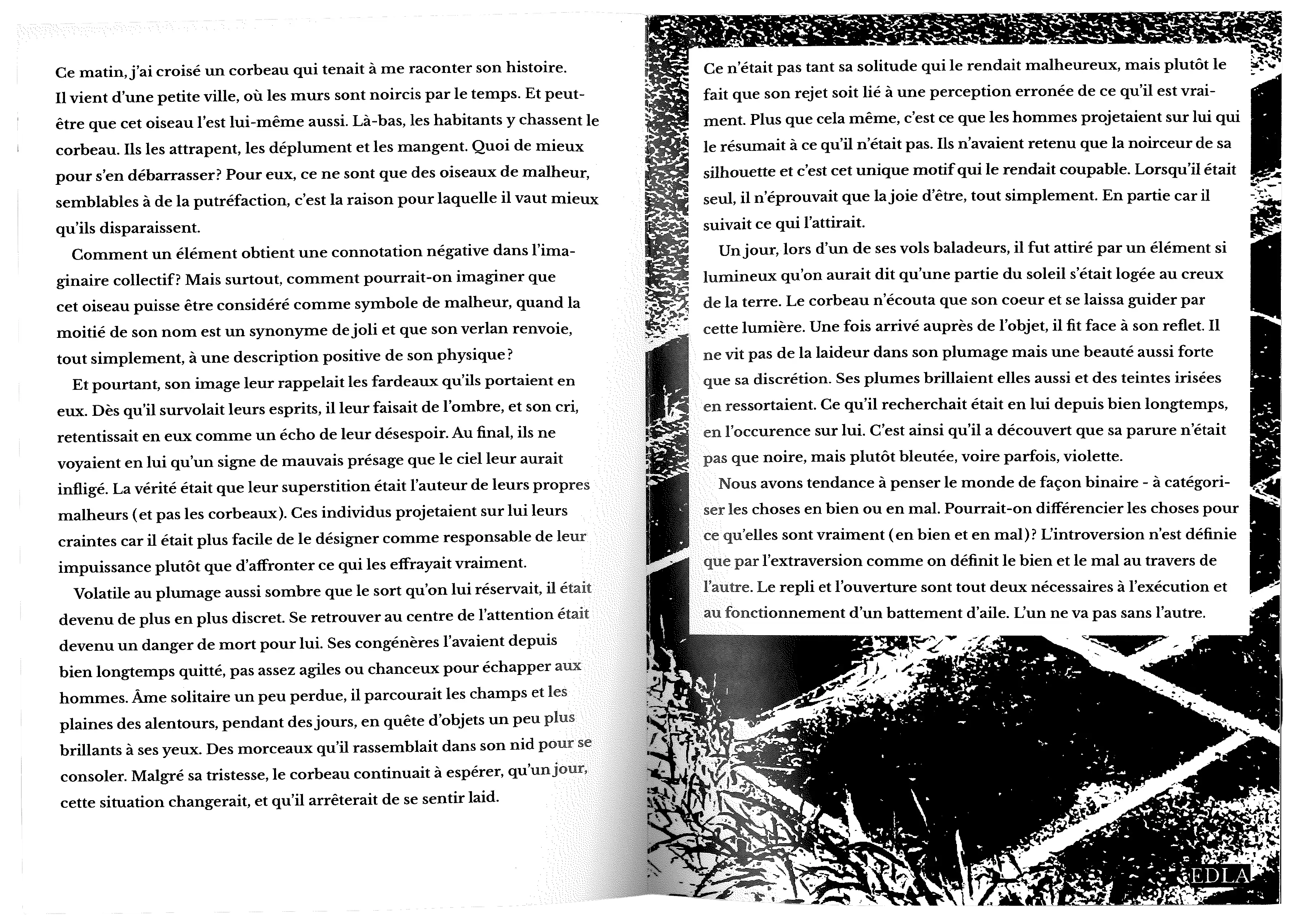
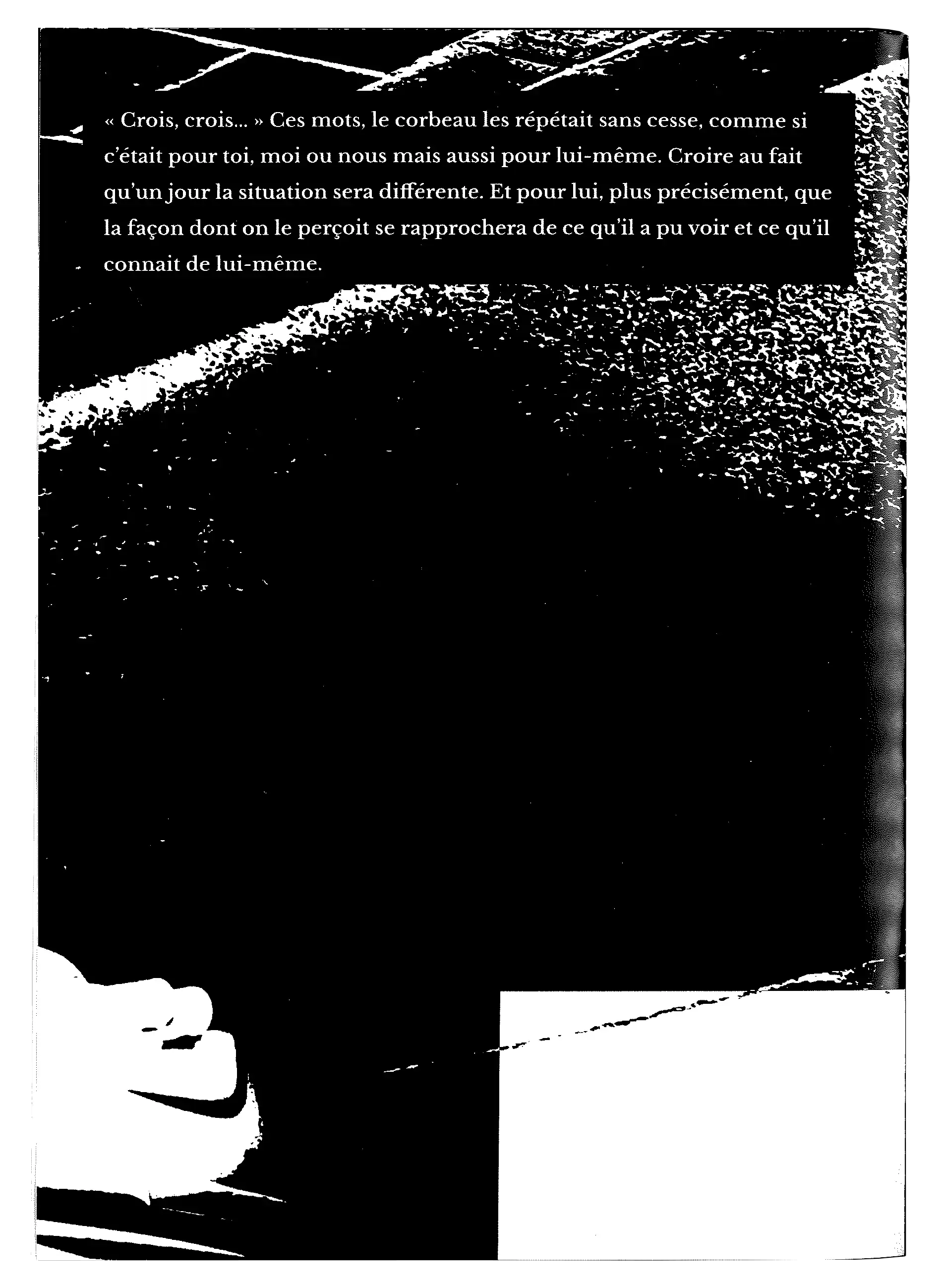
"Ce n'était pas tant sa solitude qui le rendait malheureux, mais plutôt
le fait que son rejet soit lié à une perception erronée de ce qu’il est
vraiment. Plus que cela même, c'est ce que les hommes projetaient sur
lui qui le résumait à ce qu'il n'était pas. Ils n'avaient retenu que la
noirceur de sa silhouette et c'est cet unique motif qui le rendait coupable.
Lorsqu'il était seul, il n'éprouvait que la joie d'être, tout simplement.
Il suivait ce qui l'attirait." — Abstract from 'Ode aux corbeaux'
Booklet / Poster, FR
A3 folded, fonts: 'Spanning'
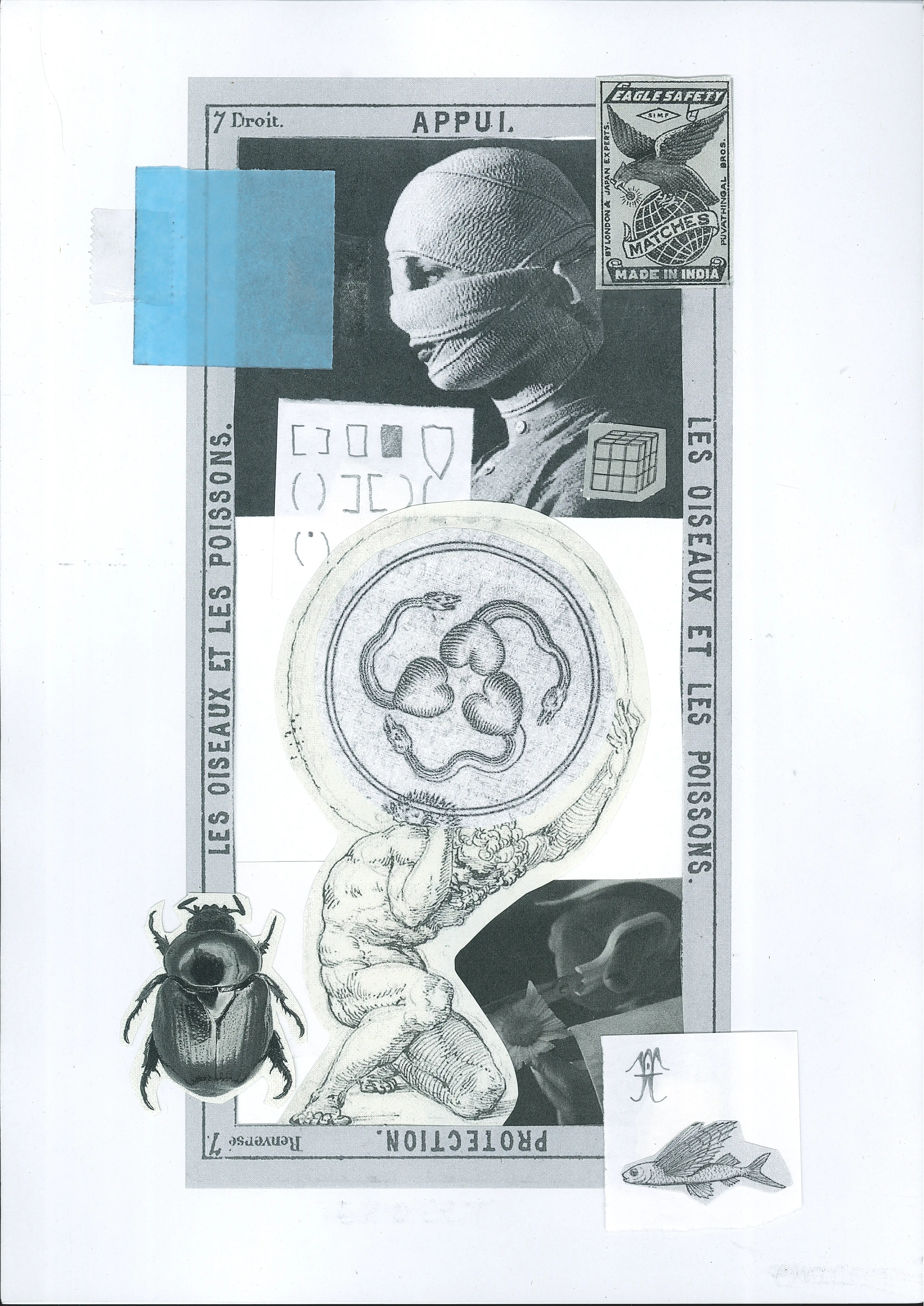
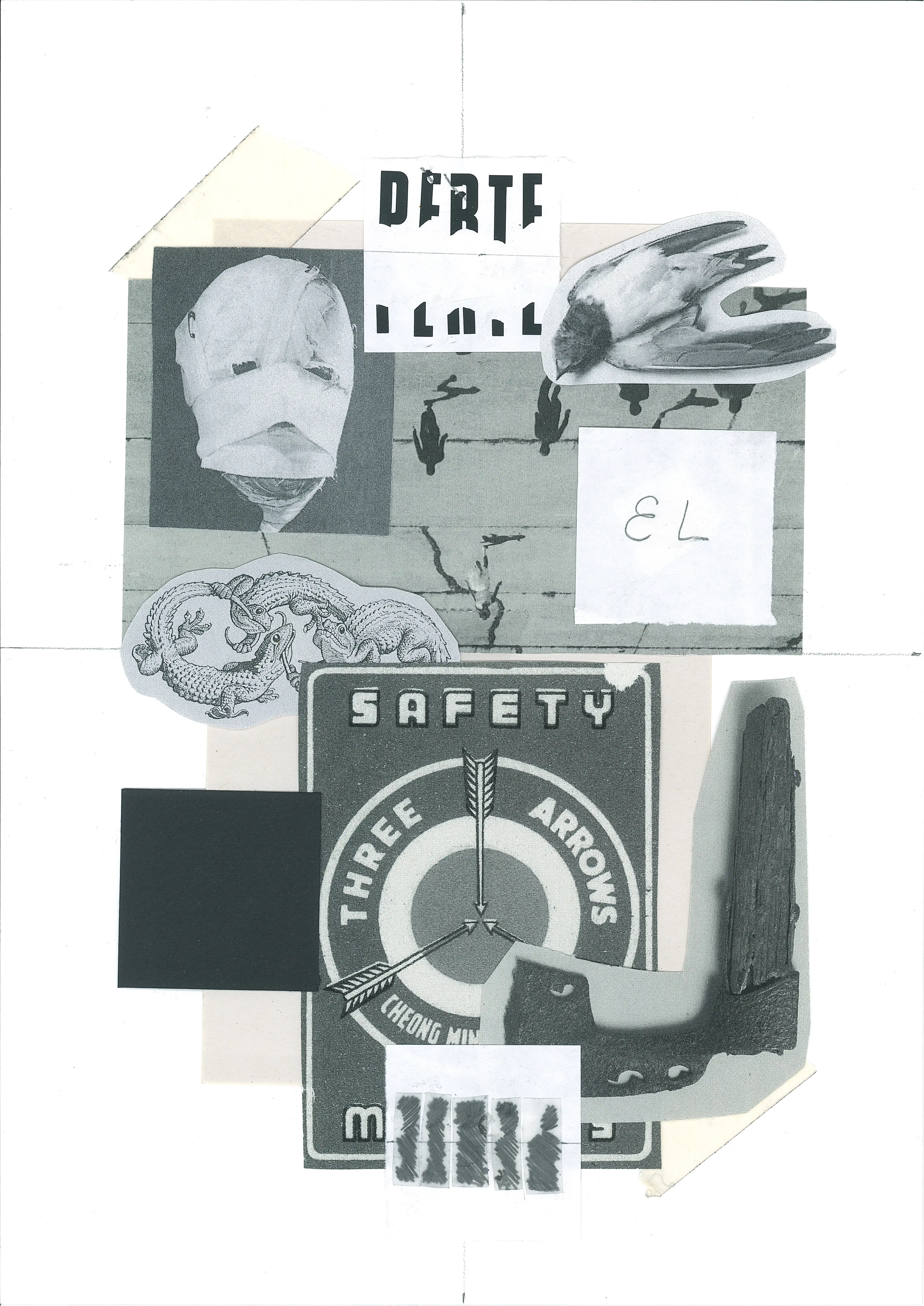
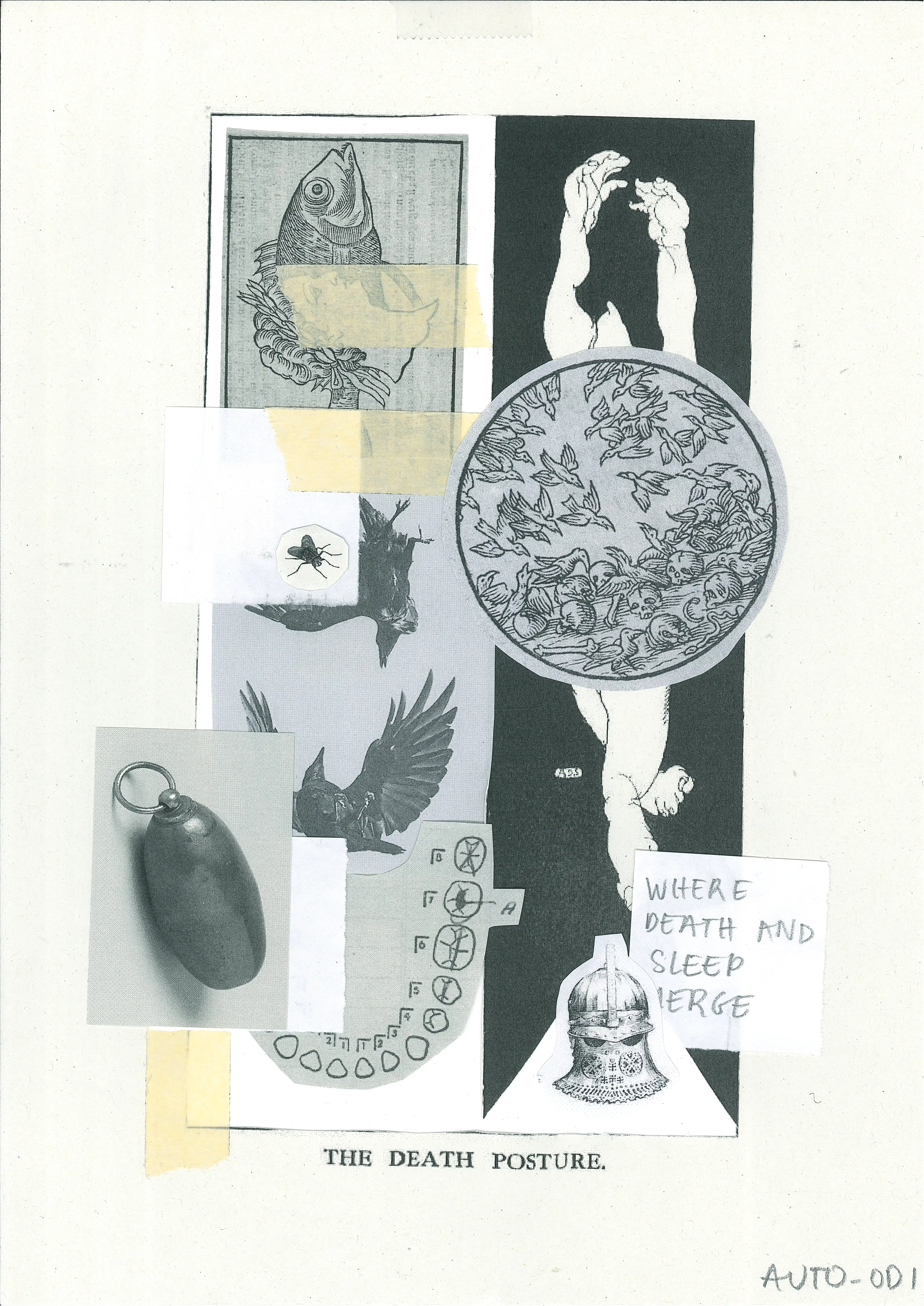
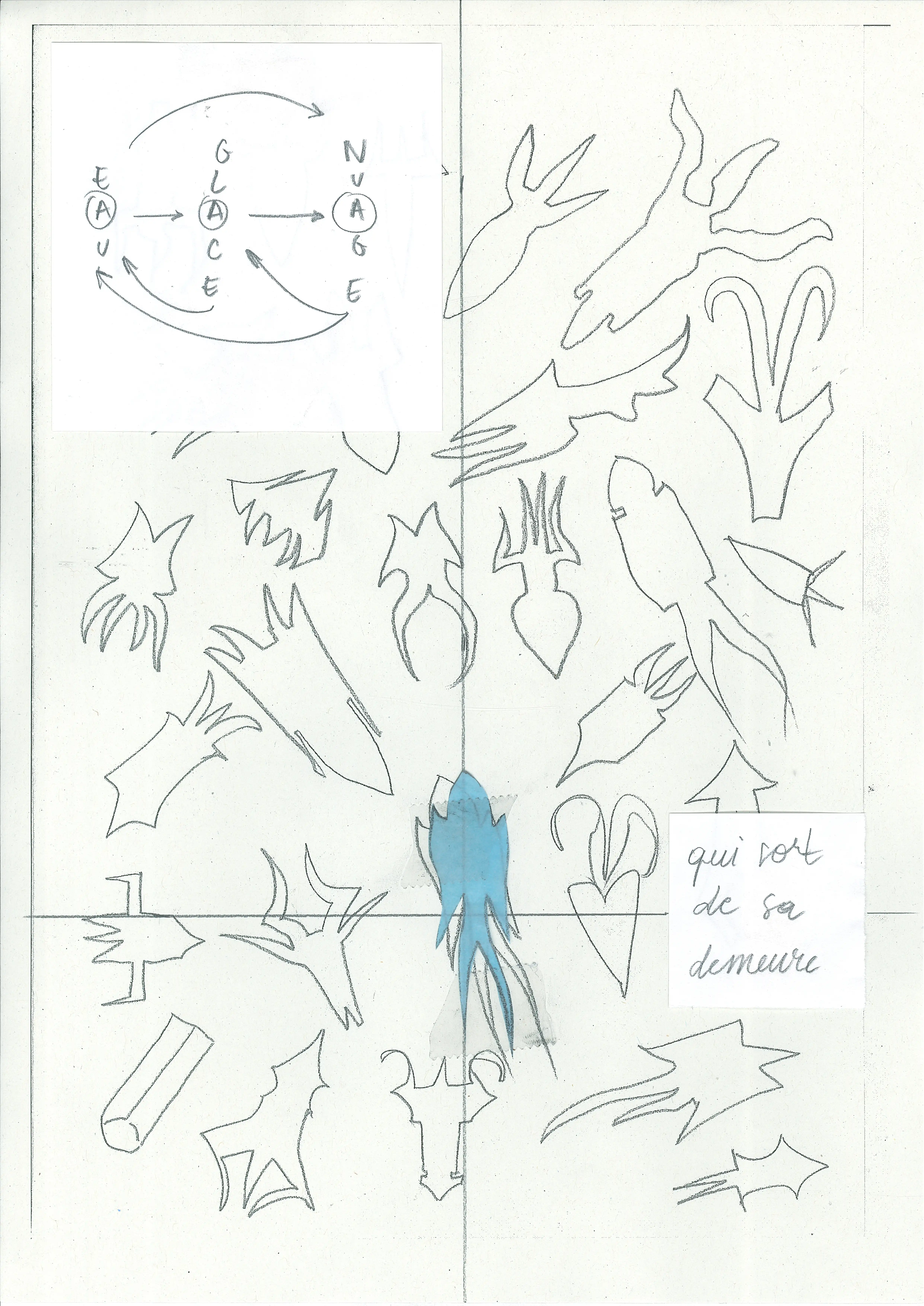
hope, introversion, iconophagy
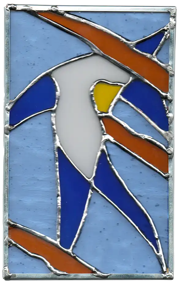
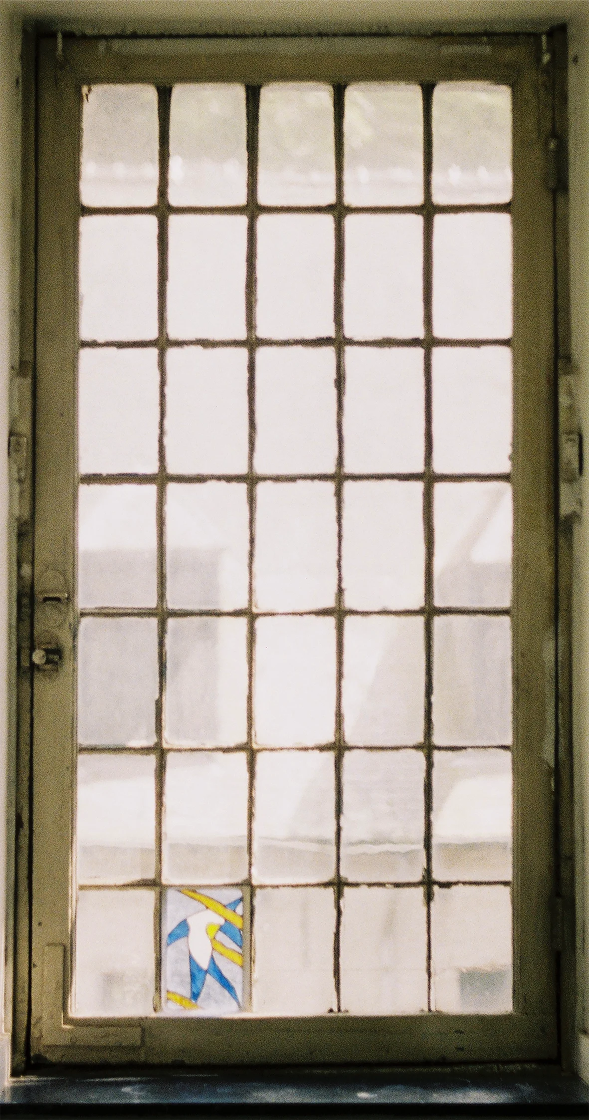
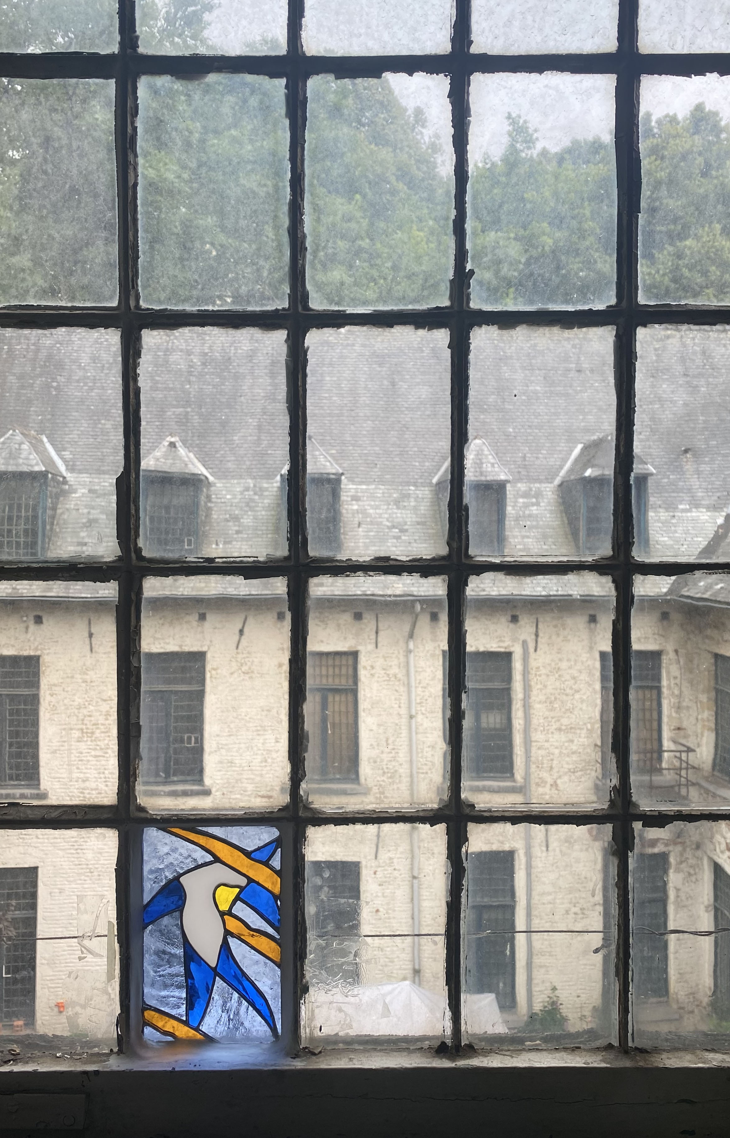
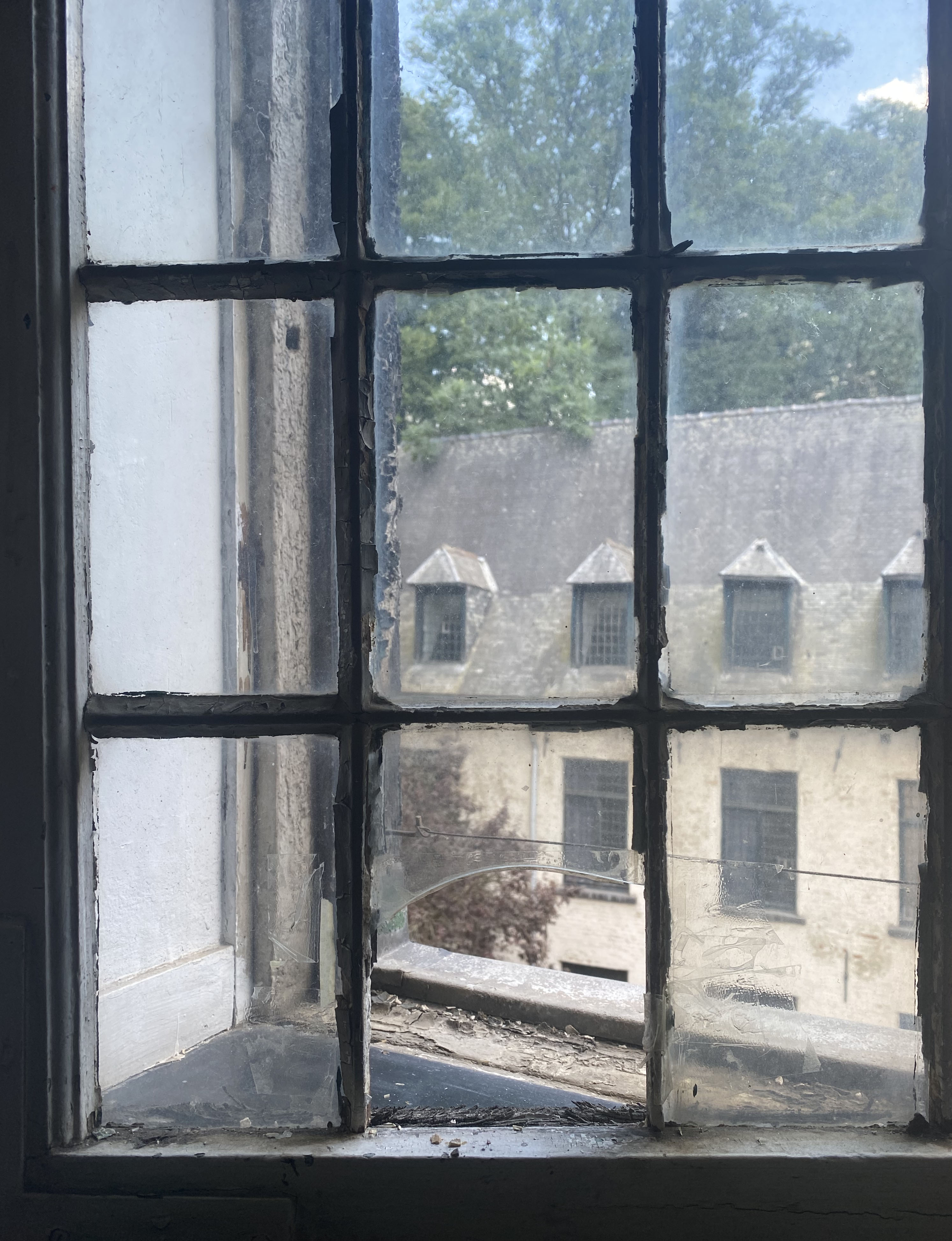
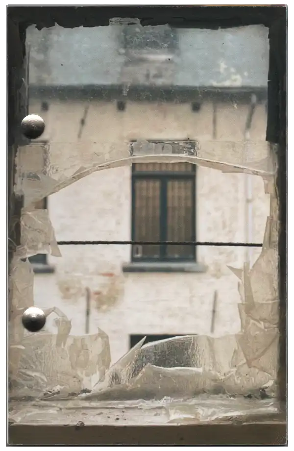
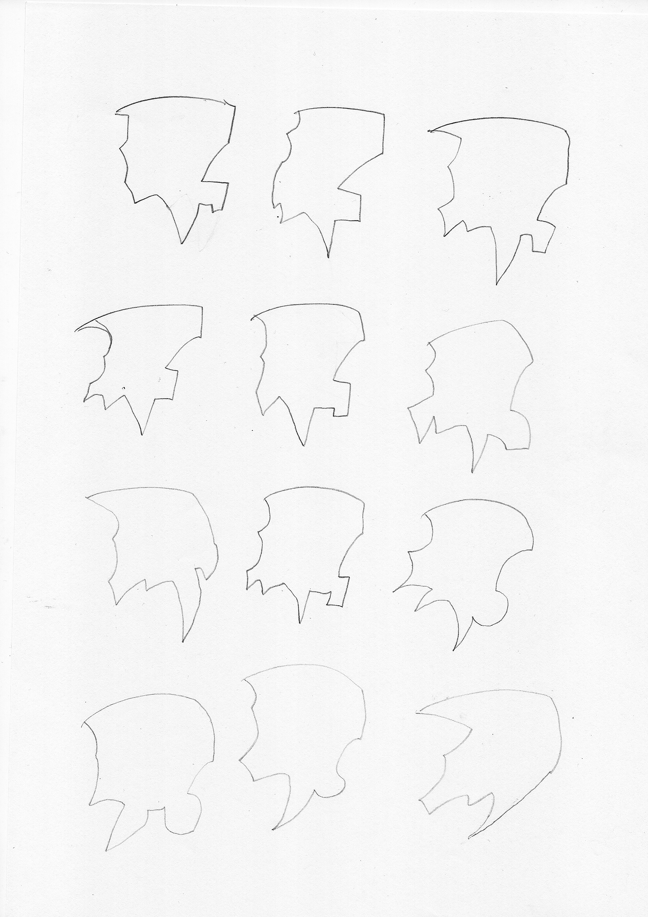
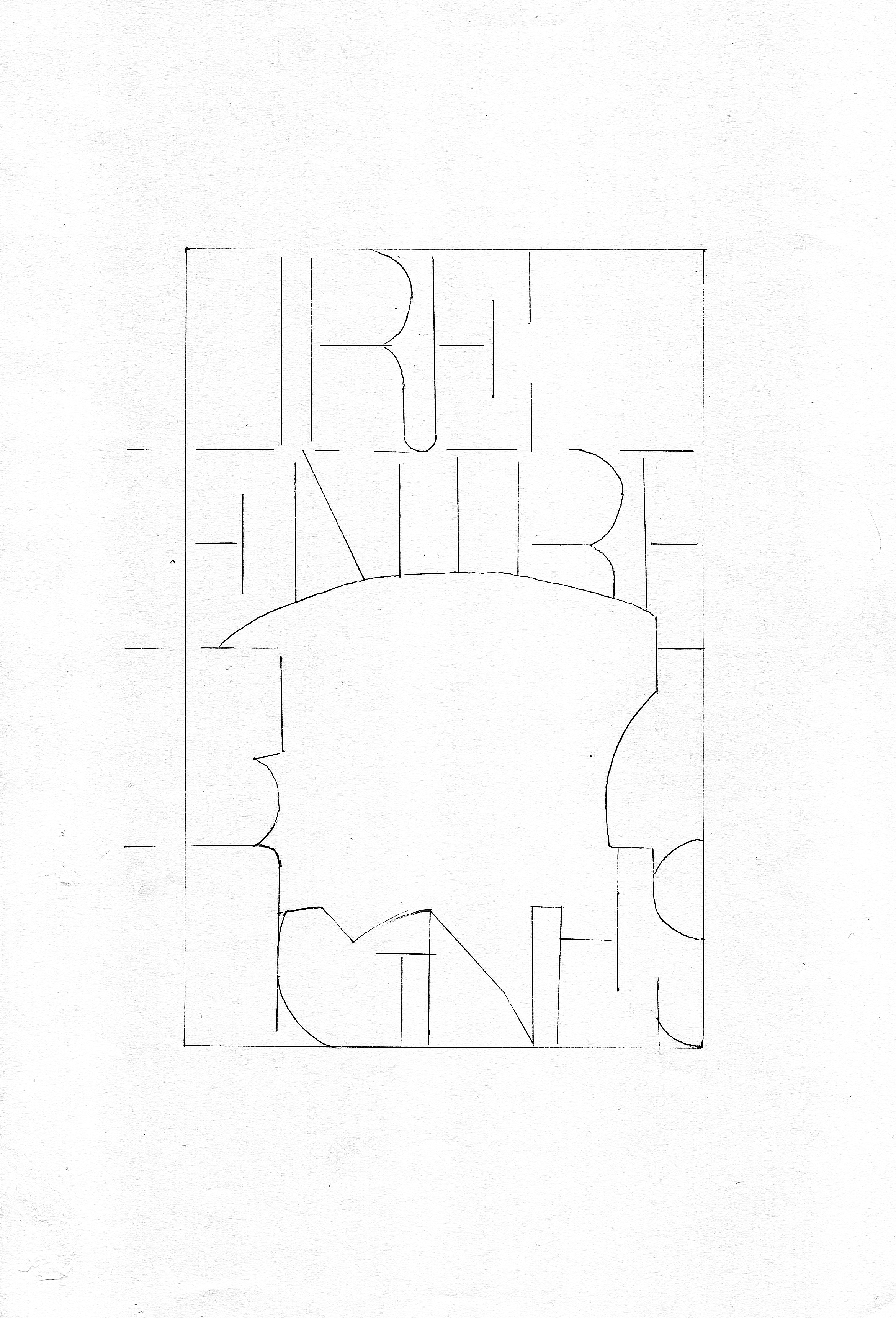
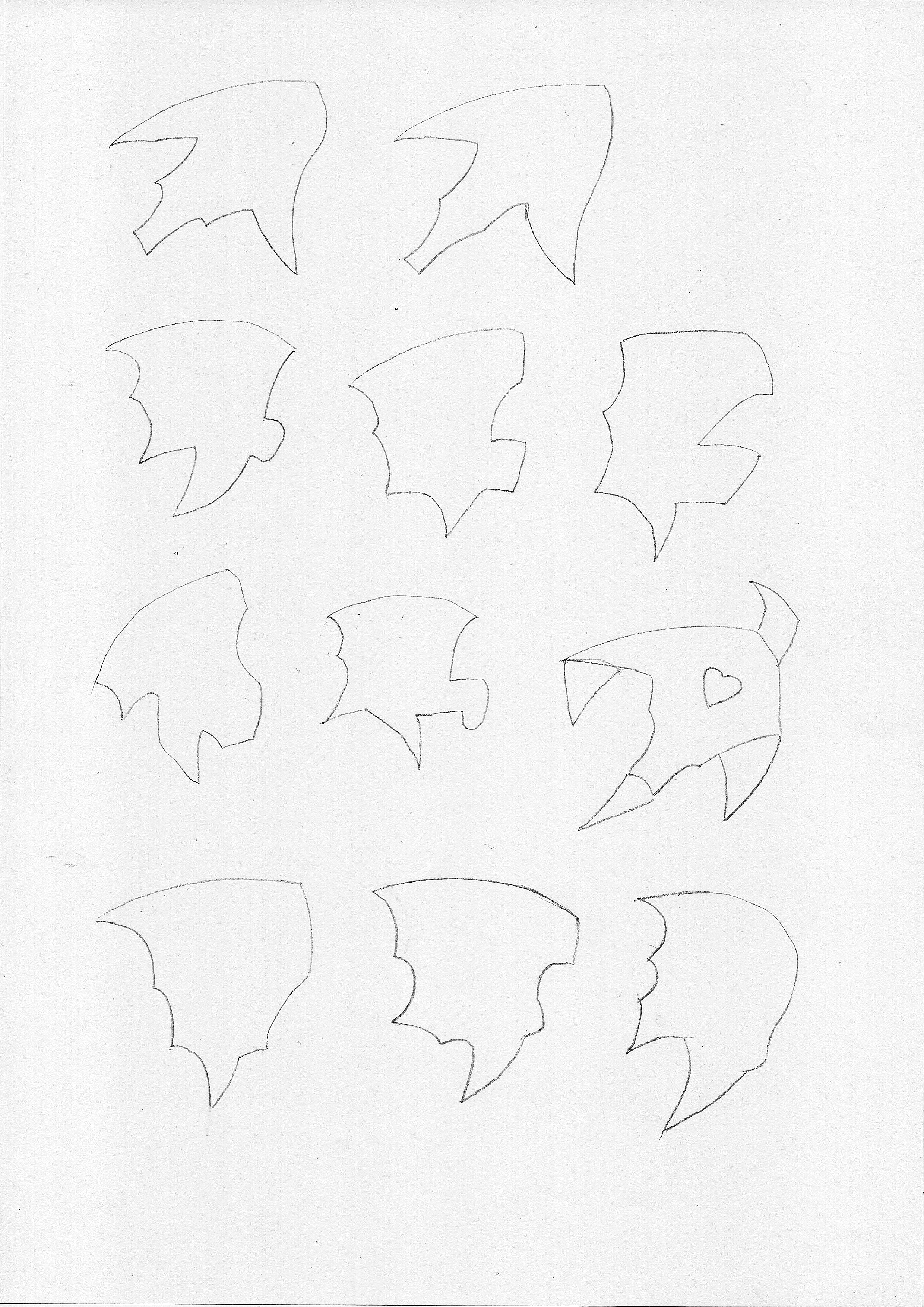
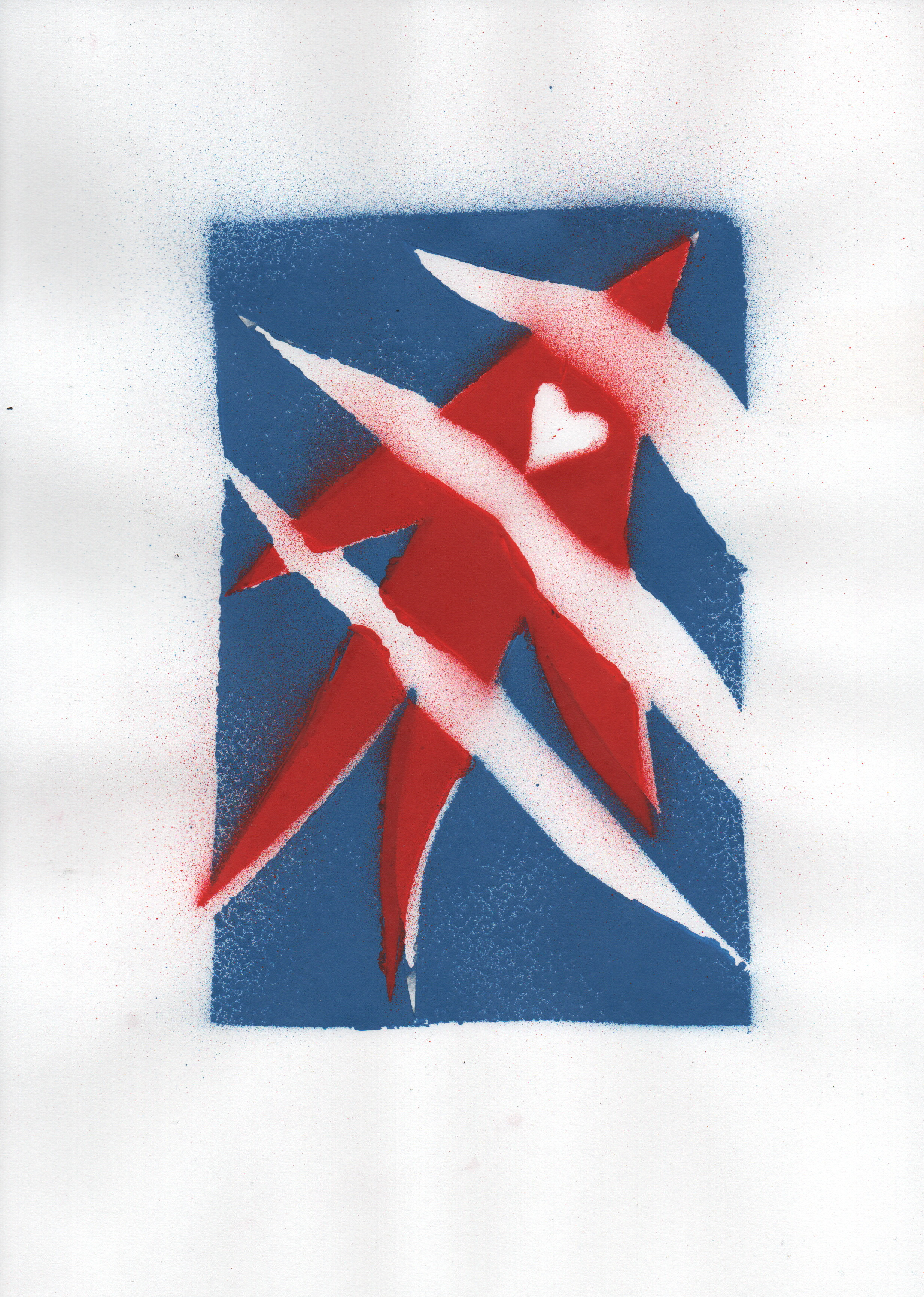

Vitrail, 12 x 18 cm
Made by Oscar Flores, in his atelier—33 Rue de Dublin, Ixelles
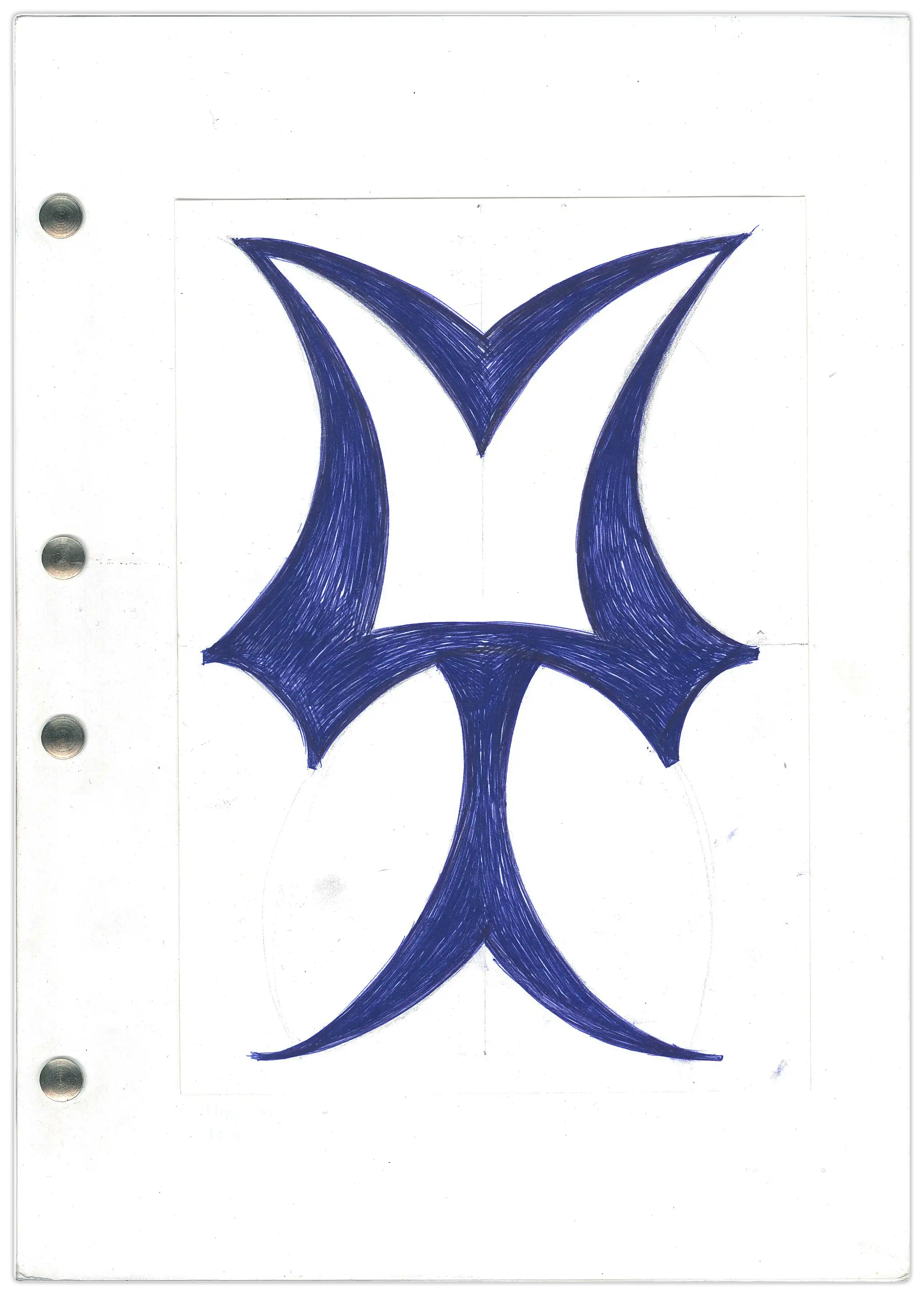
W.HERE
T.HE
SW.ALLOWS
C.ALL
EX.CHANGE
.
O.PEN
H.AND
H.ARM
Y.OURSELF
.
COL.OR
A.PART
BEHO.OF
Y.OURSELF
.
H.OUR
D.OWN
SQU.ARE
WITH.OUT
HEART
Bilingual edition, ENG / FR (+ some dutch)
The book works as a palyndrom. There is one original and an edition of 30 facsimiles.
A4, 193 p., swiss binding
fonts: 'Libre Baskerville', 'MEAN 26'
language evolution, writing, punctum delens
"Suis-je la fleur de lune
Ou bien l'eau qui dort?
Suis-je l'herbe sauvage
Ou le ciel de pluie?"
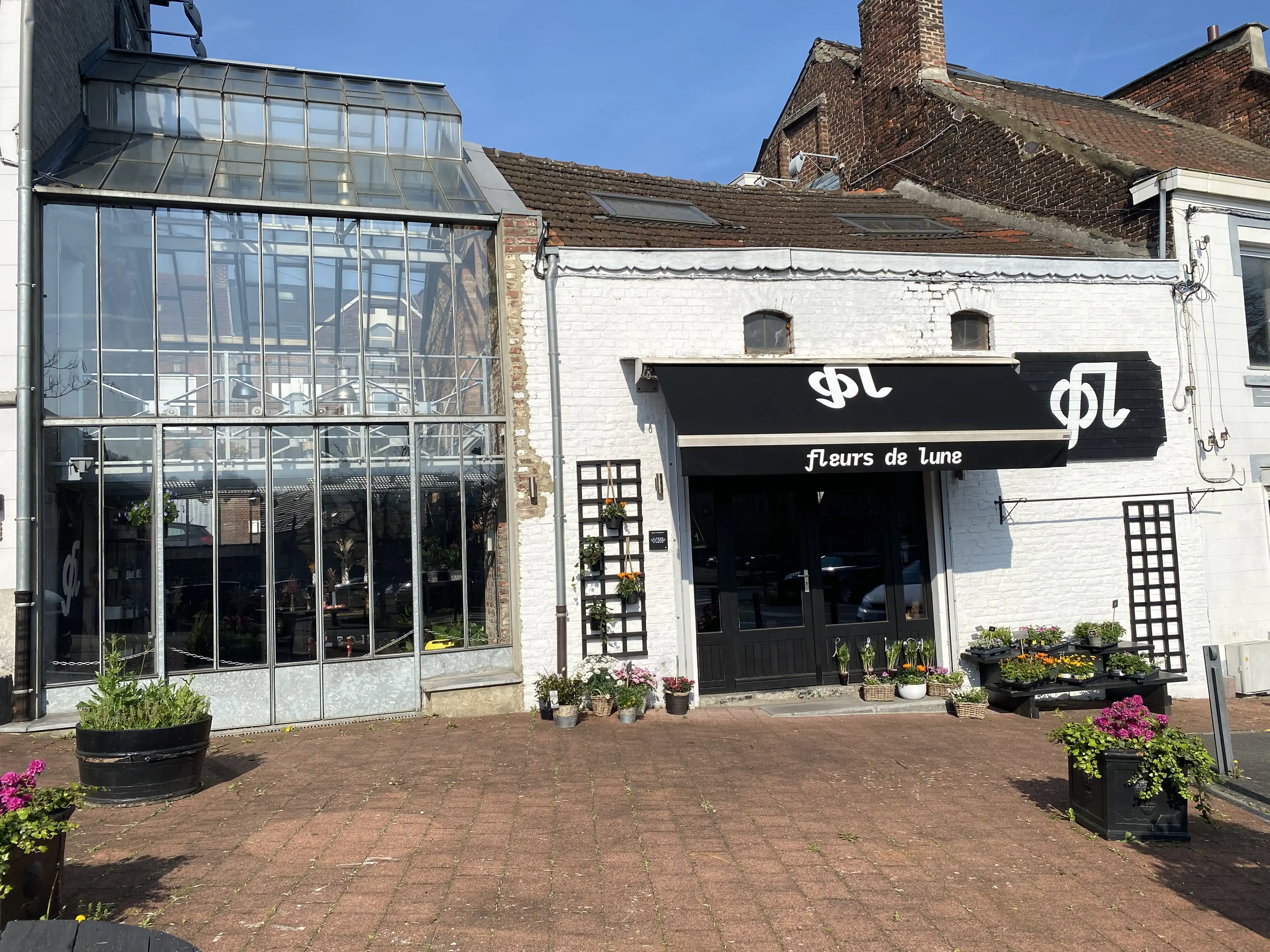
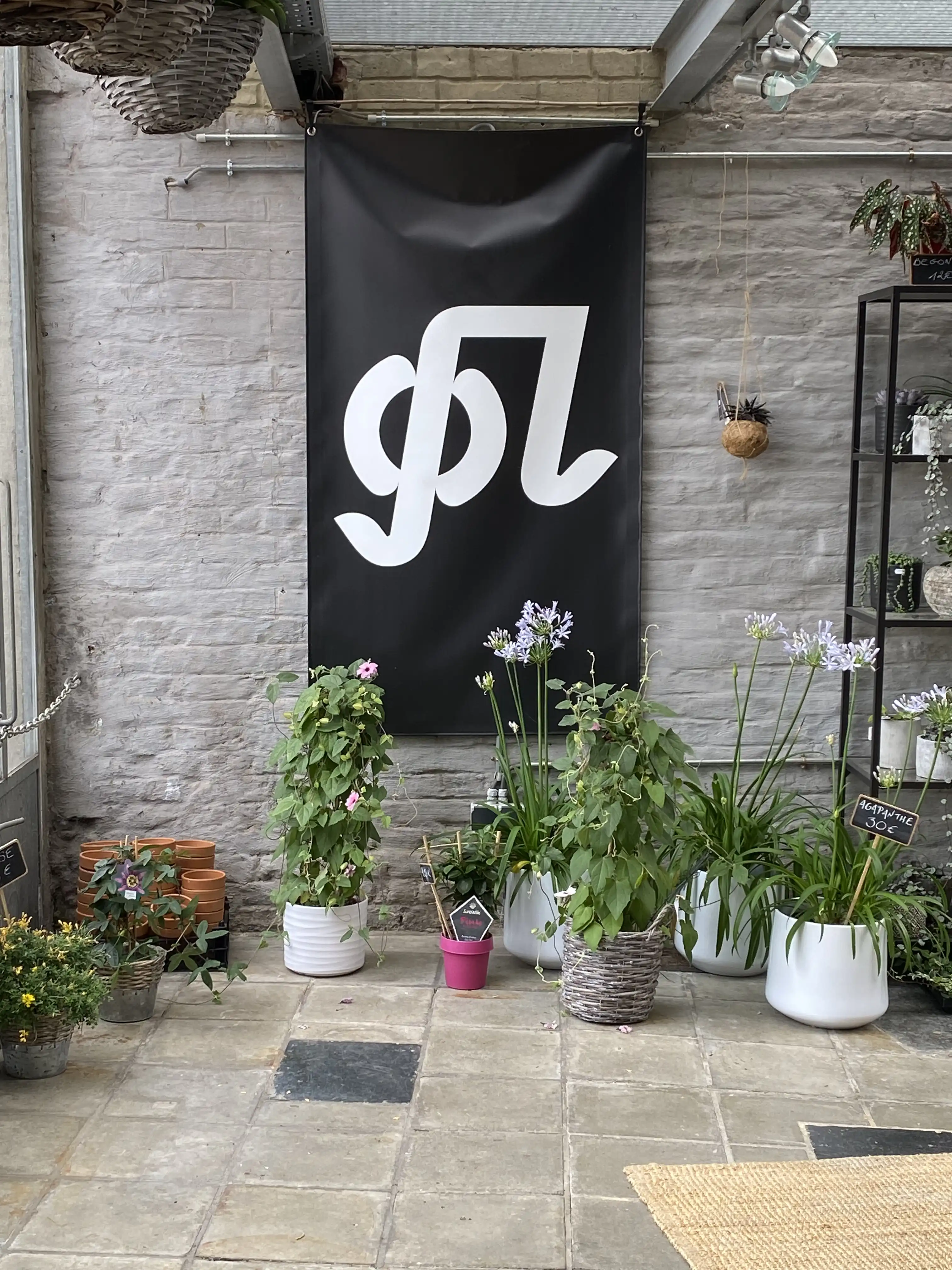
Logo designed for two florists opening their shop together in Couillet (377 Route de Philippeville, 6010 Charleroi)
in 2022. I help them finding a name, after several propositions they went for 'Fleurs de Lune', which I came up with
after listening to Françoise Hardy's eponymous song.
Logo based on the ligature 'Fl'
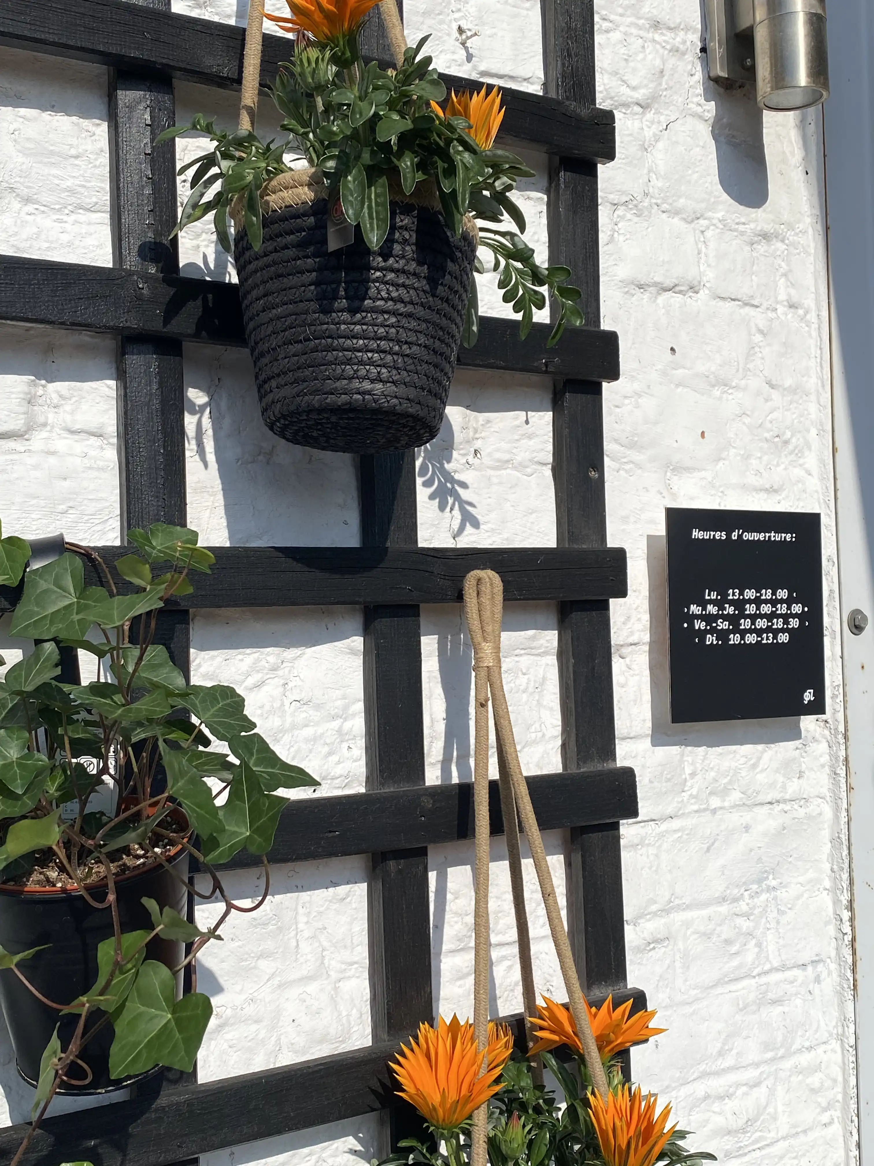
Typeface: 'IBM Plex'
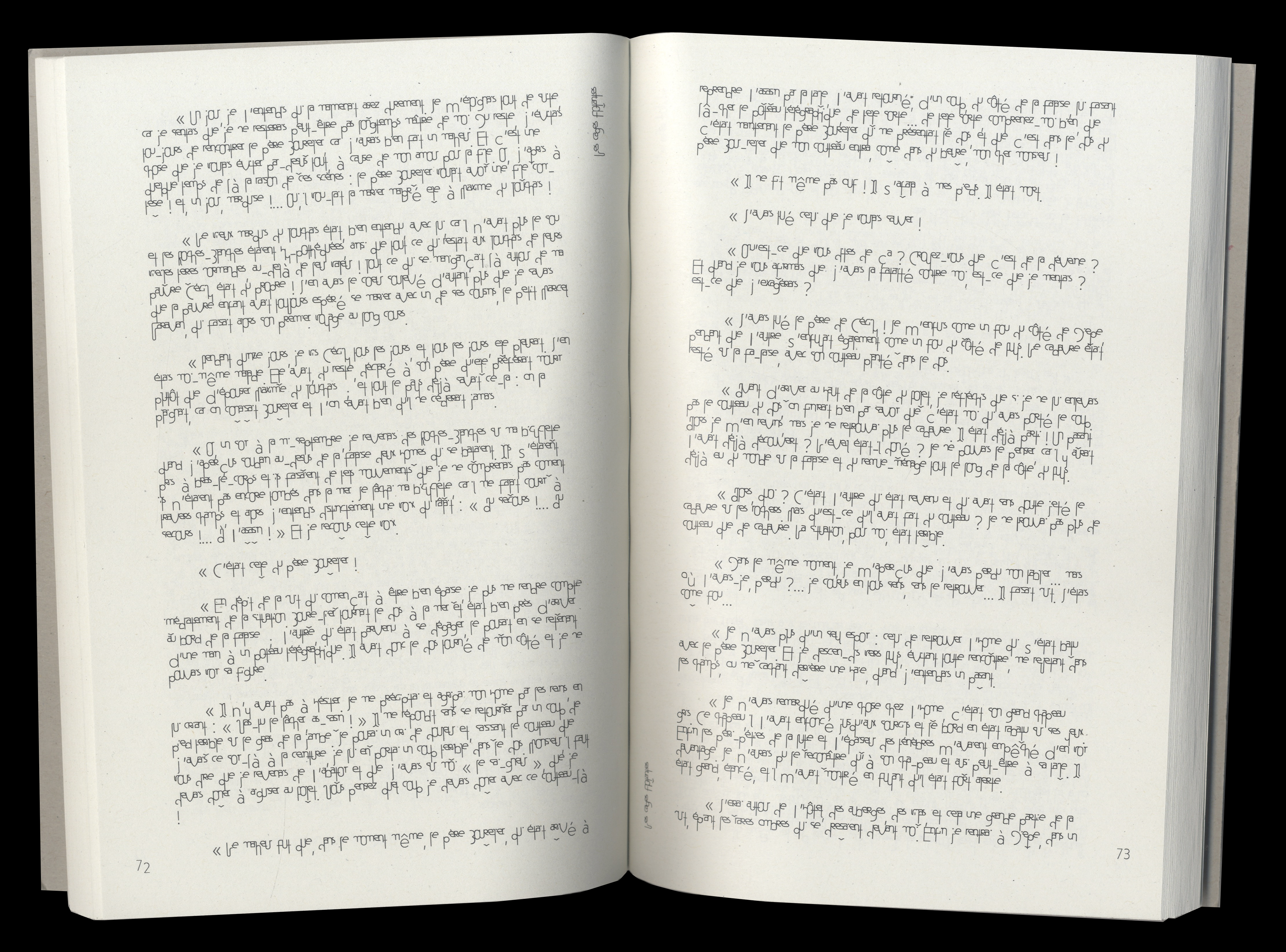
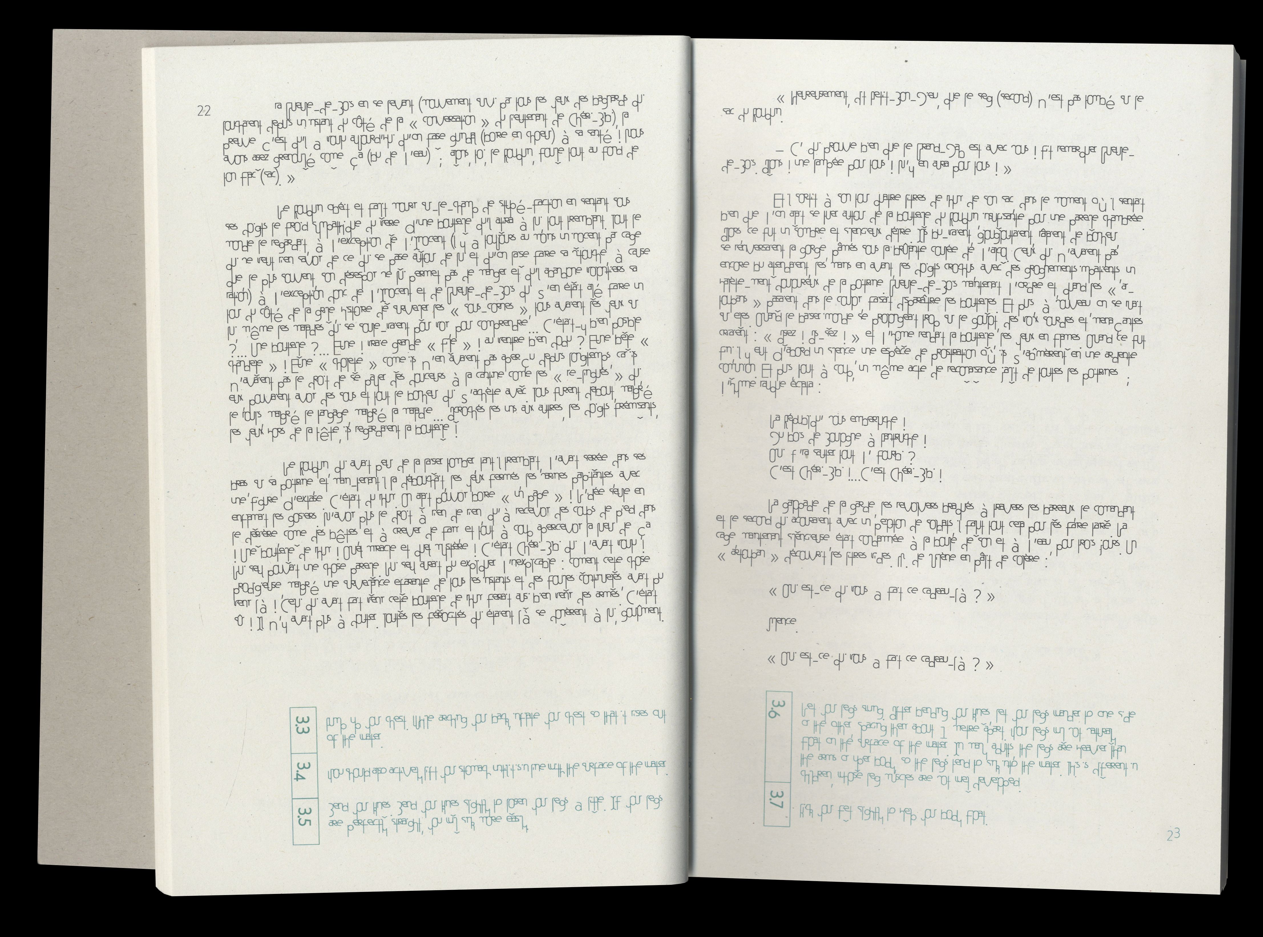

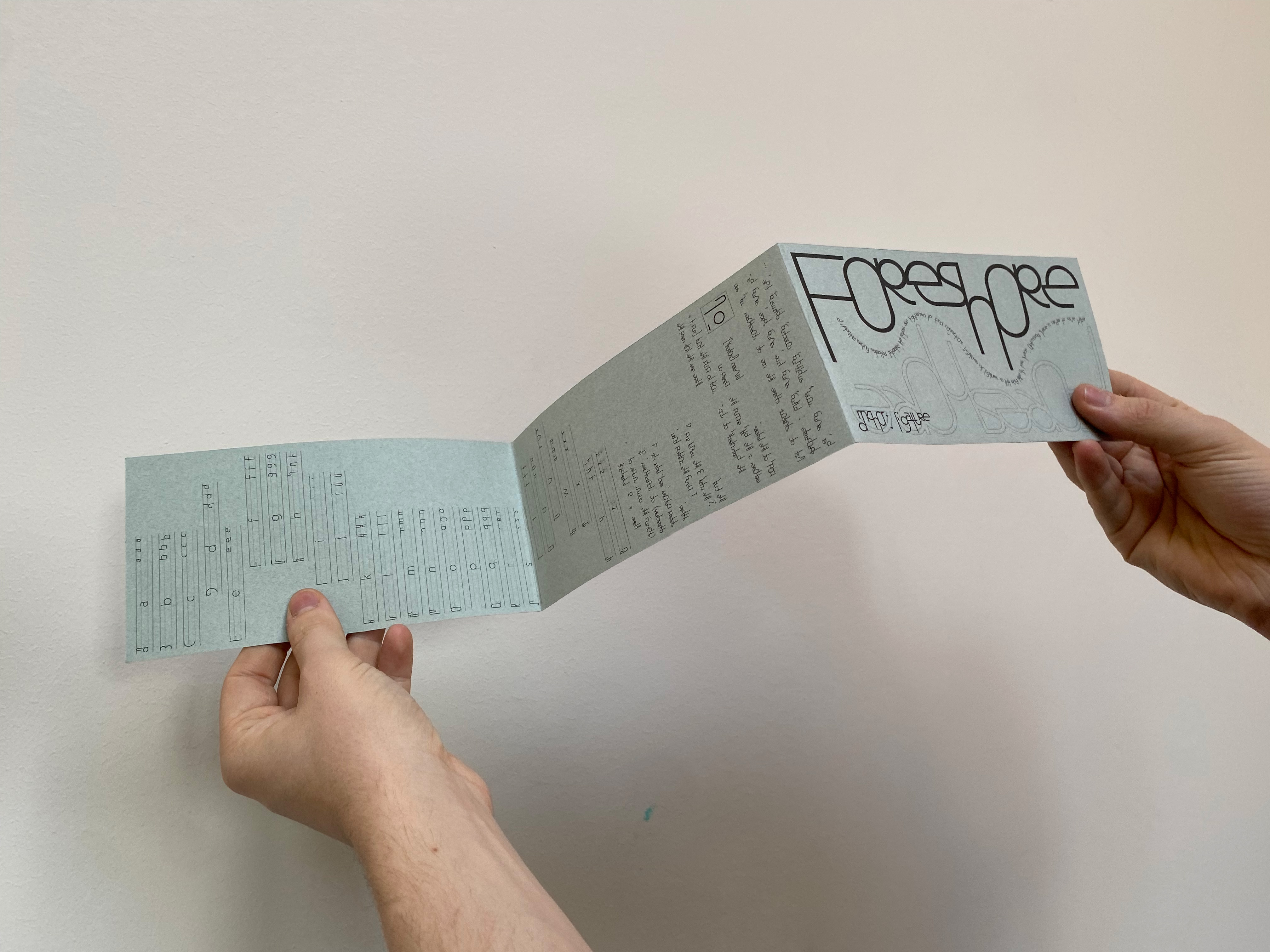
Foreshore is a typeface based on the concept of ligatures. Its first objective, and also one of the ligature's objectives, is to reduce the space used in order to reduce paper consumption. To achieve that idea, various stratagems have been applied to Foreshore, for example the Latin alphabet is deformed / adapted to follow the way Arabic scripts are fonctionning. All the letters of Foreshore have 4 different shapes, it changes depending on their place in a word (an isolated, an initial, a medial and a final form). A text written with Foreshore can be reduce until 62,2%. 'Les cages flottantes' is the name of the books serie I made using foreshore, to see how much space is saved.
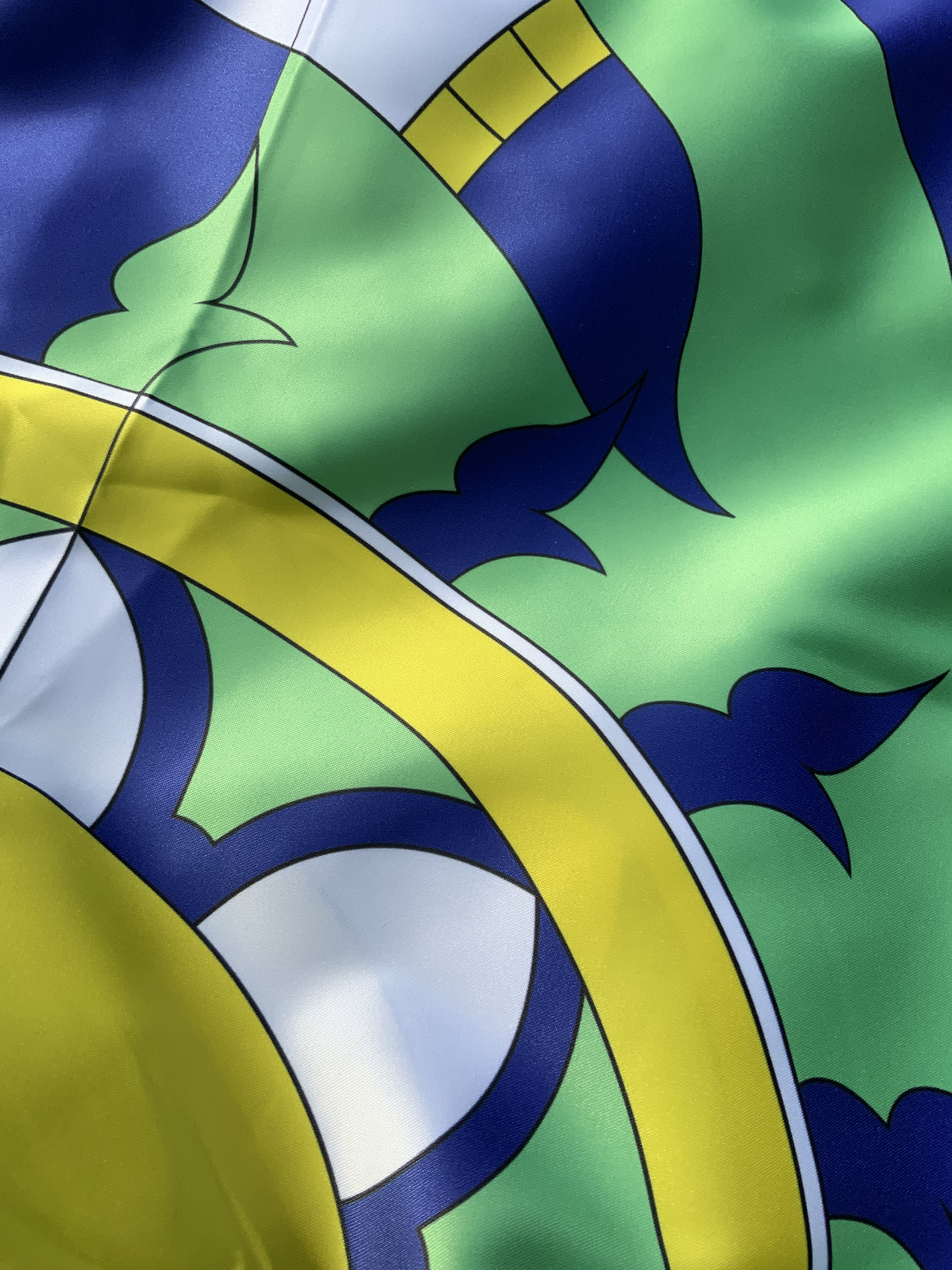
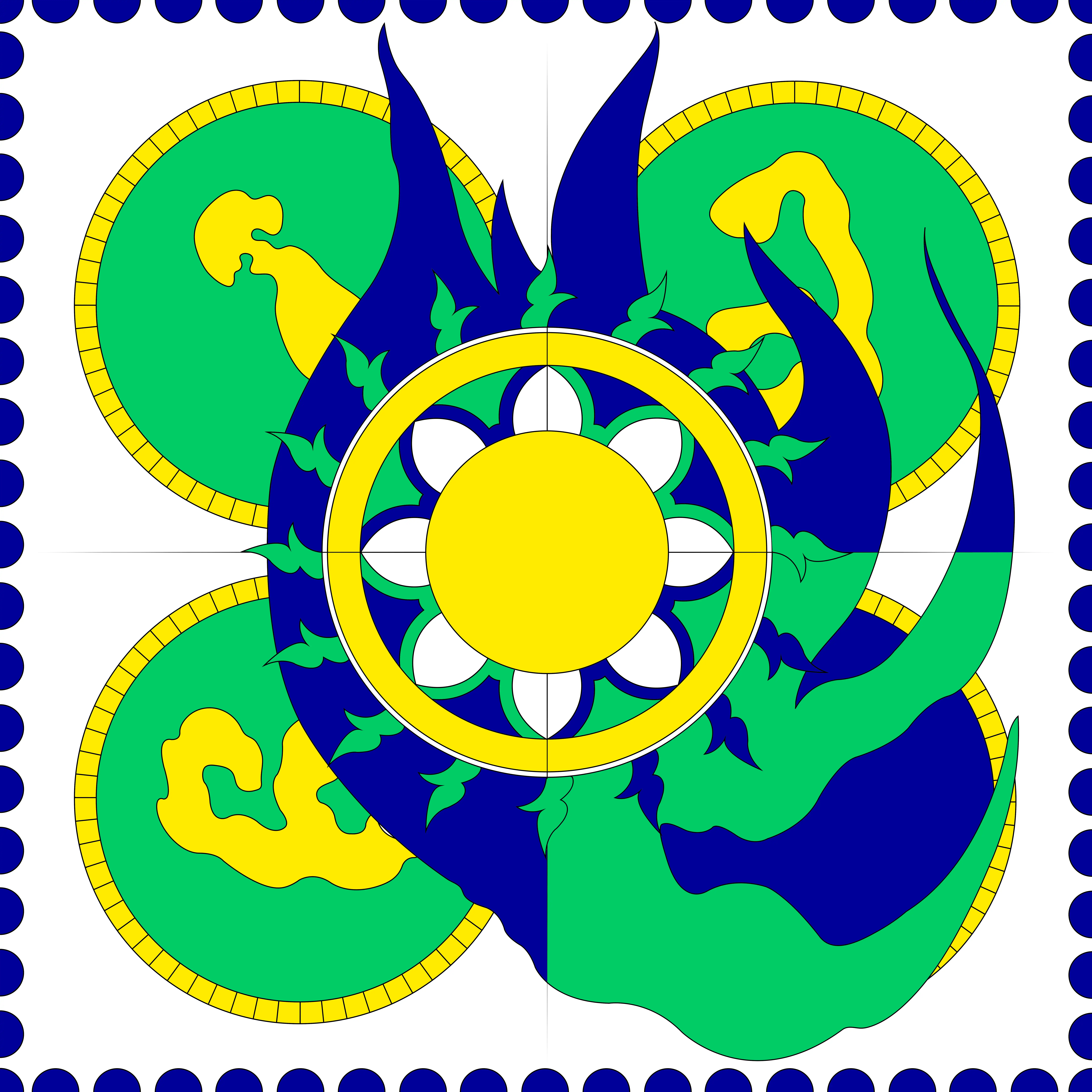
Once, someone stole my friend's scarf. I'd been wanting
to give her something special for a while, so I decided to make her a personalized
scarf. I wanted to make her something that could represent her. The words 'change'
and 'strength' were important in this research. Bia is a deity of Greek mythology,
sister of Nike, personifying those ideas. Colors are chosen following the scarf she lost.
Scarf, silk
70 x 70 cm
changement, strength, mythology
'Dualitéit' is a bilingual poster, based on words that are
visually identical in French and Dutch. To read this text, you need to be able to
speak both languages in order to follow the transition from one to the other.
It represents, at the same time, the limits of the language barrier but also what
makes Belgium so rich and particular: its duality. This poster is a visual metaphor
of the cacophony that one can encounter while living in this country. The footnotes
explain in French what each word means in both languages and vice versa. The following
example might perhaps illustrate my process.
Arme:
(FR) Français, définition: Objet (violence, combat)
(FR) Néerlandais, traduit: Adjectif "pauvre" accordé
(NL) Frans: Voorwerp (geweld, gevecht)
(NL) Nederlands: Adjectief "arm"
Poster, NL / FR
A0, fonts: 'Stratos', 'Motor-stencil'
bilingualism, belgium, identity
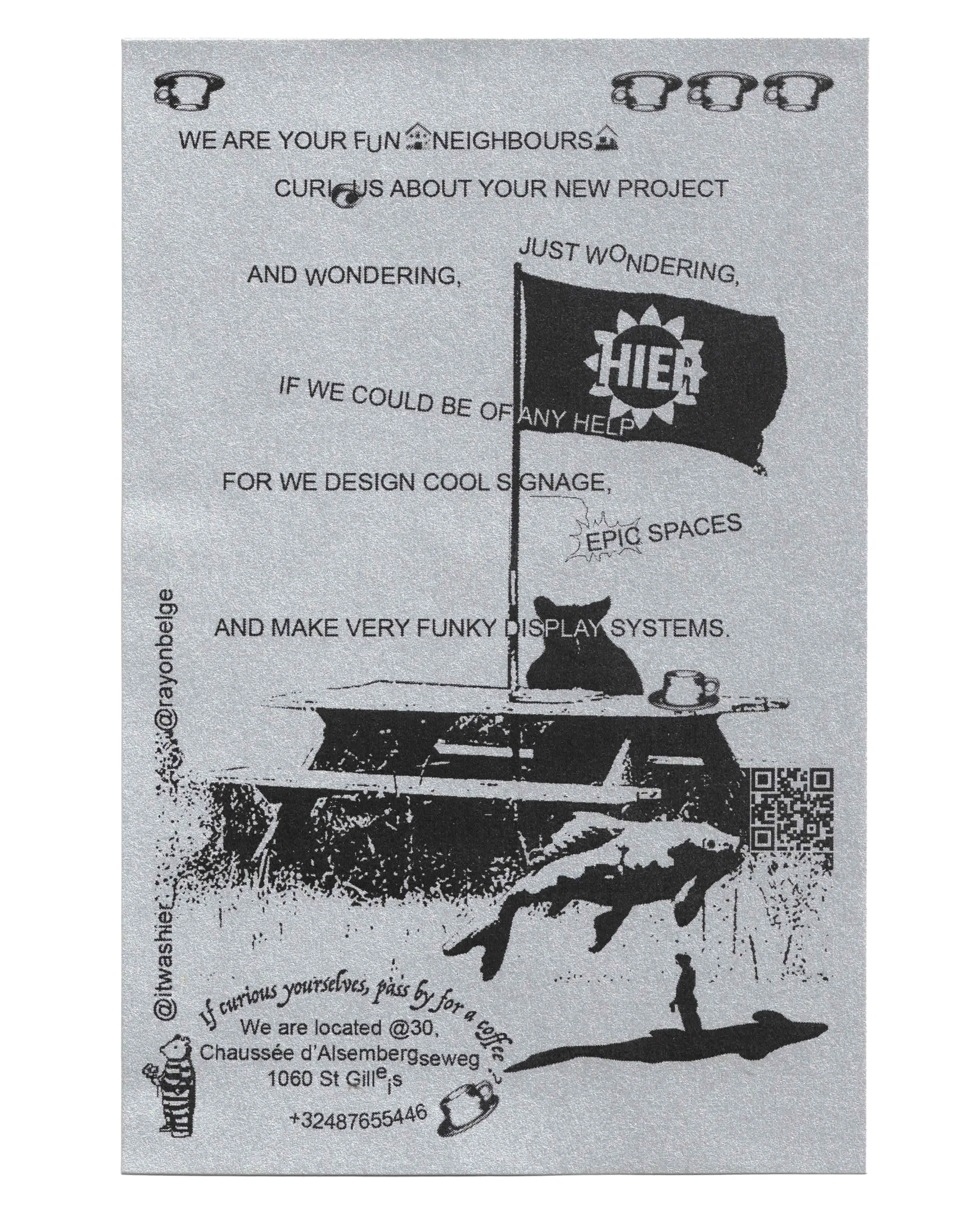
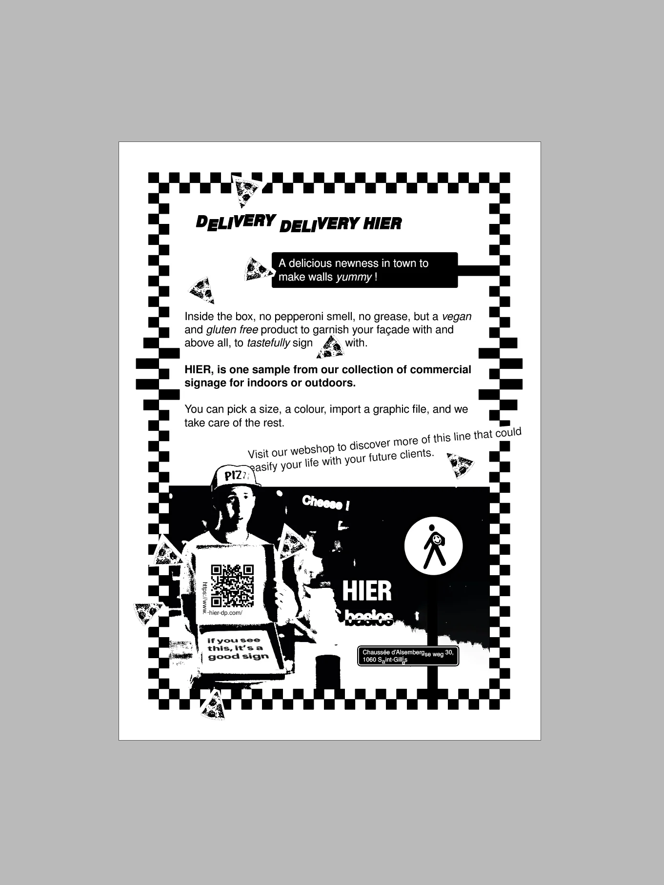

Well-written text layouts and total freedom, it's very simple,
I had a lot of fun creating these compositions.
flyer formats :
hier 10 x 15 cm
basics A5
layout, experimentation
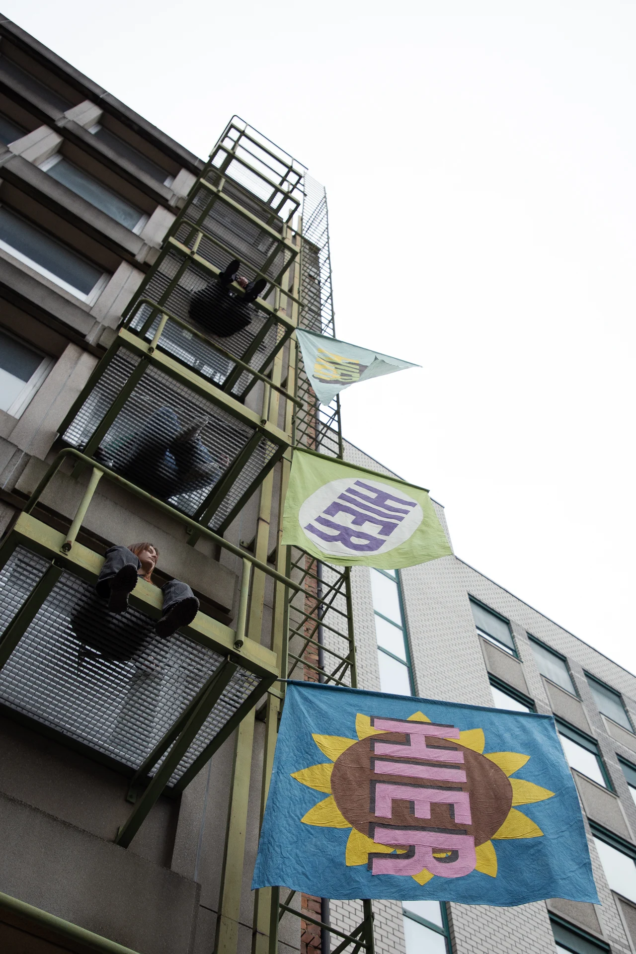
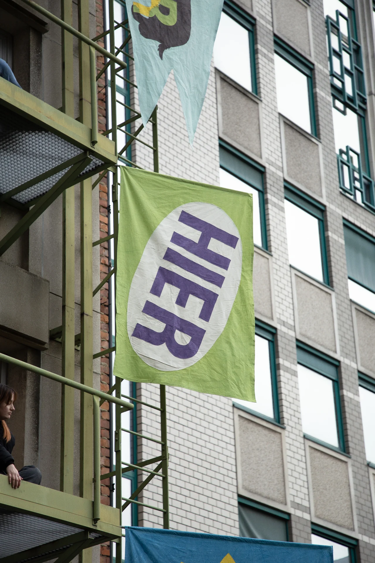
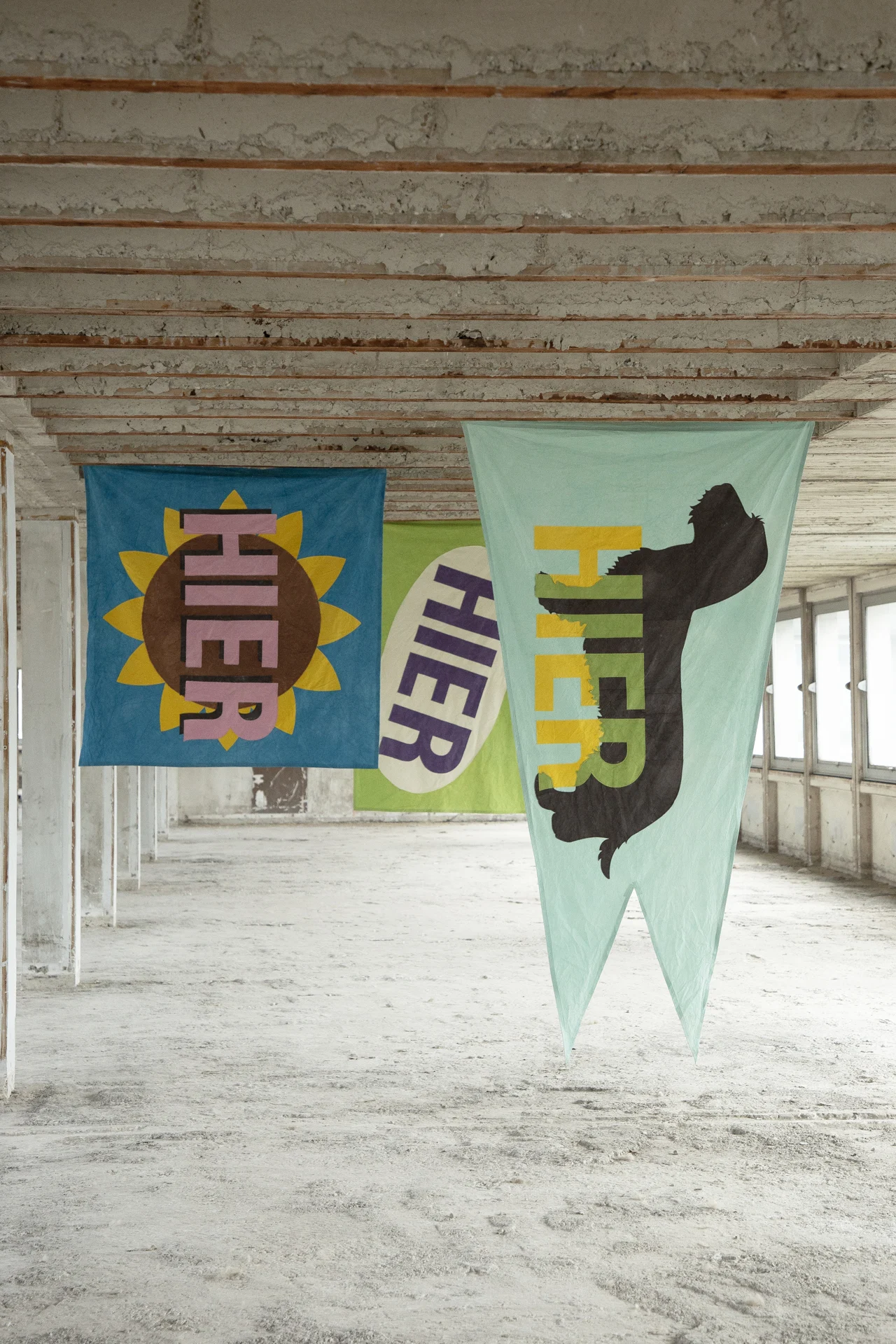
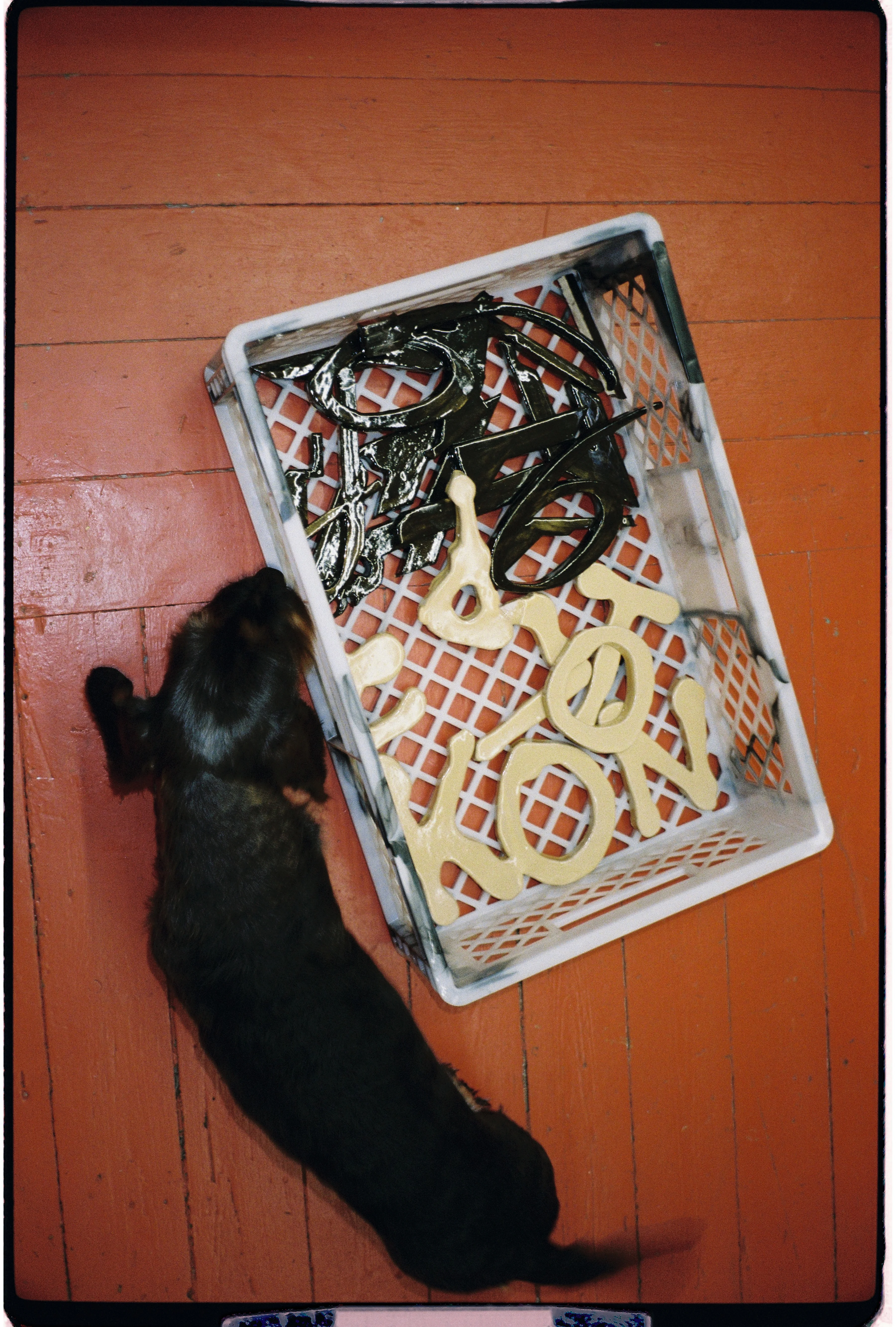
hier is a workshop specialized in
scenography and signage. Lately, they've been
experimenting with the production of signs using two techniques, fabric and ceramic.
During my time at the studio, I had the opportunity to participate to this research, called « hard and soft »,
with ideas and visuals for flags and ceramic pieces.
Later on, I should be able to show more of this process.
The photos used to show this project were taken by the talented Luciana Schultz.
flags :
160 x 250 cm
160 x 220 cm
160 x 160 cm
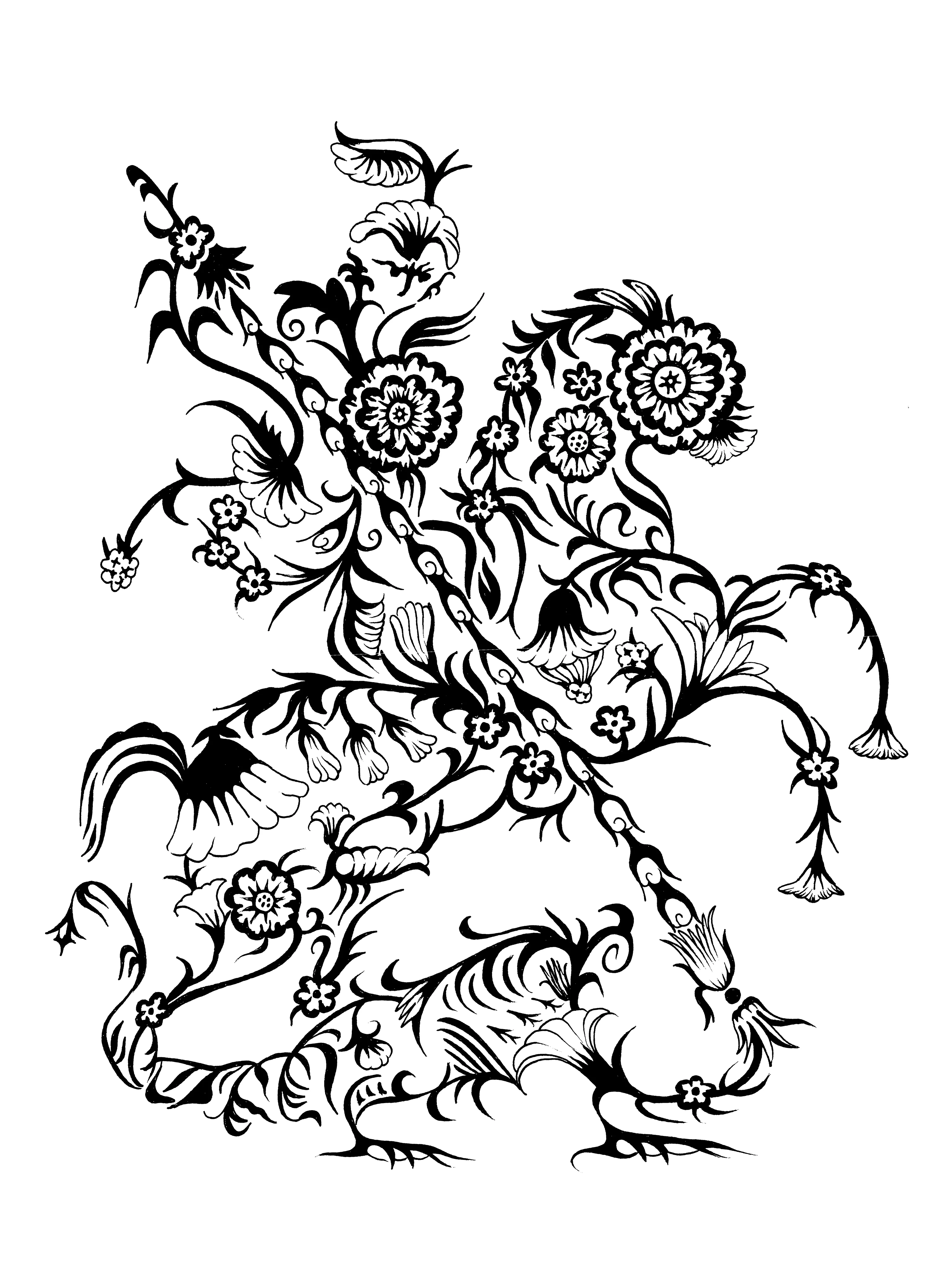
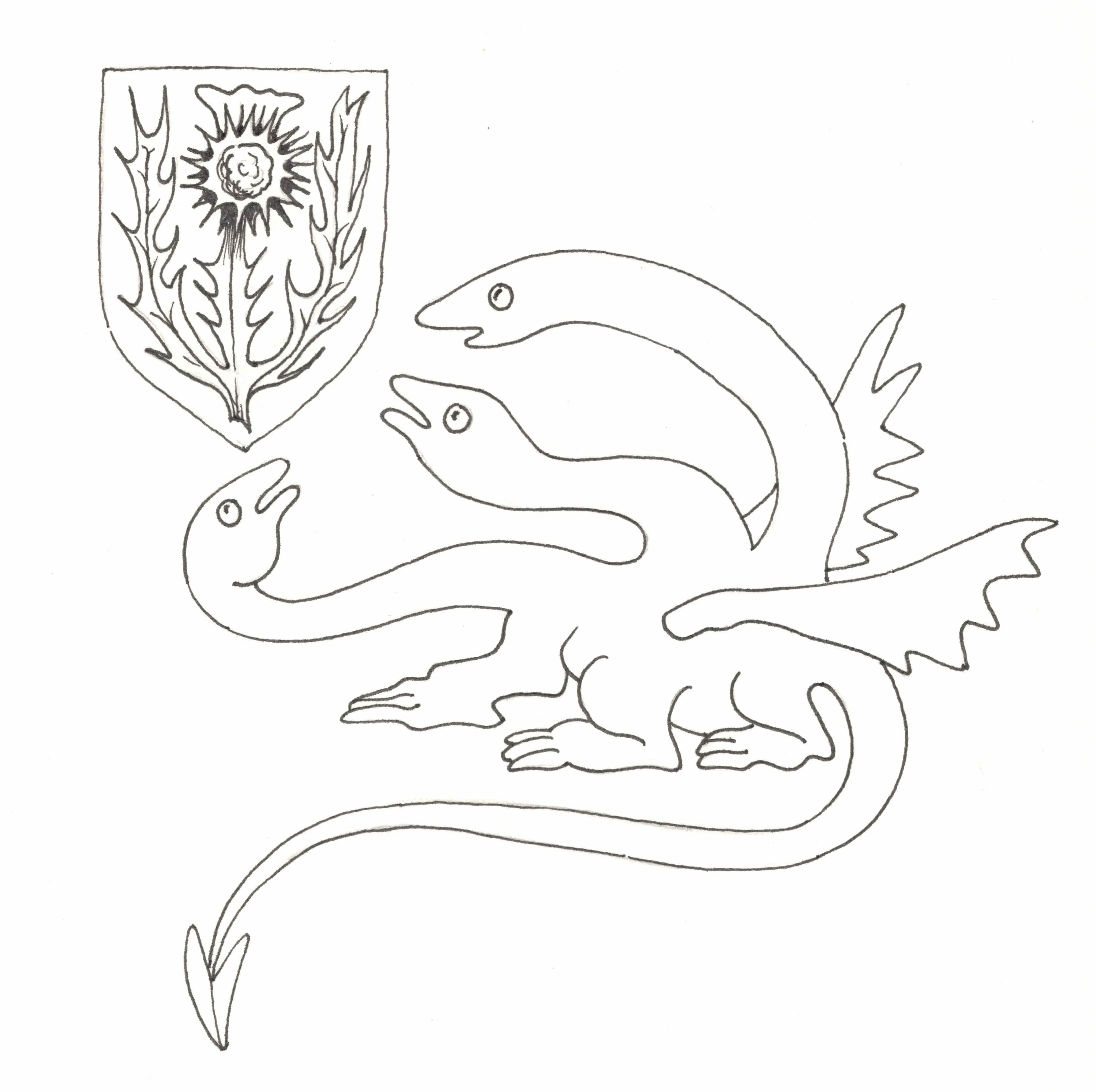
drawings :
St Georges, A3
dragon « in hard we soft », A4
illustration, design, medieval
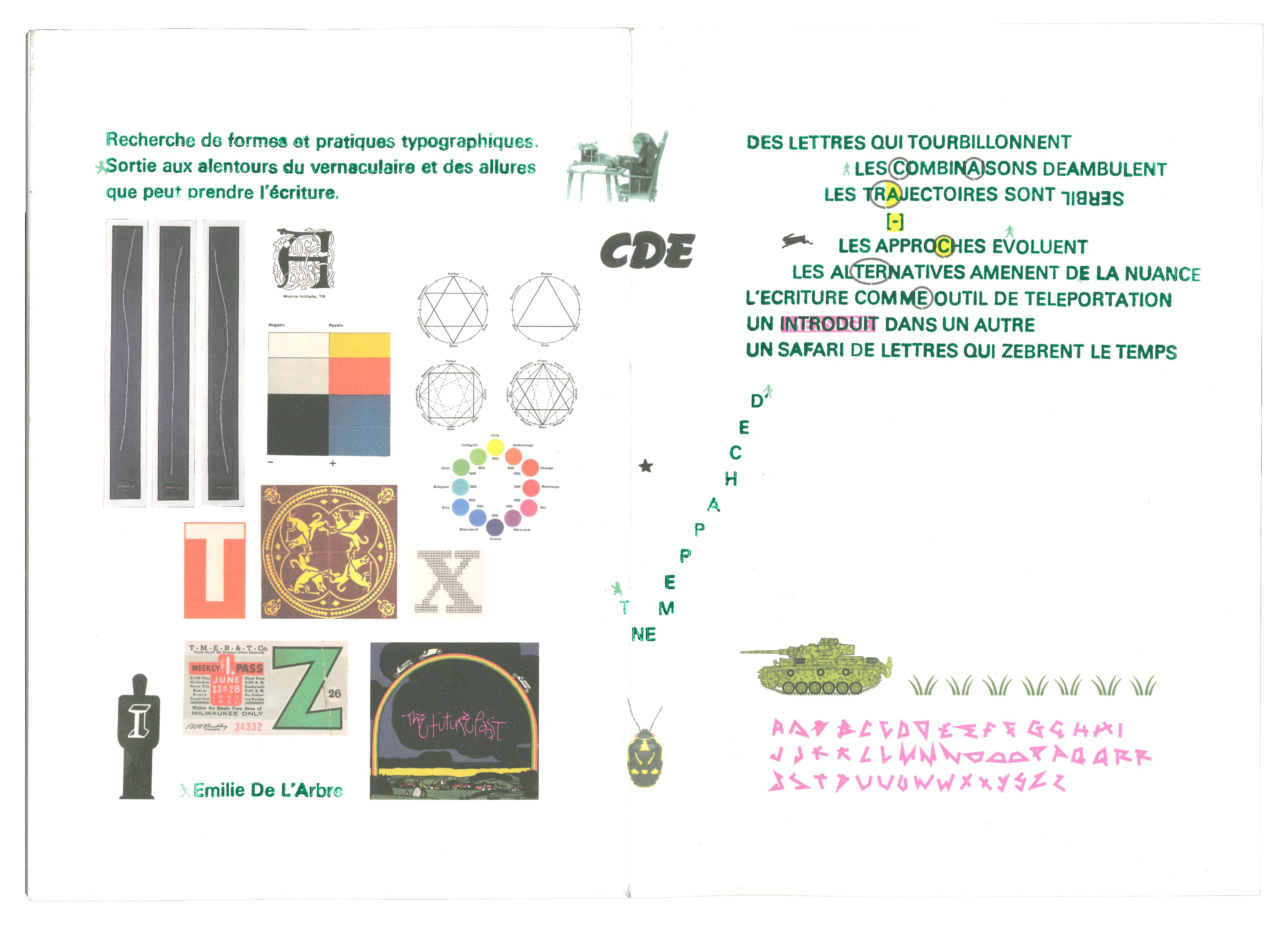
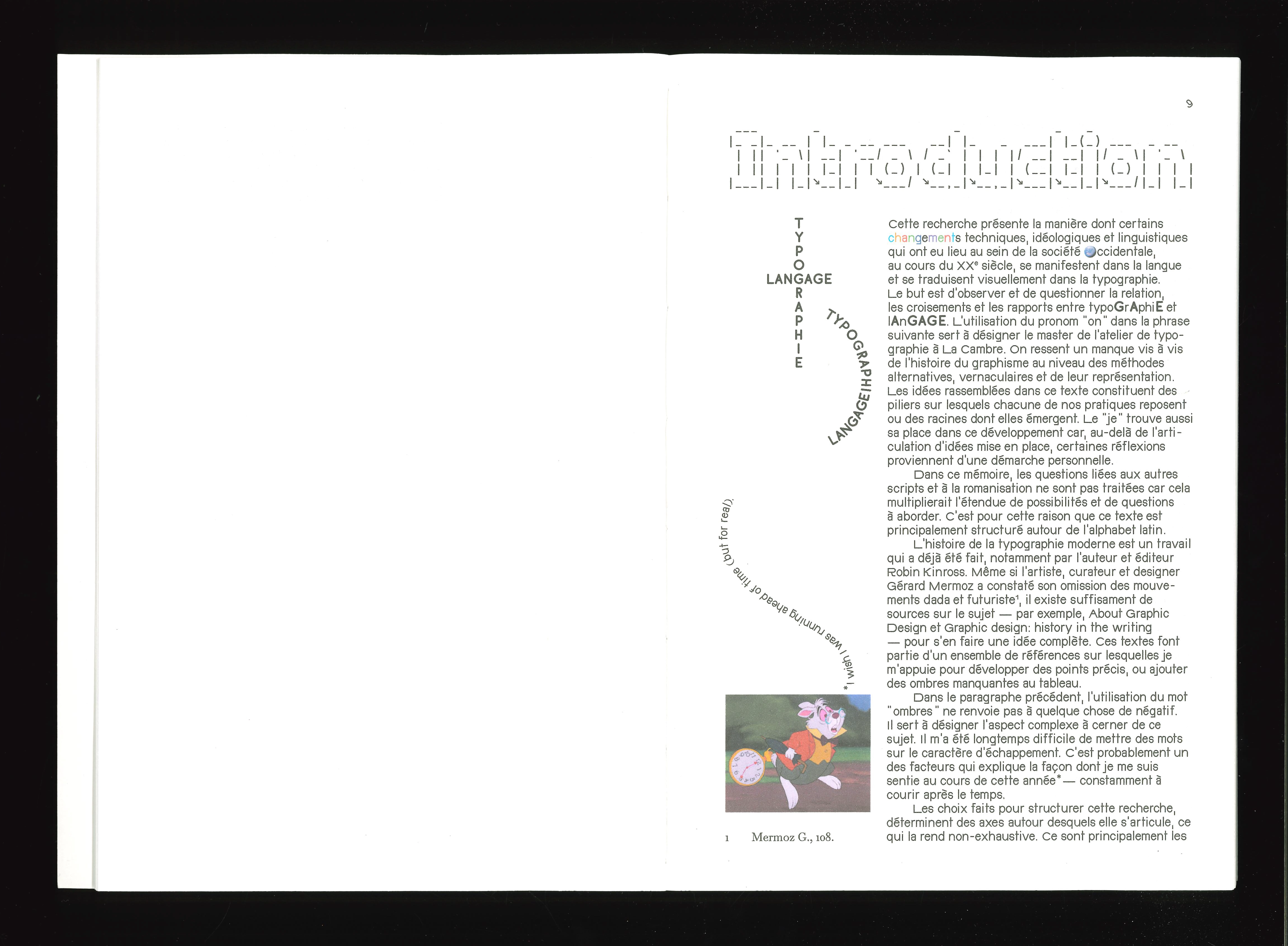
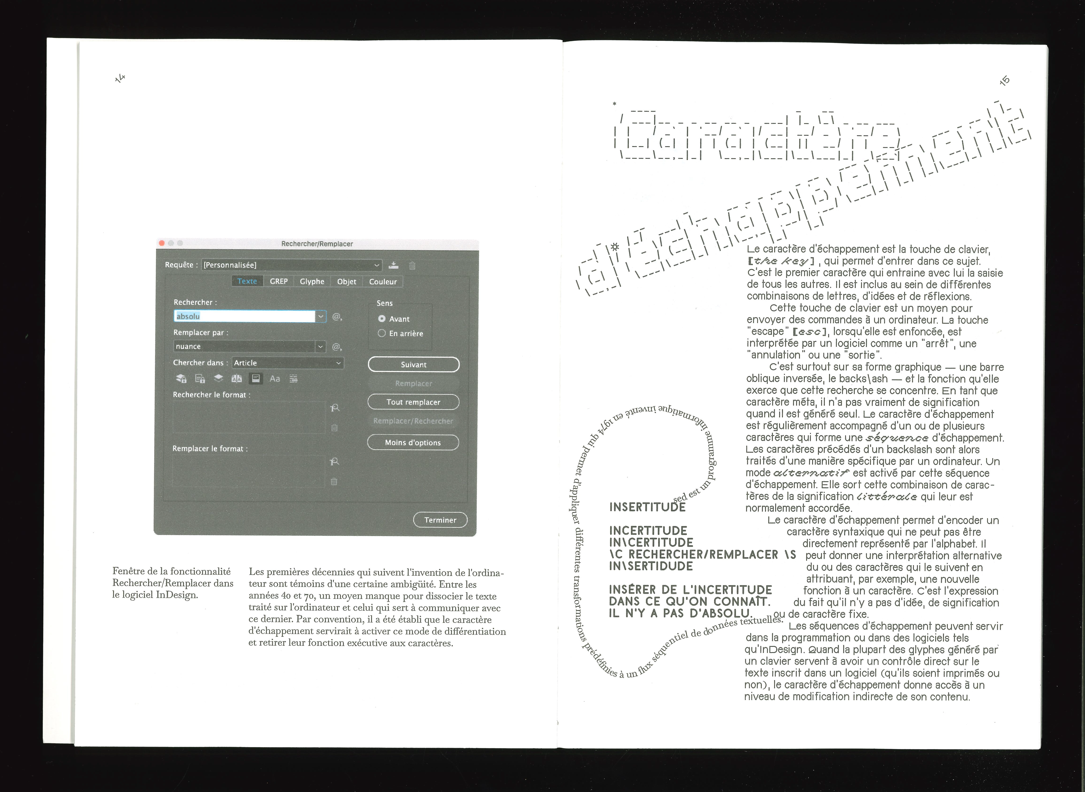
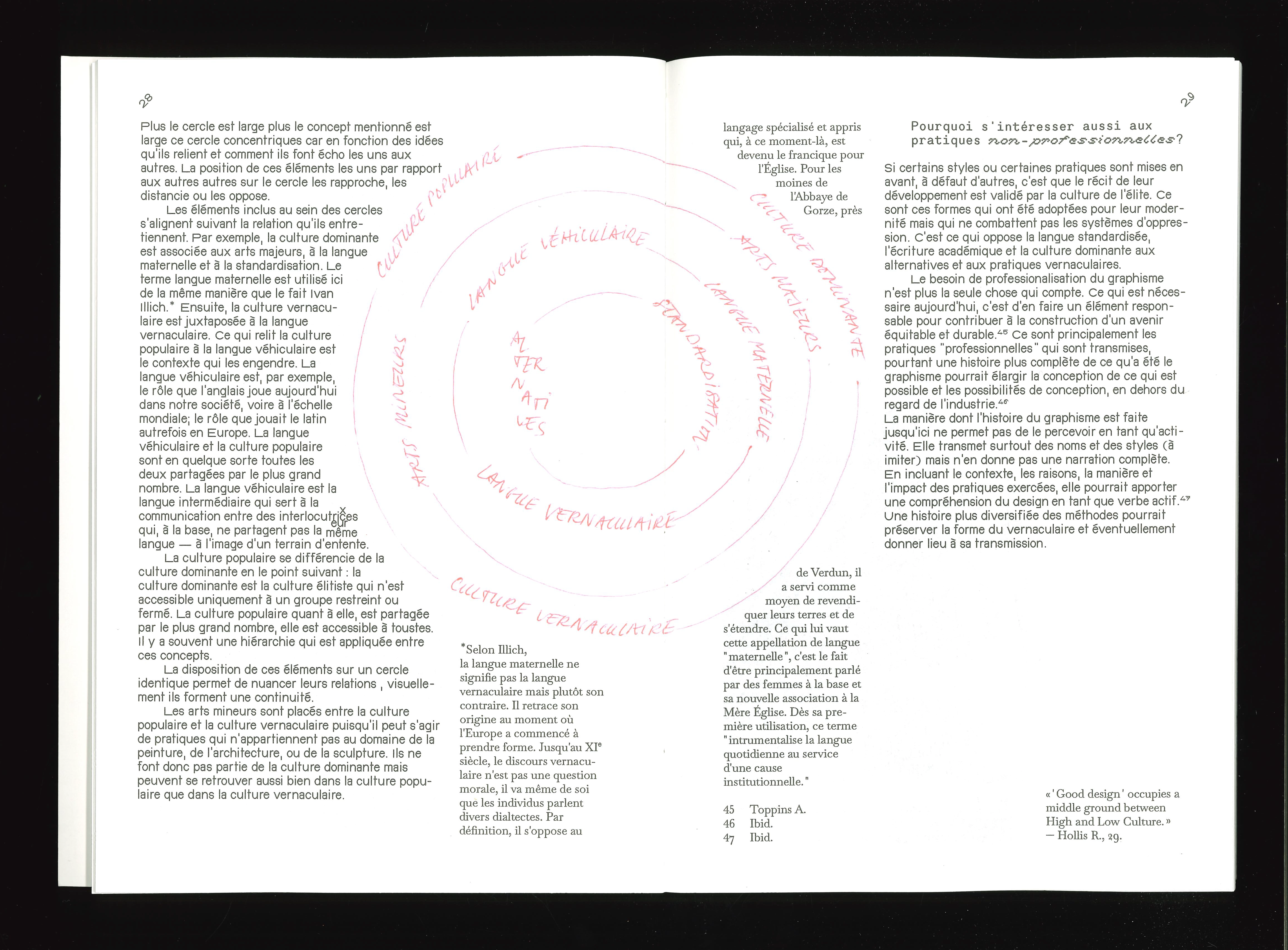
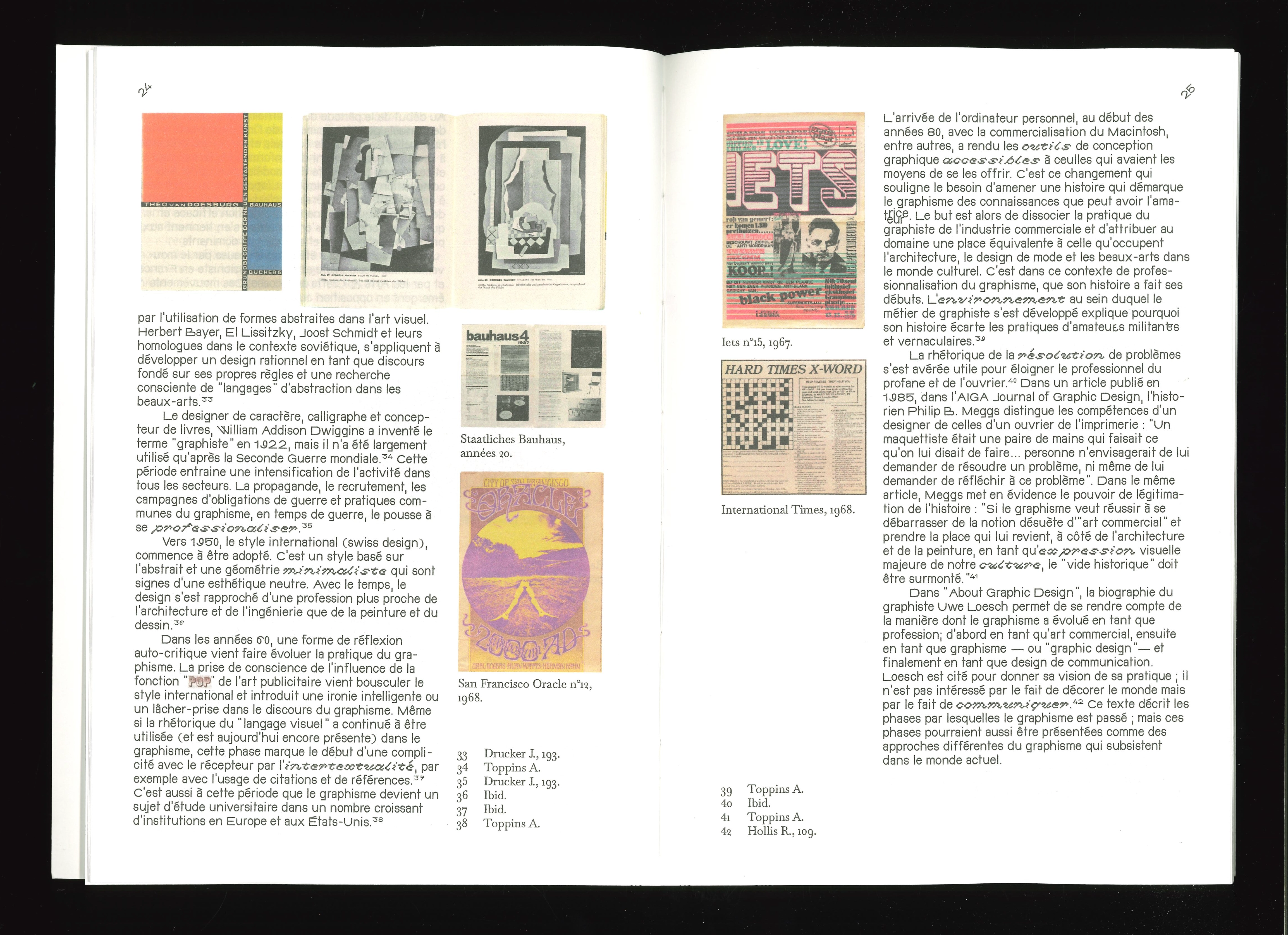
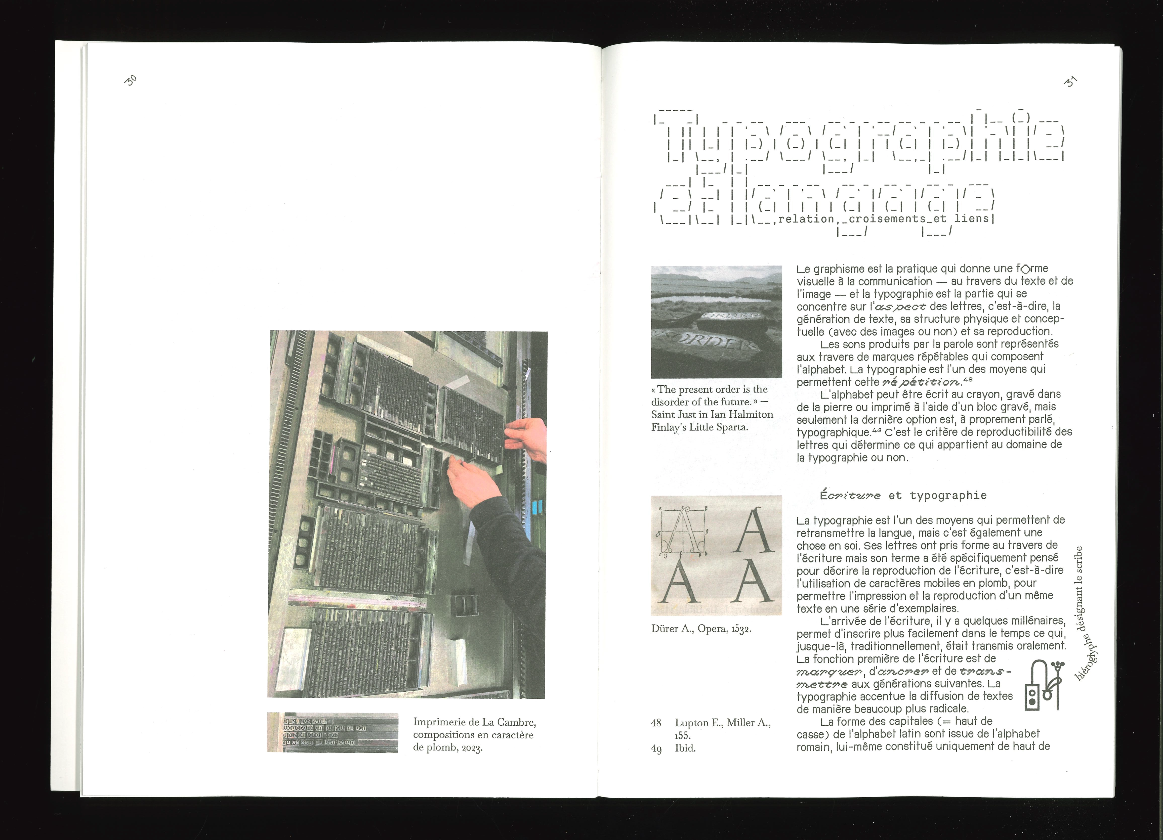
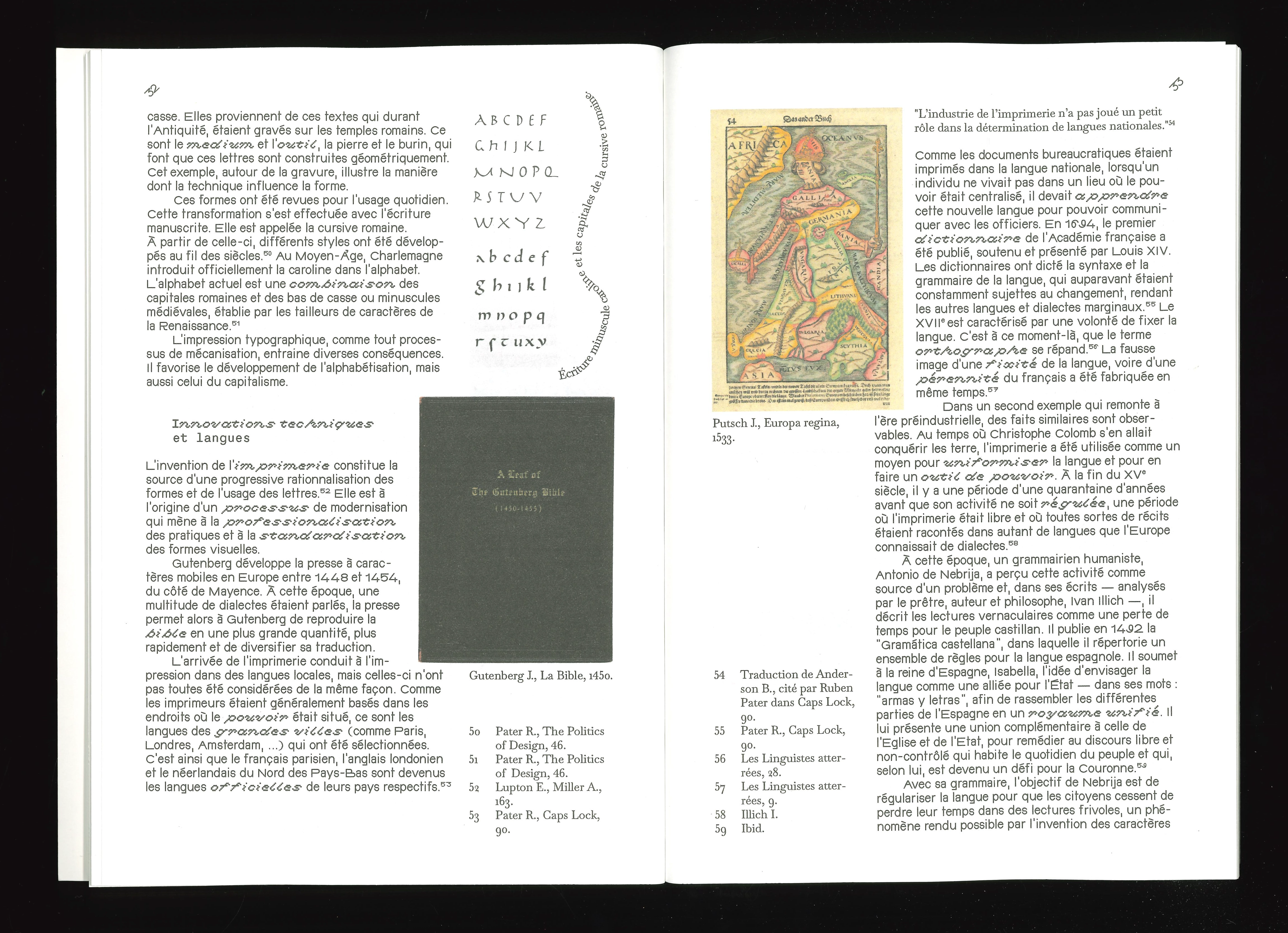
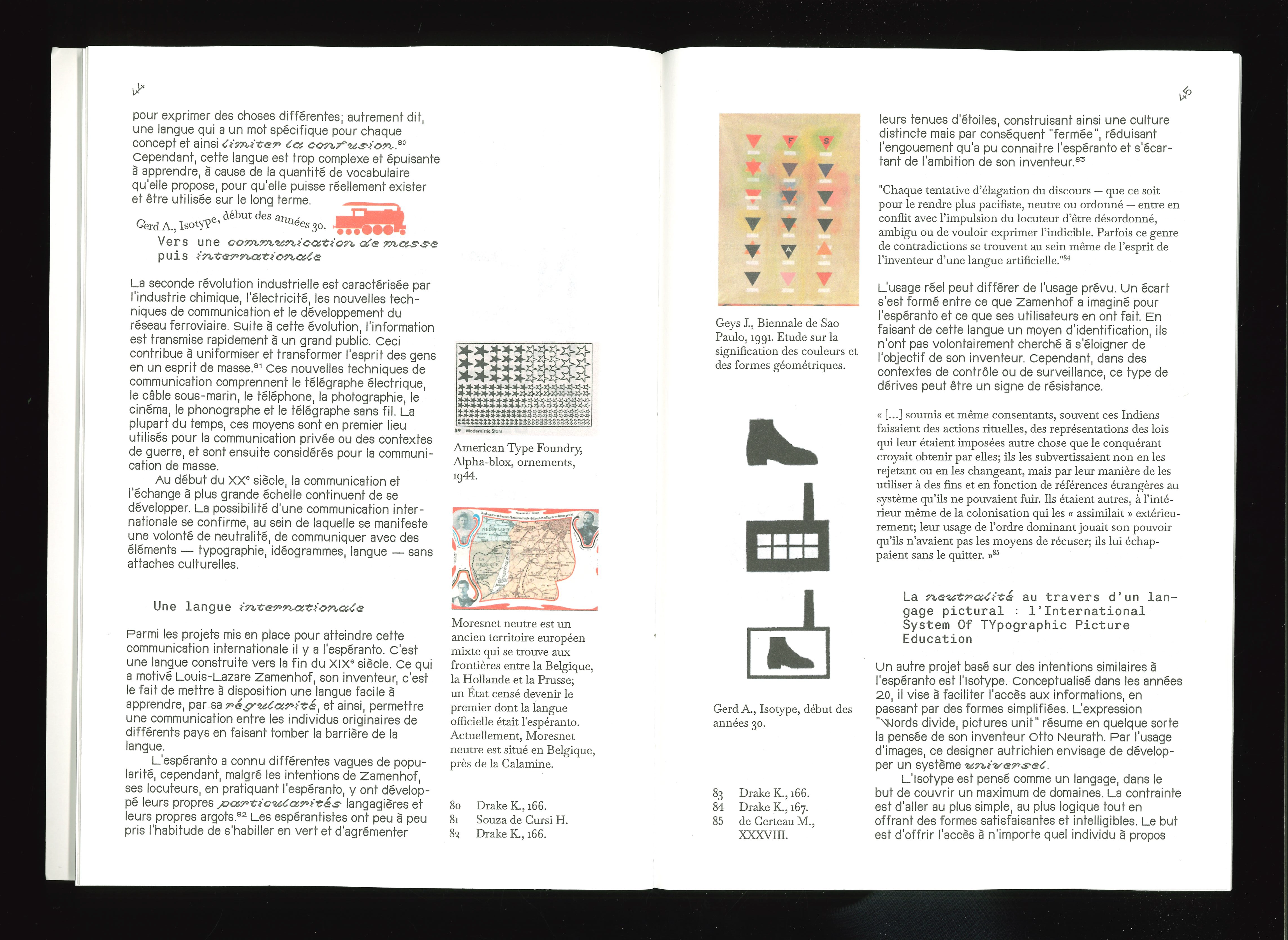
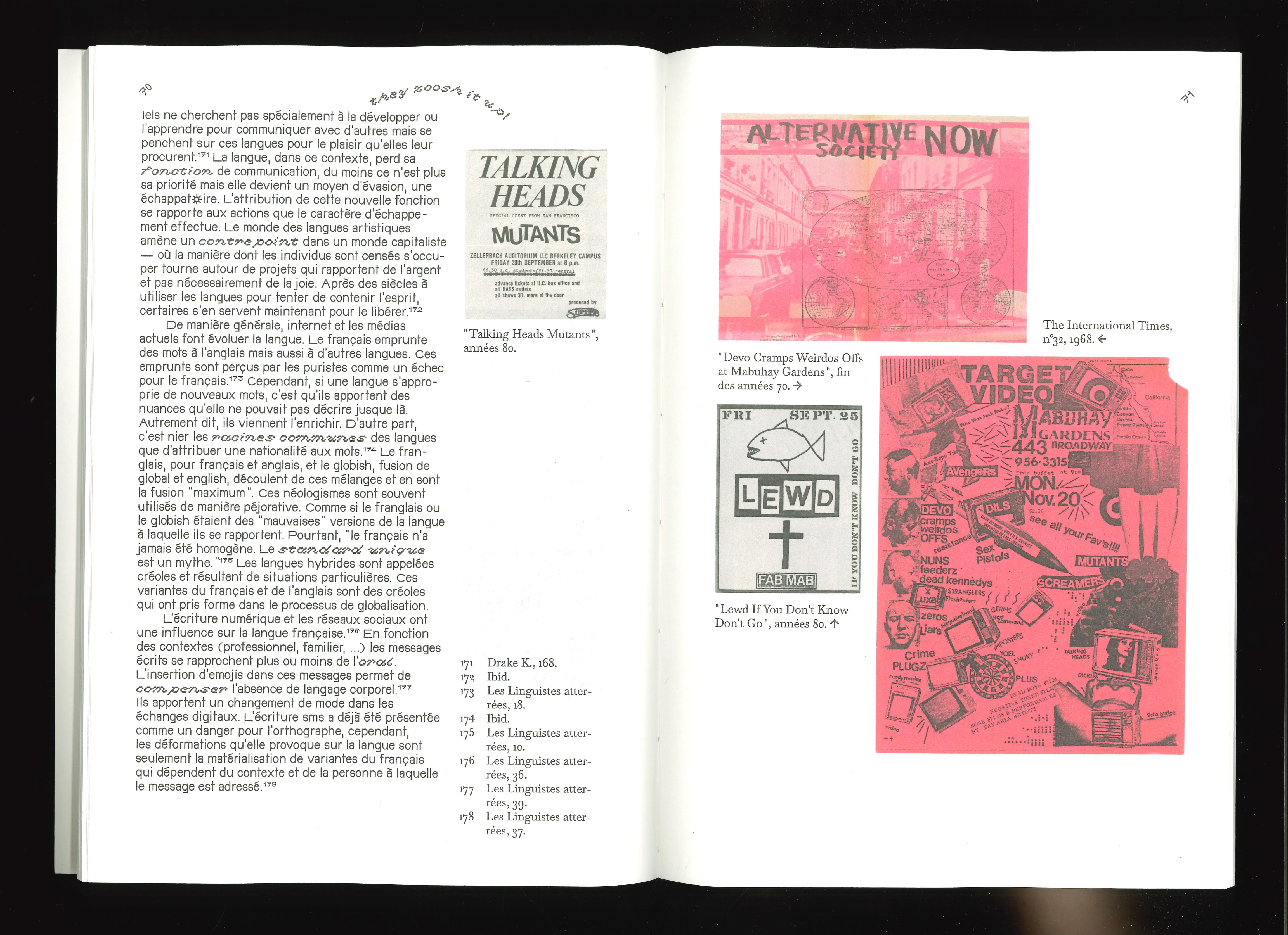
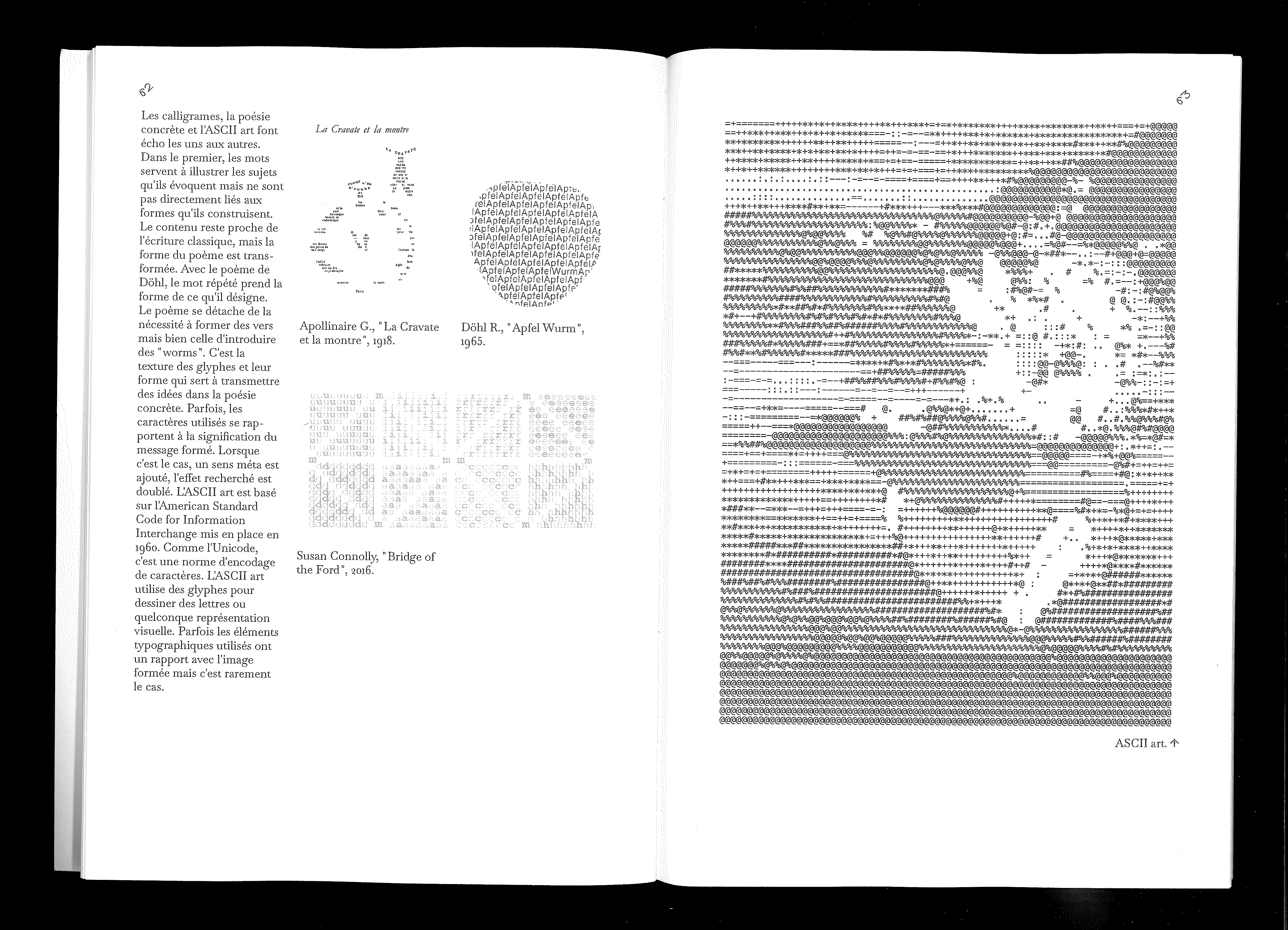
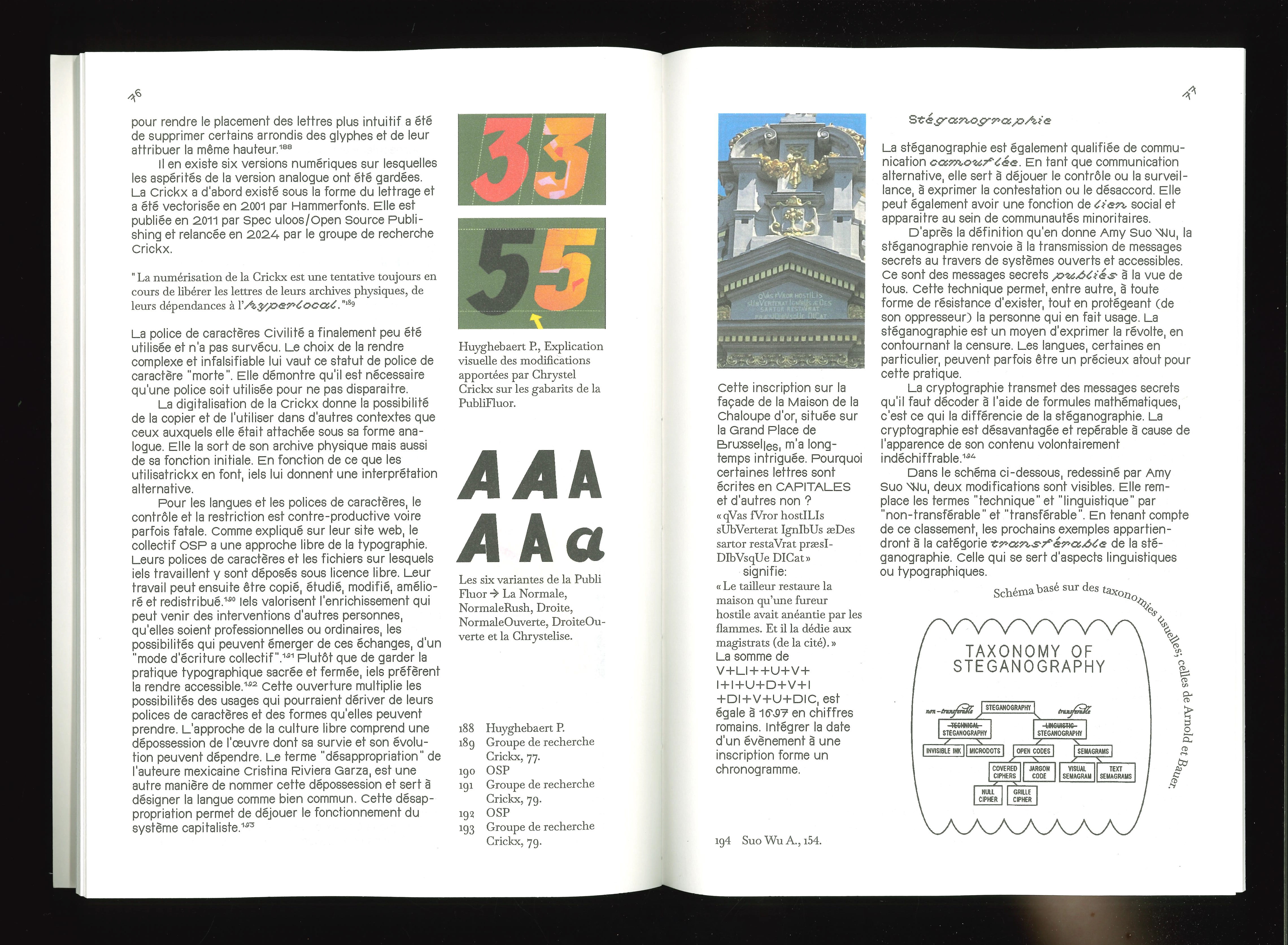
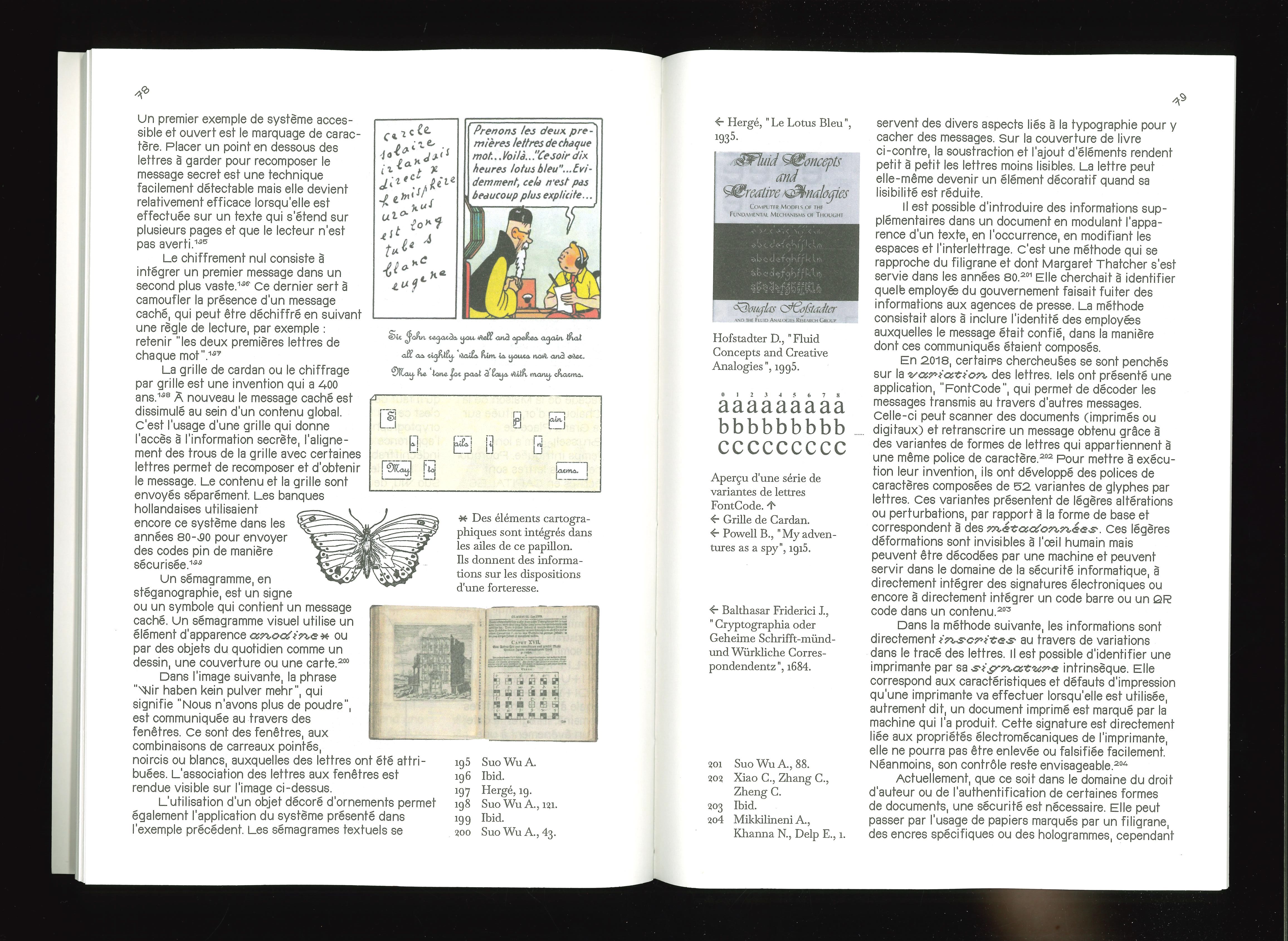
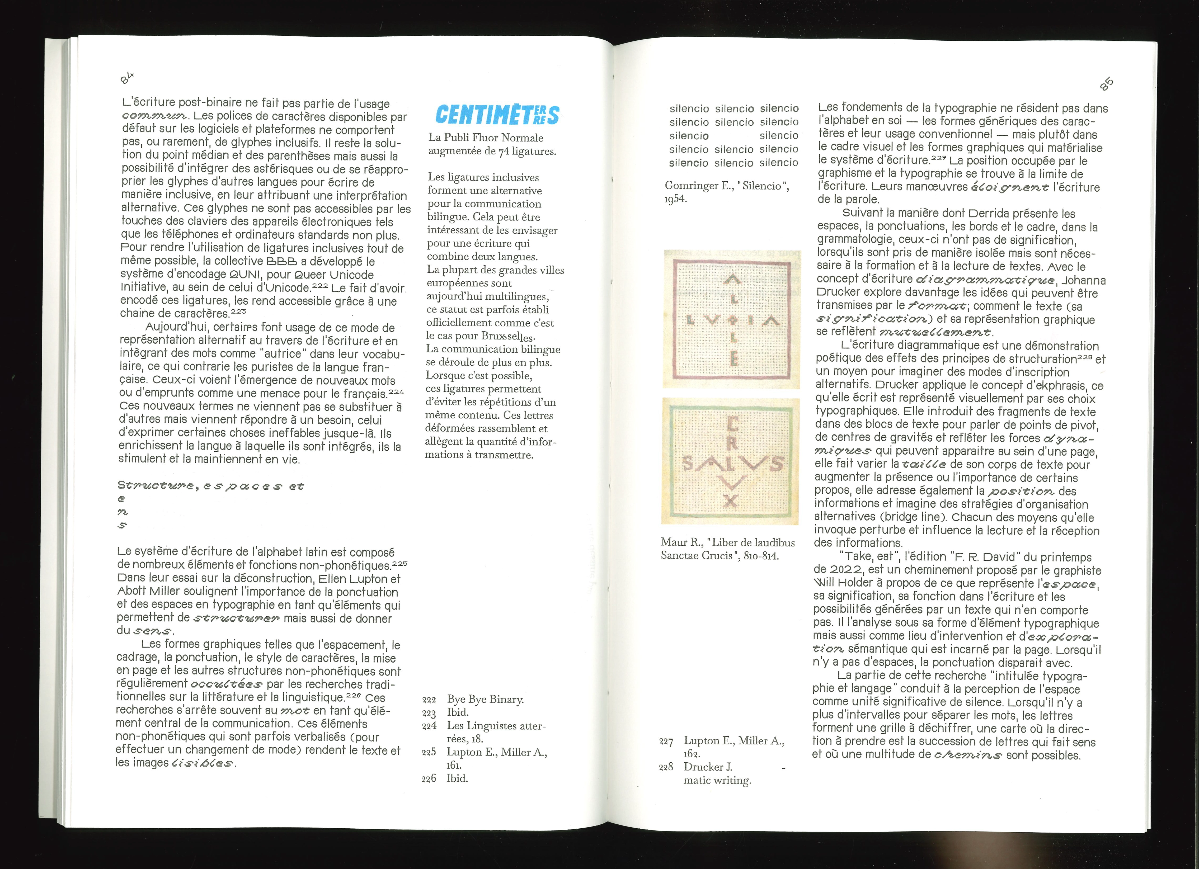
The escape character introduces uncertainty, a space to consider responses
that are different from those developed in the past.
☼
_
⏌
⏌
⏌
Research into typographic forms and practices.
Errand in the vernacular and the different forms that writing can take.
This is a CambrULBian thesis supervised by Ellen Van Huffel and Pierre Huyghebaert.
Thesis, FR + ENG every now and then
17,5x25,5 cm, 104 p., coptic binding
typography and language, text x image, escape character
If you are interested in a digital version of "Caractère d'échappement", send me an e-mail.
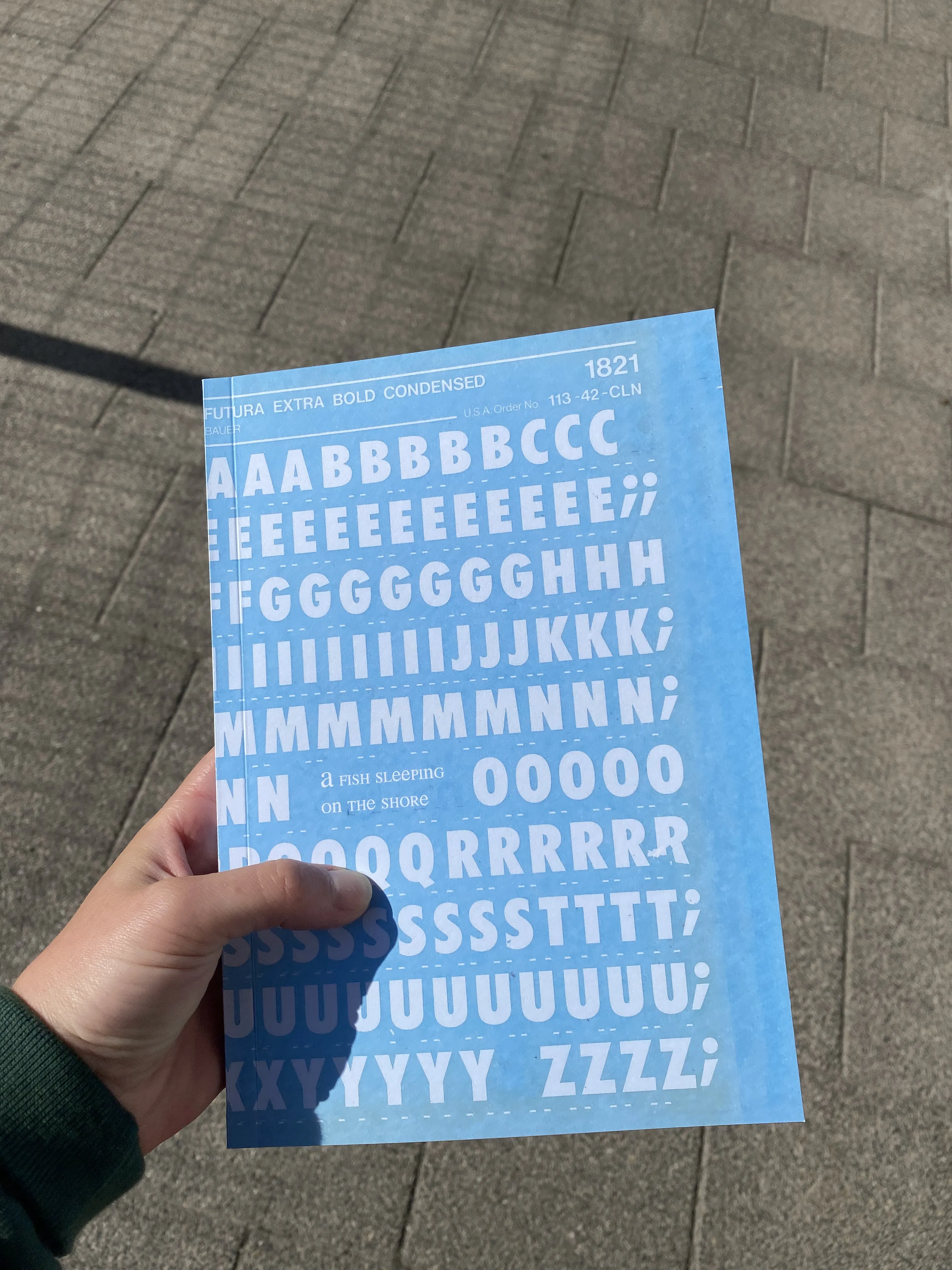
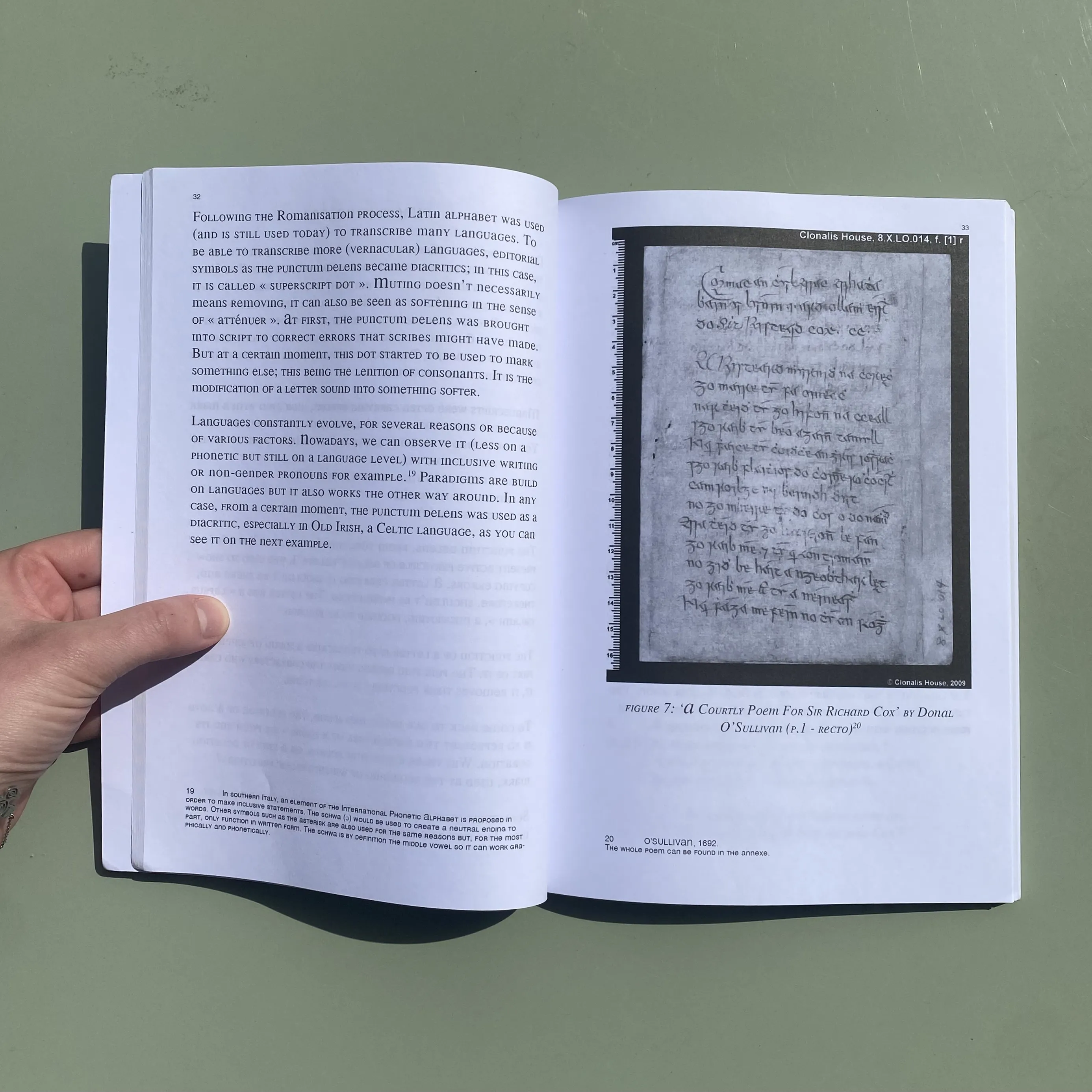
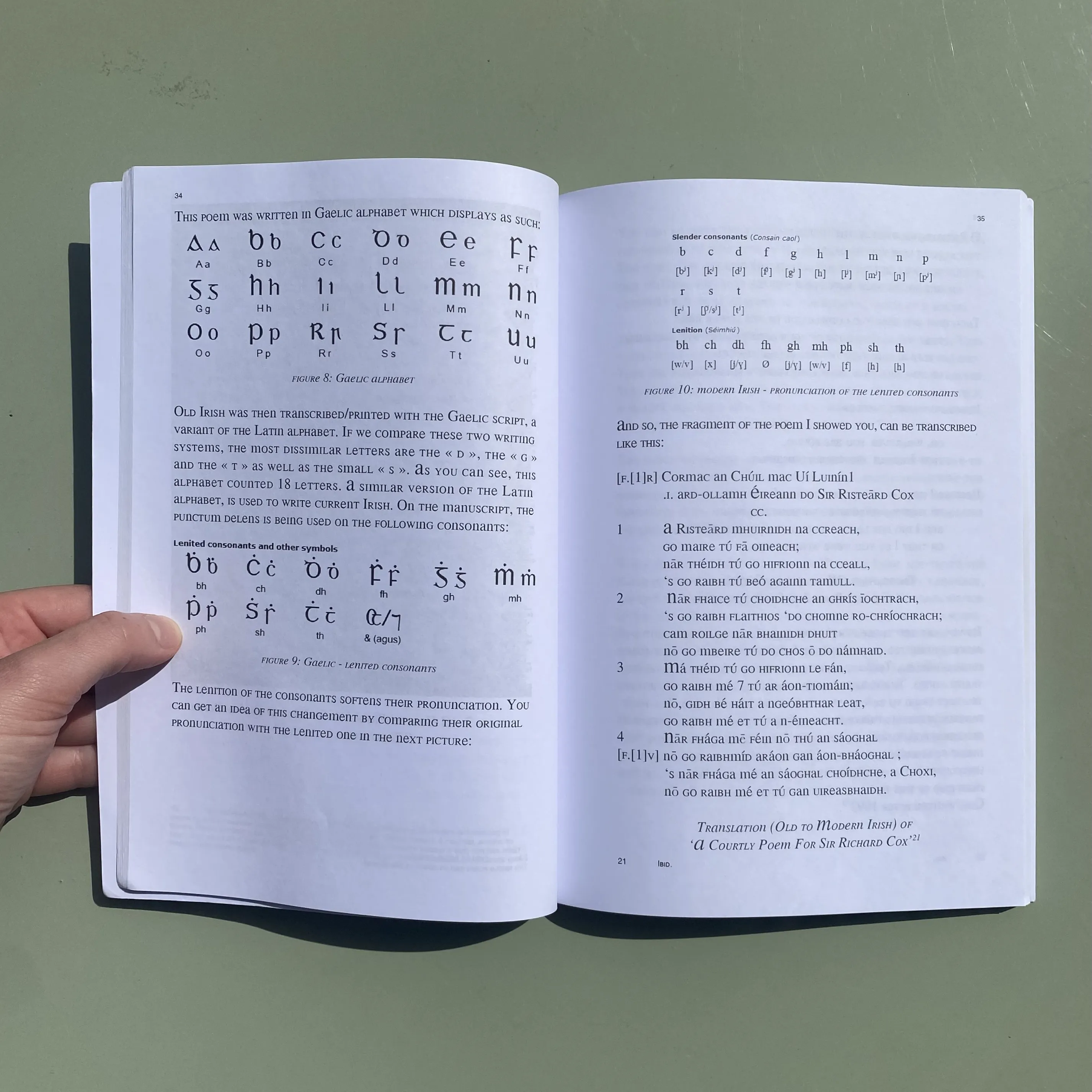
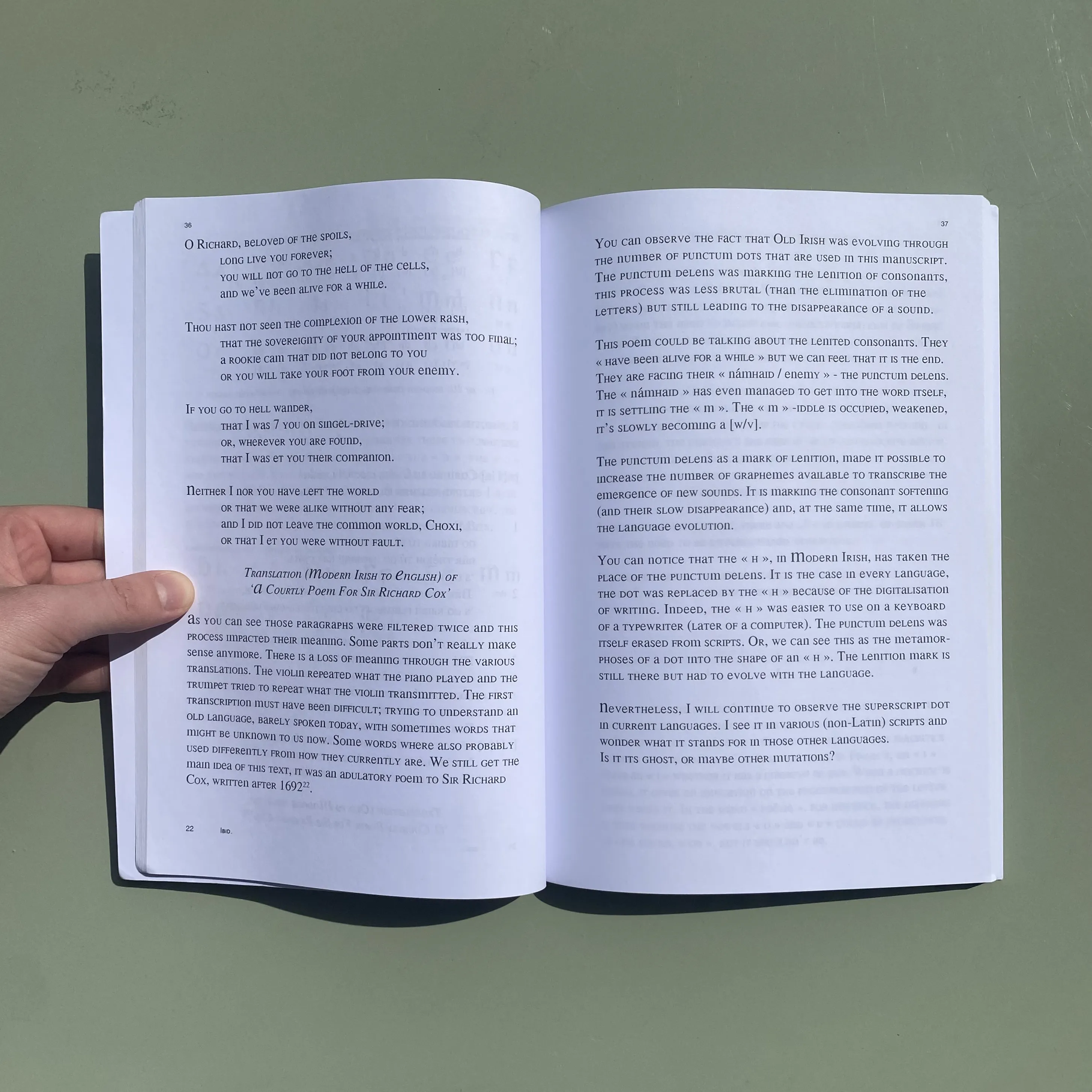
I choose to start this reflection around a diacritic from the Latin alphabet - the superscript dot.
It is the starting point but could also be considered as the gravitational center of my thesis.
Thesis, ENG (+ FR for the conclusion)
16x23 cm, 124 p., glued binding
This research was supervised by Nicolas Baeyens and Andrea di Serego Alighieri.
removal in language, punctum delens, multilingualism
To read more about 'A fish sleeping on the shore', send me an e-mail.
